自定义Qt Quick控件
一组用于在Qt Quick中创建用户界面的UI控件
Qt Quick Controls 由一组层次结构(树)的项目组成。为了提供自定义的外观和感觉,每个项目的默认 QML 实现可以被自定义的实现替换。
自定义控件
有时您会想为UI的特定部分创建一个“一次性”的外观,并在其他地方使用完整的样式。也许您对正在使用的样式感到满意,但有一个特定的按钮具有一些特殊的意义。
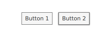
创建此按钮的第一种方法是简单地在需要的地方定义它。例如,您可能对Basic样式的按钮有直角不满意。为了使它们变圆,您可以覆盖background项并设置Rectangle的radius属性:
注意
由于构成任何给定样式中控件的不同项目被设计为协同工作,可能需要覆盖其他项目以获得您想要的外观。此外,并非所有样式都可以自定义。有关更多信息,请参阅自定义参考中的说明。
如果你计划在多个地方使用圆角按钮,第二种创建按钮的方法是很好的。它涉及将代码移动到项目中的自己的QML文件中。
对于这种方法,我们将从基本样式的Button.qml中复制背景代码。此文件可以在您的Qt安装中的以下路径找到:
$QTDIR/qml/QtQuick/Controls/Basic/Button.qml
完成这些操作后,我们只需添加以下行:
radius: 4
为了避免与模块本身的控件混淆,我们将文件命名为MyButton.qml。要在您的应用程序中使用该控件,请通过其文件名引用它:
创建按钮的第三种方式在文件系统中所处的位置以及在QML中的使用方式上更加结构化。首先,像上面那样复制一个现有文件,但这次将其放入项目中的一个子文件夹中,例如命名为controls。要使用该控件,首先将文件夹导入到一个命名空间中:
既然你现在有了MyControls命名空间,你可以根据Qt Quick Controls模块中的实际对应项来命名控件。你可以对任何你希望添加的控件重复这个过程。
这三种方法的一个额外好处是不需要从头开始实现模板。
创建自定义样式
有几种方法可以创建您自己的样式。下面,我们将解释各种方法。
样式的定义
在Qt Quick Controls中,样式本质上是一个目录中的一组QML文件。要使样式可用,有四个要求:
必须存在至少一个名称与控件匹配的QML文件(例如,
Button.qml)。每个QML文件必须包含来自QtQuick.Templates导入的相关类型作为根项目。例如,Button.qml必须包含一个Button模板作为其根项目。
如果我们像上一节那样使用来自QtQuick.Controls导入的相应类型,它将无法工作:我们正在定义的控件将尝试从自身派生。
必须存在一个与QML文件并存的qmldir文件。以下是一个提供按钮样式的简单
qmldir文件的示例:module MyStyle Button 2.15 Button.qml如果您使用的是编译时样式选择,qmldir文件还应导入备用样式:
# ... import QtQuick.Controls.Basic auto这也可以用于运行时样式选择,而不是使用例如
setFallbackStyle()。这种样式的目录结构如下所示:
MyStyle
├─── Button.qml
└─── qmldir
文件必须位于可通过QML导入路径找到的目录中。
例如,如果上述MyStyle目录的路径是
/home/user/MyApp/MyStyle,那么/home/user/MyApp必须添加到QML导入路径中。要在MyApp中使用 MyStyle,请通过名称引用它:
./MyApp -style MyStyle样式名称必须与样式目录的大小写匹配;不支持传递mystyle或MYSTYLE。
默认情况下,样式系统使用基本样式作为未实现控件的回退。要自定义或扩展任何其他内置样式,可以使用QQuickStyle指定不同的回退样式。
这意味着你可以为你的自定义样式实现任意数量的控件,并将它们放置在几乎任何地方。它还允许用户为你的应用程序创建他们自己的样式。
在Qt Quick Designer中预览自定义样式
使用上述方法,可以在Qt Quick Designer中预览自定义样式。为此,请确保项目中有一个qtquickcontrols2.conf文件,并且存在以下条目:
[Controls]
Style=MyStyle
欲了解更多信息,请查看扁平风格示例。
特定风格的C++扩展
有时你可能需要使用C++来扩展你的自定义样式。
使用CMake
qt_add_qml_module(ACoolItem
    URI MyItems
    VERSION 1.0
    SOURCES
        acoolcppitem.cpp acoolcppitem.h
)
使用QMake
CONFIG += qmltypes
QML_IMPORT_NAME = MyItems
QML_IMPORT_MAJOR_VERSION = 1
如果声明该类的头文件无法从项目的包含路径访问,您可能需要修改包含路径,以便生成的注册代码可以编译。
INCLUDEPATH += MyItems
有关更多信息,请参阅从C++定义QML类型和构建QML应用程序。
如果使用该类型的样式是应用程序唯一使用的样式,请通过添加QML_ELEMENT宏并将文件作为QML模块的一部分来向QML引擎注册该类型:
如果使用该类型的样式是应用程序使用的众多样式之一,请考虑将每个样式放入单独的模块中。然后,这些模块将按需加载。
自定义样式的注意事项
在实现自己的样式和自定义控件时,有一些要点需要注意,以确保您的应用程序尽可能高效。
避免为样式项委托的实现分配id
如样式定义中所述,当你为控件实现自己的样式时,你从该控件的相关模板开始。例如,一个样式的Button.qml将与此类似:
当你在应用程序中使用按钮时,background 和 contentItem 项目将被创建并作为根 Button 项目的子项:
假设你随后需要对按钮进行一次性的定制(如自定义控件中所述):
在QML中,这通常会导致默认的background实现和一次性自定义的background项都被创建。Qt Quick Controls使用了一种技术,避免了同时创建这两个项,而是只创建自定义的background,从而大大提高了控件的创建性能。
这种技术依赖于样式实现中该项目没有id。如果分配了id,该技术将无法工作,并且将创建两个项目。例如,可能会想要为background或contentItem分配一个id,以便文件中的其他对象可以引用这些项目:
使用此代码时,每次创建具有自定义背景的Button实例时,都会创建两个背景,导致创建性能不佳。
在Qt 5.15之前,旧的、未使用的背景会被删除以释放与之相关的资源。然而,由于控件并不拥有这些项目,它不应该删除它们。从Qt 5.15开始,旧的项目不再被删除,因此backgroundRect项目的生命周期将比需要的更长——通常直到应用程序退出。尽管旧的项目会被隐藏,从控件中视觉上解除父子关系,并从可访问性树中移除,但在这种情况下分配id时,记住这些未使用项目的创建时间和内存使用情况是很重要的。
避免自定义项目的命令式赋值
上述部分提到的技术仅在项目首次声明性分配时有效,因此命令式分配将导致孤立项目。尽可能始终使用声明性绑定来分配自定义项目。
不要在QML实现中导入QtQuick.Controls
在编写控件样式的QML实现时,重要的是不要导入QtQuick.Controls。这样做会阻止QML编译器编译QML。
实现其他类型使用的类型
假设你在应用程序中使用ScrollViews,并决定自定义它们的滚动条。你可能会想直接实现一个自定义的ScrollBar .qml,并让ScrollView自动获取自定义的ScrollBar。然而,这不会奏效。你必须同时实现ScrollBar .qml 和 ScrollView .qml。
附加属性
通常,样式会有某些属性或特性适用于所有控件。附加属性是在QML中扩展项目的一种很好的方式,而无需修改该项目的任何现有C++代码。例如,Material和Universal样式都有一个附加的主题属性,用于控制项目及其子项目是以浅色主题还是深色主题呈现。
举个例子,让我们添加一个控制高度的附加属性。我们的样式将通过投影来展示高度;高度越高,投影越大。
第一步是在Qt Creator中创建一个新的Qt Quick Controls应用程序。之后,我们添加一个存储高度的C++类型。由于该类型将用于我们样式支持的每个控件,并且因为我们可能希望稍后添加其他附加属性,我们将其称为MyStyle。以下是MyStyle.h:
#ifndef MYSTYLE_H
#define MYSTYLE_H

#include <QObject>
#include <QtQml>

class MyStyle : public QObject
{
    Q_OBJECT
    Q_PROPERTY(int elevation READ elevation WRITE setElevation NOTIFY elevationChanged)

public:
    explicit MyStyle(QObject *parent = nullptr);

    static MyStyle *qmlAttachedProperties(QObject *object);

    int elevation() const;
    void setElevation(int elevation);

signals:
    void elevationChanged();

private:
    int m_elevation;
};

QML_DECLARE_TYPEINFO(MyStyle, QML_HAS_ATTACHED_PROPERTIES)

#endif // MYSTYLE_H
MyStyle.cpp:
#include "mystyle.h"

MyStyle::MyStyle(QObject *parent) :
    QObject(parent),
    m_elevation(0)
{
}

MyStyle *MyStyle::qmlAttachedProperties(QObject *object)
{
    return new MyStyle(object);
}

int MyStyle::elevation() const
{
    return m_elevation;
}

void MyStyle::setElevation(int elevation)
{
    if (elevation == m_elevation)
        return;

    m_elevation = elevation;
    emit elevationChanged();
}
MyStyle 类型的特殊之处在于它不应该被实例化,而是应该用于其附加属性。因此,我们在 main.cpp 中以以下方式注册它:
#include <QGuiApplication>
#include <QQmlApplicationEngine>

#include "mystyle.h"

int main(int argc, char *argv[])
{
    QGuiApplication app(argc, argv);

    qmlRegisterUncreatableType<MyStyle>("MyStyle", 1, 0, "MyStyle", "MyStyle is an attached property");

    QQmlApplicationEngine engine;
    // Make the directory containing our style known to the QML engine.
    engine.addImportPath(":/");
    engine.load(QUrl(QLatin1String("qrc:/main.qml")));

    return app.exec();
}
然后我们从基本样式中复制Button.qml,从$QTDIR/qml/QtQuick/Controls/Basic/到我们项目目录中的一个新的myproject文件夹中。将新复制的Button.qml添加到qml.qrc中,这是包含我们QML文件的资源文件。
接下来,我们为按钮的background代理添加一个阴影:
请注意我们:
当高度为
0时,不要费心使用阴影根据按钮是否具有焦点来更改阴影的颜色
使阴影的大小取决于高度
要尝试附加属性,我们在main.qml中创建一个包含两个按钮的Row:
一个按钮没有高度,另一个按钮的高度为10。
有了这些,我们就可以运行我们的示例了。为了告诉应用程序使用我们的新样式,我们将-style MyStyle作为应用程序参数传递,但有多种方式可以指定要使用的样式。
最终结果:
请注意,import MyStyle 1.0 语句仅在因为我们使用属于 MyStyle 的附加属性时才需要。即使我们移除导入,两个按钮仍将使用我们的自定义样式。
自定义参考
以下片段展示了使用与自定义控件部分相同的方法自定义基本样式控件的示例。该代码可以作为实现自定义外观和感觉的起点。
自定义ApplicationWindow
ApplicationWindow 包含一个视觉项:background 。
import QtQuick
import QtQuick.Controls.Basic

ApplicationWindow {
    visible: true

    background: Rectangle {
        gradient: Gradient {
            GradientStop { position: 0; color: "#ffffff" }
            GradientStop { position: 1; color: "#c1bbf9" }
        }
    }
}
自定义BusyIndicator
BusyIndicator 由两个视觉项组成:background 和 contentItem。

import QtQuick
import QtQuick.Controls.Basic

BusyIndicator {
    id: control

    contentItem: Item {
        implicitWidth: 64
        implicitHeight: 64

        Item {
            id: item
            x: parent.width / 2 - 32
            y: parent.height / 2 - 32
            width: 64
            height: 64
            opacity: control.running ? 1 : 0

            Behavior on opacity {
                OpacityAnimator {
                    duration: 250
                }
            }

            RotationAnimator {
                target: item
                running: control.visible && control.running
                from: 0
                to: 360
                loops: Animation.Infinite
                duration: 1250
            }

            Repeater {
                id: repeater
                model: 6

                Rectangle {
                    id: delegate
                    x: item.width / 2 - width / 2
                    y: item.height / 2 - height / 2
                    implicitWidth: 10
                    implicitHeight: 10
                    radius: 5
                    color: "#21be2b"

                    required property int index

                    transform: [
                        Translate {
                            y: -Math.min(item.width, item.height) * 0.5 + 5
                        },
                        Rotation {
                            angle: delegate.index / repeater.count * 360
                            origin.x: 5
                            origin.y: 5
                        }
                    ]
                }
            }
        }
    }
}
自定义按钮
按钮由两个视觉项目组成:background 和 content item。
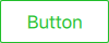
import QtQuick
import QtQuick.Controls.Basic

Button {
    id: control
    text: qsTr("Button")

    contentItem: Text {
        text: control.text
        font: control.font
        opacity: enabled ? 1.0 : 0.3
        color: control.down ? "#17a81a" : "#21be2b"
        horizontalAlignment: Text.AlignHCenter
        verticalAlignment: Text.AlignVCenter
        elide: Text.ElideRight
    }

    background: Rectangle {
        implicitWidth: 100
        implicitHeight: 40
        opacity: enabled ? 1 : 0.3
        border.color: control.down ? "#17a81a" : "#21be2b"
        border.width: 1
        radius: 2
    }
}
自定义复选框
CheckBox 由三个视觉项组成:background、contentItem 和 indicator。

import QtQuick
import QtQuick.Controls.Basic

CheckBox {
    id: control
    text: qsTr("CheckBox")
    checked: true

    indicator: Rectangle {
        implicitWidth: 26
        implicitHeight: 26
        x: control.leftPadding
        y: parent.height / 2 - height / 2
        radius: 3
        border.color: control.down ? "#17a81a" : "#21be2b"

        Rectangle {
            width: 14
            height: 14
            x: 6
            y: 6
            radius: 2
            color: control.down ? "#17a81a" : "#21be2b"
            visible: control.checked
        }
    }

    contentItem: Text {
        text: control.text
        font: control.font
        opacity: enabled ? 1.0 : 0.3
        color: control.down ? "#17a81a" : "#21be2b"
        verticalAlignment: Text.AlignVCenter
        leftPadding: control.indicator.width + control.spacing
    }
}
自定义CheckDelegate
CheckDelegate 由三个视觉项目组成:background、contentItem 和 indicator。

import QtQuick
import QtQuick.Controls.Basic

CheckDelegate {
    id: control
    text: qsTr("CheckDelegate")
    checked: true

    contentItem: Text {
        rightPadding: control.indicator.width + control.spacing
        text: control.text
        font: control.font
        opacity: enabled ? 1.0 : 0.3
        color: control.down ? "#17a81a" : "#21be2b"
        elide: Text.ElideRight
        verticalAlignment: Text.AlignVCenter
    }

    indicator: Rectangle {
        implicitWidth: 26
        implicitHeight: 26
        x: control.width - width - control.rightPadding
        y: control.topPadding + control.availableHeight / 2 - height / 2
        radius: 3
        color: "transparent"
        border.color: control.down ? "#17a81a" : "#21be2b"

        Rectangle {
            width: 14
            height: 14
            x: 6
            y: 6
            radius: 2
            color: control.down ? "#17a81a" : "#21be2b"
            visible: control.checked
        }
    }

    background: Rectangle {
        implicitWidth: 100
        implicitHeight: 40
        visible: control.down || control.highlighted
        color: control.down ? "#bdbebf" : "#eeeeee"
    }
}
自定义组合框
ComboBox 由 background、content item、popup、indicator 和 delegate 组成。
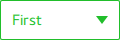
pragma ComponentBehavior: Bound

import QtQuick
import QtQuick.Controls.Basic

ComboBox {
    id: control
    model: ["First", "Second", "Third"]

    delegate: ItemDelegate {
        id: delegate

        required property var model
        required property int index

        width: control.width
        contentItem: Text {
            text: delegate.model[control.textRole]
            color: "#21be2b"
            font: control.font
            elide: Text.ElideRight
            verticalAlignment: Text.AlignVCenter
        }
        highlighted: control.highlightedIndex === index
    }

    indicator: Canvas {
        id: canvas
        x: control.width - width - control.rightPadding
        y: control.topPadding + (control.availableHeight - height) / 2
        width: 12
        height: 8
        contextType: "2d"

        Connections {
            target: control
            function onPressedChanged() { canvas.requestPaint(); }
        }

        onPaint: {
            context.reset();
            context.moveTo(0, 0);
            context.lineTo(width, 0);
            context.lineTo(width / 2, height);
            context.closePath();
            context.fillStyle = control.pressed ? "#17a81a" : "#21be2b";
            context.fill();
        }
    }

    contentItem: Text {
        leftPadding: 0
        rightPadding: control.indicator.width + control.spacing

        text: control.displayText
        font: control.font
        color: control.pressed ? "#17a81a" : "#21be2b"
        verticalAlignment: Text.AlignVCenter
        elide: Text.ElideRight
    }

    background: Rectangle {
        implicitWidth: 120
        implicitHeight: 40
        border.color: control.pressed ? "#17a81a" : "#21be2b"
        border.width: control.visualFocus ? 2 : 1
        radius: 2
    }

    popup: Popup {
        y: control.height - 1
        width: control.width
        implicitHeight: contentItem.implicitHeight
        padding: 1

        contentItem: ListView {
            clip: true
            implicitHeight: contentHeight
            model: control.popup.visible ? control.delegateModel : null
            currentIndex: control.highlightedIndex

            ScrollIndicator.vertical: ScrollIndicator { }
        }

        background: Rectangle {
            border.color: "#21be2b"
            radius: 2
        }
    }
}
如ComboBox Model Roles中所述,ComboBox支持多种类型的模型。
由于所有模型都提供了一个带有modelData的匿名属性,以下表达式在所有情况下都能检索到正确的文本:
text: model[control.textRole]
当你提供一个特定的textRole和一个提供所选角色的结构化数据模型时,这个表达式是一个常规的属性查找。当你提供一个具有单一数据的模型,例如字符串列表,并且提供一个空的textRole时,这个表达式会检索modelData。
自定义DelayButton
DelayButton 由两个视觉项组成:background 和 content item。
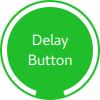
import QtQuick
import QtQuick.Controls.Basic

DelayButton {
    id: control
    checked: true
    text: qsTr("Delay\nButton")

    contentItem: Text {
        text: control.text
        font: control.font
        opacity: enabled ? 1.0 : 0.3
        color: "white"
        horizontalAlignment: Text.AlignHCenter
        verticalAlignment: Text.AlignVCenter
        elide: Text.ElideRight
    }

    background: Rectangle {
        implicitWidth: 100
        implicitHeight: 100
        opacity: enabled ? 1 : 0.3
        color: control.down ? "#17a81a" : "#21be2b"
        radius: size / 2

        readonly property real size: Math.min(control.width, control.height)
        width: size
        height: size
        anchors.centerIn: parent

        Canvas {
            id: canvas
            anchors.fill: parent

            Connections {
                target: control
                function onProgressChanged() { canvas.requestPaint(); }
            }

            onPaint: {
                var ctx = getContext("2d")
                ctx.clearRect(0, 0, width, height)
                ctx.strokeStyle = "white"
                ctx.lineWidth = parent.size / 20
                ctx.beginPath()
                var startAngle = Math.PI / 5 * 3
                var endAngle = startAngle + control.progress * Math.PI / 5 * 9
                ctx.arc(width / 2, height / 2, width / 2 - ctx.lineWidth / 2 - 2, startAngle, endAngle)
                ctx.stroke()
            }
        }
    }
}
自定义拨号
Dial由两个视觉项目组成:background和handle。
import QtQuick
import QtQuick.Controls.Basic

Dial {
    id: control
    background: Rectangle {
        x: control.width / 2 - width / 2
        y: control.height / 2 - height / 2
        implicitWidth: 140
        implicitHeight: 140
        width: Math.max(64, Math.min(control.width, control.height))
        height: width
        color: "transparent"
        radius: width / 2
        border.color: control.pressed ? "#17a81a" : "#21be2b"
        opacity: control.enabled ? 1 : 0.3
    }

    handle: Rectangle {
        id: handleItem
        x: control.background.x + control.background.width / 2 - width / 2
        y: control.background.y + control.background.height / 2 - height / 2
        width: 16
        height: 16
        color: control.pressed ? "#17a81a" : "#21be2b"
        radius: 8
        antialiasing: true
        opacity: control.enabled ? 1 : 0.3
        transform: [
            Translate {
                y: -Math.min(control.background.width, control.background.height) * 0.4 + handleItem.height / 2
            },
            Rotation {
                angle: control.angle
                origin.x: handleItem.width / 2
                origin.y: handleItem.height / 2
            }
        ]
    }
}
自定义抽屉
抽屉可以有一个视觉上的背景项目。
background: Rectangle {
    Rectangle {
        x: parent.width - 1
        width: 1
        height: parent.height
        color: "#21be2b"
    }
}
自定义框架
框架由一个视觉项目组成:background。
 import QtQuick import QtQuick.Controls.Basic Frame { background: Rectangle { color: "transparent" border.color: "#21be2b" radius: 2 } Label { text: qsTr("Content goes here!") } }
自定义GroupBox
GroupBox 由两个视觉项目组成:background 和 label。
 import QtQuick import QtQuick.Controls.Basic GroupBox { id: control title: qsTr("GroupBox") background: Rectangle { y: control.topPadding - control.bottomPadding width: parent.width height: parent.height - control.topPadding + control.bottomPadding color: "transparent" border.color: "#21be2b" radius: 2 } label: Label { x: control.leftPadding width: control.availableWidth text: control.title color: "#21be2b" elide: Text.ElideRight } Label { text: qsTr("Content goes here!") } }
自定义ItemDelegate
ItemDelegate 由两个视觉项组成:background 和 content item。
import QtQuick
import QtQuick.Controls.Basic

ItemDelegate {
    id: control
    text: qsTr("ItemDelegate")

    contentItem: Text {
        rightPadding: control.spacing
        text: control.text
        font: control.font
        color: control.enabled ? (control.down ? "#17a81a" : "#21be2b") : "#bdbebf"
        elide: Text.ElideRight
        verticalAlignment: Text.AlignVCenter
    }

    background: Rectangle {
        implicitWidth: 100
        implicitHeight: 40
        opacity: enabled ? 1 : 0.3
        color: control.down ? "#dddedf" : "#eeeeee"

        Rectangle {
            width: parent.width
            height: 1
            color: control.down ? "#17a81a" : "#21be2b"
            anchors.bottom: parent.bottom
        }
    }
}
自定义标签
标签可以有一个视觉上的背景项。
 import QtQuick import QtQuick.Controls.Basic Label { text: qsTr("Label") color: "#21be2b" }
自定义菜单
Menu 包含一个视觉上的 background 项目。
MenuItem 由四个视觉项组成:background、content item、indicator 和 arrow。
MenuSeparator 由视觉上的 background 和 content item 组成。

自定义菜单栏
MenuBar 可以有一个视觉上的 background 项目,而 MenuBarItem 由两个视觉项目组成:background 和 content item。
自定义页面指示器
PageIndicator 由一个背景、内容项和委托组成。

import QtQuick
import QtQuick.Controls.Basic

PageIndicator {
    id: control
    count: 5
    currentIndex: 2

    delegate: Rectangle {
        implicitWidth: 8
        implicitHeight: 8

        radius: width / 2
        color: "#21be2b"

        opacity: index === control.currentIndex ? 0.95 : pressed ? 0.7 : 0.45

        required property int index

        Behavior on opacity {
            OpacityAnimator {
                duration: 100
            }
        }
    }
}
自定义面板
面板由一个背景组成。
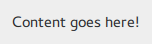 import QtQuick import QtQuick.Controls.Basic Pane { background: Rectangle { color: "#eeeeee" } Label { text: qsTr("Content goes here!") } }
自定义弹出窗口
 .. _overviews_customizing-progressbar:
自定义进度条
ProgressBar 由两个视觉项目组成:background 和 content item。

import QtQuick
import QtQuick.Controls.Basic

ProgressBar {
    id: control
    value: 0.5
    padding: 2

    background: Rectangle {
        implicitWidth: 200
        implicitHeight: 6
        color: "#e6e6e6"
        radius: 3
    }

    contentItem: Item {
        implicitWidth: 200
        implicitHeight: 4

        // Progress indicator for determinate state.
        Rectangle {
            width: control.visualPosition * parent.width
            height: parent.height
            radius: 2
            color: "#17a81a"
            visible: !control.indeterminate
        }

        // Scrolling animation for indeterminate state.
        Item {
            anchors.fill: parent
            visible: control.indeterminate
            clip: true

            Row {
                spacing: 20

                Repeater {
                    model: control.width / 40 + 1

                    Rectangle {
                        color: "#17a81a"
                        width: 20
                        height: control.height
                    }
                }
                XAnimator on x {
                    from: 0
                    to: -40
                    loops: Animation.Infinite
                    running: control.indeterminate
                }
            }
        }
    }
}
上面,内容项也被动画化以表示一个不确定的进度条状态。
自定义单选按钮
RadioButton 由三个视觉项组成:background、content item 和 indicator。

import QtQuick
import QtQuick.Controls.Basic

RadioButton {
    id: control
    text: qsTr("RadioButton")
    checked: true

    indicator: Rectangle {
        implicitWidth: 26
        implicitHeight: 26
        x: control.leftPadding
        y: parent.height / 2 - height / 2
        radius: 13
        border.color: control.down ? "#17a81a" : "#21be2b"

        Rectangle {
            width: 14
            height: 14
            x: 6
            y: 6
            radius: 7
            color: control.down ? "#17a81a" : "#21be2b"
            visible: control.checked
        }
    }

    contentItem: Text {
        text: control.text
        font: control.font
        opacity: enabled ? 1.0 : 0.3
        color: control.down ? "#17a81a" : "#21be2b"
        verticalAlignment: Text.AlignVCenter
        leftPadding: control.indicator.width + control.spacing
    }
}
自定义RadioDelegate
RadioDelegate 由三个视觉项组成:background、contentItem 和 indicator。

import QtQuick
import QtQuick.Controls.Basic

RadioDelegate {
    id: control
    text: qsTr("RadioDelegate")
    checked: true

    contentItem: Text {
        rightPadding: control.indicator.width + control.spacing
        text: control.text
        font: control.font
        opacity: enabled ? 1.0 : 0.3
        color: control.down ? "#17a81a" : "#21be2b"
        elide: Text.ElideRight
        verticalAlignment: Text.AlignVCenter
    }

    indicator: Rectangle {
        implicitWidth: 26
        implicitHeight: 26
        x: control.width - width - control.rightPadding
        y: parent.height / 2 - height / 2
        radius: 13
        color: "transparent"
        border.color: control.down ? "#17a81a" : "#21be2b"

        Rectangle {
            width: 14
            height: 14
            x: 6
            y: 6
            radius: 7
            color: control.down ? "#17a81a" : "#21be2b"
            visible: control.checked
        }
    }

    background: Rectangle {
        implicitWidth: 100
        implicitHeight: 40
        visible: control.down || control.highlighted
        color: control.down ? "#bdbebf" : "#eeeeee"
    }
}
自定义RangeSlider
RangeSlider 由三个视觉项目组成:background、first.handle 和 second.handle。
import QtQuick
import QtQuick.Controls.Basic

RangeSlider {
    id: control
    first.value: 0.25
    second.value: 0.75

    background: Rectangle {
        x: control.leftPadding
        y: control.topPadding + control.availableHeight / 2 - height / 2
        implicitWidth: 200
        implicitHeight: 4
        width: control.availableWidth
        height: implicitHeight
        radius: 2
        color: "#bdbebf"

        Rectangle {
            x: control.first.visualPosition * parent.width
            width: control.second.visualPosition * parent.width - x
            height: parent.height
            color: "#21be2b"
            radius: 2
        }
    }

    first.handle: Rectangle {
        x: control.leftPadding + control.first.visualPosition * (control.availableWidth - width)
        y: control.topPadding + control.availableHeight / 2 - height / 2
        implicitWidth: 26
        implicitHeight: 26
        radius: 13
        color: control.first.pressed ? "#f0f0f0" : "#f6f6f6"
        border.color: "#bdbebf"
    }

    second.handle: Rectangle {
        x: control.leftPadding + control.second.visualPosition * (control.availableWidth - width)
        y: control.topPadding + control.availableHeight / 2 - height / 2
        implicitWidth: 26
        implicitHeight: 26
        radius: 13
        color: control.second.pressed ? "#f0f0f0" : "#f6f6f6"
        border.color: "#bdbebf"
    }
}
自定义滚动条
ScrollBar 由两个视觉项目组成:background 和 content item。

import QtQuick
import QtQuick.Controls.Basic

ScrollBar {
    id: control
    size: 0.3
    position: 0.2
    active: true
    orientation: Qt.Vertical

    contentItem: Rectangle {
        implicitWidth: 6
        implicitHeight: 100
        radius: width / 2
        color: control.pressed ? "#81e889" : "#c2f4c6"
        // Hide the ScrollBar when it's not needed.
        opacity: control.policy === ScrollBar.AlwaysOn || (control.active && control.size < 1.0) ? 0.75 : 0

        // Animate the changes in opacity (default duration is 250 ms).
        Behavior on opacity {
            NumberAnimation {}
        }
    }
}
自定义滚动指示器
ScrollIndicator 由两个视觉项组成:background 和 content item。
 import QtQuick import QtQuick.Controls.Basic ScrollIndicator { id: control size: 0.3 position: 0.2 active: true orientation: Qt.Vertical contentItem: Rectangle { implicitWidth: 2 implicitHeight: 100 color: "#c2f4c6" } }
自定义ScrollView
ScrollView 包含一个 background 项目,以及水平和垂直滚动条。
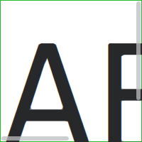
ScrollView {
    id: control

    width: 200
    height: 200
    focus: true

    Label {
        text: "ABC"
        font.pixelSize: 224
    }

    ScrollBar.vertical: ScrollBar {
        parent: control
        x: control.mirrored ? 0 : control.width - width
        y: control.topPadding
        height: control.availableHeight
        active: control.ScrollBar.horizontal.active
    }

    ScrollBar.horizontal: ScrollBar {
        parent: control
        x: control.leftPadding
        y: control.height - height
        width: control.availableWidth
        active: control.ScrollBar.vertical.active
    }

    background: Rectangle {
        border.color: control.activeFocus ? "#21be2b" : "#bdbebf"
    }
}
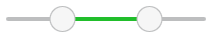
自定义滑块
滑块由两个视觉项目组成:background 和 handle。
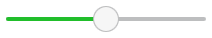
import QtQuick
import QtQuick.Controls.Basic

Slider {
    id: control
    value: 0.5

    background: Rectangle {
        x: control.leftPadding
        y: control.topPadding + control.availableHeight / 2 - height / 2
        implicitWidth: 200
        implicitHeight: 4
        width: control.availableWidth
        height: implicitHeight
        radius: 2
        color: "#bdbebf"

        Rectangle {
            width: control.visualPosition * parent.width
            height: parent.height
            color: "#21be2b"
            radius: 2
        }
    }

    handle: Rectangle {
        x: control.leftPadding + control.visualPosition * (control.availableWidth - width)
        y: control.topPadding + control.availableHeight / 2 - height / 2
        implicitWidth: 26
        implicitHeight: 26
        radius: 13
        color: control.pressed ? "#f0f0f0" : "#f6f6f6"
        border.color: "#bdbebf"
    }
}
自定义SpinBox
SpinBox 由四个视觉项目组成:background、contentItem、up indicator 和 down indicator。
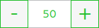
import QtQuick
import QtQuick.Controls.Basic

SpinBox {
    id: control
    value: 50
    editable: true

    contentItem: TextInput {
        z: 2
        text: control.textFromValue(control.value, control.locale)

        font: control.font
        color: "#21be2b"
        selectionColor: "#21be2b"
        selectedTextColor: "#ffffff"
        horizontalAlignment: Qt.AlignHCenter
        verticalAlignment: Qt.AlignVCenter

        readOnly: !control.editable
        validator: control.validator
        inputMethodHints: Qt.ImhFormattedNumbersOnly
    }

    up.indicator: Rectangle {
        x: control.mirrored ? 0 : parent.width - width
        height: parent.height
        implicitWidth: 40
        implicitHeight: 40
        color: control.up.pressed ? "#e4e4e4" : "#f6f6f6"
        border.color: enabled ? "#21be2b" : "#bdbebf"

        Text {
            text: "+"
            font.pixelSize: control.font.pixelSize * 2
            color: "#21be2b"
            anchors.fill: parent
            fontSizeMode: Text.Fit
            horizontalAlignment: Text.AlignHCenter
            verticalAlignment: Text.AlignVCenter
        }
    }

    down.indicator: Rectangle {
        x: control.mirrored ? parent.width - width : 0
        height: parent.height
        implicitWidth: 40
        implicitHeight: 40
        color: control.down.pressed ? "#e4e4e4" : "#f6f6f6"
        border.color: enabled ? "#21be2b" : "#bdbebf"

        Text {
            text: "-"
            font.pixelSize: control.font.pixelSize * 2
            color: "#21be2b"
            anchors.fill: parent
            fontSizeMode: Text.Fit
            horizontalAlignment: Text.AlignHCenter
            verticalAlignment: Text.AlignVCenter
        }
    }

    background: Rectangle {
        implicitWidth: 140
        border.color: "#bdbebf"
    }
}
自定义SplitView

SplitView {
    id: splitView
    anchors.fill: parent

    handle: Rectangle {
        implicitWidth: 4
        implicitHeight: 4
        color: SplitHandle.pressed ? "#81e889"
            : (SplitHandle.hovered ? Qt.lighter("#c2f4c6", 1.1) : "#c2f4c6")
    }

    Rectangle {
        implicitWidth: 150
        color: "#444"
    }
    Rectangle {
        implicitWidth: 50
        color: "#666"
    }
}
自定义StackView
StackView 可以有一个视觉上的 背景 项目,并且它允许自定义用于推送、弹出和替换操作的过渡效果。
import QtQuick
import QtQuick.Controls.Basic

StackView {
    id: control

    popEnter: Transition {
        XAnimator {
            from: (control.mirrored ? -1 : 1) * -control.width
            to: 0
            duration: 400
            easing.type: Easing.OutCubic
        }
    }

    popExit: Transition {
        XAnimator {
            from: 0
            to: (control.mirrored ? -1 : 1) * control.width
            duration: 400
            easing.type: Easing.OutCubic
        }
    }
}
自定义 SwipeDelegate
SwipeDelegate 由六个视觉项目组成:background、content item、indicator、swipe.left、swipe.right 和 swipe.behind。
import QtQuick
import QtQuick.Controls.Basic

SwipeDelegate {
    id: control
    text: qsTr("SwipeDelegate")

    Component {
        id: component

        Rectangle {
            color: SwipeDelegate.pressed ? "#333" : "#444"
            width: parent.width
            height: parent.height
            clip: true

            Label {
                text: qsTr("Press me!")
                color: "#21be2b"
                anchors.centerIn: parent
            }
        }
    }

    swipe.left: component
    swipe.right: component

    contentItem: Text {
        text: control.text
        font: control.font
        color: control.enabled ? (control.down ? "#17a81a" : "#21be2b") : "#bdbebf"
        elide: Text.ElideRight
        verticalAlignment: Text.AlignVCenter

        Behavior on x {
            enabled: !control.down
            NumberAnimation {
                easing.type: Easing.InOutCubic
                duration: 400
            }
        }
    }
}
自定义SwipeView
SwipeView 可以有一个视觉上的 背景 项目。导航由 内容项目 实现。
import QtQuick
import QtQuick.Controls.Basic

SwipeView {
    id: control

    background: Rectangle {
        color: "#eeeeee"
    }
}
自定义开关
开关由三个视觉项目组成:background、content item 和 indicator。

import QtQuick
import QtQuick.Controls.Basic

Switch {
    id: control
    text: qsTr("Switch")

    indicator: Rectangle {
        implicitWidth: 48
        implicitHeight: 26
        x: control.leftPadding
        y: parent.height / 2 - height / 2
        radius: 13
        color: control.checked ? "#17a81a" : "#ffffff"
        border.color: control.checked ? "#17a81a" : "#cccccc"

        Rectangle {
            x: control.checked ? parent.width - width : 0
            width: 26
            height: 26
            radius: 13
            color: control.down ? "#cccccc" : "#ffffff"
            border.color: control.checked ? (control.down ? "#17a81a" : "#21be2b") : "#999999"
        }
    }

    contentItem: Text {
        text: control.text
        font: control.font
        opacity: enabled ? 1.0 : 0.3
        color: control.down ? "#17a81a" : "#21be2b"
        verticalAlignment: Text.AlignVCenter
        leftPadding: control.indicator.width + control.spacing
    }
}
自定义SwitchDelegate
SwitchDelegate 由三个视觉项组成:background、contentItem 和 indicator。
import QtQuick
import QtQuick.Controls.Basic

SwitchDelegate {
    id: control
    text: qsTr("SwitchDelegate")
    checked: true

    contentItem: Text {
        rightPadding: control.indicator.width + control.spacing
        text: control.text
        font: control.font
        opacity: enabled ? 1.0 : 0.3
        color: control.down ? "#17a81a" : "#21be2b"
        elide: Text.ElideRight
        verticalAlignment: Text.AlignVCenter
    }

    indicator: Rectangle {
        implicitWidth: 48
        implicitHeight: 26
        x: control.width - width - control.rightPadding
        y: parent.height / 2 - height / 2
        radius: 13
        color: control.checked ? "#17a81a" : "transparent"
        border.color: control.checked ? "#17a81a" : "#cccccc"

        Rectangle {
            x: control.checked ? parent.width - width : 0
            width: 26
            height: 26
            radius: 13
            color: control.down ? "#cccccc" : "#ffffff"
            border.color: control.checked ? (control.down ? "#17a81a" : "#21be2b") : "#999999"
        }
    }

    background: Rectangle {
        implicitWidth: 100
        implicitHeight: 40
        visible: control.down || control.highlighted
        color: control.down ? "#bdbebf" : "#eeeeee"
    }
}
自定义TabBar
TabBar 由两个视觉项目组成:background 和 contentItem。
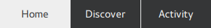 import QtQuick import QtQuick.Controls.Basic TabBar { id: control background: Rectangle { color: "#eeeeee" } TabButton { text: qsTr("Home") } TabButton { text: qsTr("Discover") } TabButton { text: qsTr("Activity") } }
自定义文本区域
TextArea 由一个 background 项目组成。
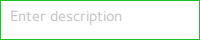
import QtQuick
import QtQuick.Controls.Basic

TextArea {
    id: control
    placeholderText: qsTr("Enter description")

    background: Rectangle {
        implicitWidth: 200
        implicitHeight: 40
        border.color: control.enabled ? "#21be2b" : "transparent"
    }
}
自定义文本字段
TextField 由一个 background 项目组成。

import QtQuick
import QtQuick.Controls.Basic

TextField {
    id: control
    placeholderText: qsTr("Enter description")

    background: Rectangle {
        implicitWidth: 200
        implicitHeight: 40
        color: control.enabled ? "transparent" : "#353637"
        border.color: control.enabled ? "#21be2b" : "transparent"
    }
}
自定义工具栏
ToolBar 由一个视觉项目组成:background 。
 ToolBar { id: control background: Rectangle { implicitHeight: 40 color: "#eeeeee" Rectangle { width: parent.width height: 1 anchors.bottom: parent.bottom color: "transparent" border.color: "#21be2b" } } RowLayout { anchors.fill: parent ToolButton { text: qsTr("Undo") } ToolButton { text: qsTr("Redo") } } }
自定义工具按钮
ToolButton 由两个视觉项组成:background 和 content item。
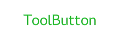
import QtQuick
import QtQuick.Controls.Basic

ToolButton {
    id: control
    text: qsTr("ToolButton")
    width: 120

    contentItem: Text {
        text: control.text
        font: control.font
        opacity: enabled ? 1.0 : 0.3
        color: control.down ? "#17a81a" : "#21be2b"
        horizontalAlignment: Text.AlignHCenter
        verticalAlignment: Text.AlignVCenter
        elide: Text.ElideRight
    }

    background: Rectangle {
        implicitWidth: 40
        implicitHeight: 40
        color: Qt.darker("#33333333", control.enabled && (control.checked || control.highlighted) ? 1.5 : 1.0)
        opacity: enabled ? 1 : 0.3
        visible: control.down || (control.enabled && (control.checked || control.highlighted))
    }
}
自定义工具分隔符
ToolSeparator 由两个视觉项目组成:background 和 content item。
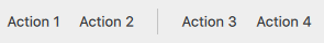
ToolBar {
    RowLayout {
        anchors.fill: parent

        ToolButton {
            text: qsTr("Action 1")
        }
        ToolButton {
            text: qsTr("Action 2")
        }

        ToolSeparator {
            padding: vertical ? 10 : 2
            topPadding: vertical ? 2 : 10
            bottomPadding: vertical ? 2 : 10

            contentItem: Rectangle {
                implicitWidth: parent.vertical ? 1 : 24
                implicitHeight: parent.vertical ? 24 : 1
                color: "#c3c3c3"
            }
        }

        ToolButton {
            text: qsTr("Action 3")
        }
        ToolButton {
            text: qsTr("Action 4")
        }

        Item {
            Layout.fillWidth: true
        }
    }
}
自定义工具提示
ToolTip 由两个视觉项目组成:background 和 content item。
注意
要自定义附加的ToolTip,必须将其作为您自己的样式的一部分提供。要对ToolTip进行一次性自定义,请参阅自定义工具提示。
自定义Tumbler
Tumbler由三个视觉项目组成:background、contentItem和delegate。

import QtQuick
import QtQuick.Controls.Basic

Tumbler {
    id: control
    model: 15

    background: Item {
        Rectangle {
            opacity: control.enabled ? 0.2 : 0.1
            border.color: "#000000"
            width: parent.width
            height: 1
            anchors.top: parent.top
        }

        Rectangle {
            opacity: control.enabled ? 0.2 : 0.1
            border.color: "#000000"
            width: parent.width
            height: 1
            anchors.bottom: parent.bottom
        }
    }

    delegate: Text {
        text: qsTr("Item %1").arg(modelData + 1)
        font: control.font
        horizontalAlignment: Text.AlignHCenter
        verticalAlignment: Text.AlignVCenter
        opacity: 1.0 - Math.abs(Tumbler.displacement) / (control.visibleItemCount / 2)

        required property var modelData
        required property int index
    }

    Rectangle {
        anchors.horizontalCenter: control.horizontalCenter
        y: control.height * 0.4
        width: 40
        height: 1
        color: "#21be2b"
    }

    Rectangle {
        anchors.horizontalCenter: control.horizontalCenter
        y: control.height * 0.6
        width: 40
        height: 1
        color: "#21be2b"
    }
}
如果你想定义自己的contentItem,可以使用ListView或PathView作为根项目。对于包装的Tumbler,使用PathView:
Tumbler {
    id: tumbler

    contentItem: PathView {
        id: pathView
        model: tumbler.model
        delegate: tumbler.delegate
        clip: true
        pathItemCount: tumbler.visibleItemCount + 1
        preferredHighlightBegin: 0.5
        preferredHighlightEnd: 0.5
        dragMargin: width / 2

        path: Path {
            startX: pathView.width / 2
            startY: -pathView.delegateHeight / 2
            PathLine {
                x: pathView.width / 2
                y: pathView.pathItemCount * pathView.delegateHeight - pathView.delegateHeight / 2
            }
        }

        property real delegateHeight: tumbler.availableHeight / tumbler.visibleItemCount
    }
}
对于不换行的Tumbler,使用ListView:
Tumbler {
    id: tumbler

    contentItem: ListView {
        model: tumbler.model
        delegate: tumbler.delegate

        snapMode: ListView.SnapToItem
        highlightRangeMode: ListView.StrictlyEnforceRange
        preferredHighlightBegin: height / 2 - (height / tumbler.visibleItemCount / 2)
        preferredHighlightEnd: height / 2 + (height / tumbler.visibleItemCount / 2)
        clip: true
    }
}