想象风格

Imagine Style 基于可配置的图像资源。更多…

附加属性

  • path :ref:` ` : 字符串

详细描述

Imagine 风格基于图像资源。该风格附带了一组默认图像,但可以通过使用预定义的命名约定提供一个包含图像的目录来轻松更改图像。
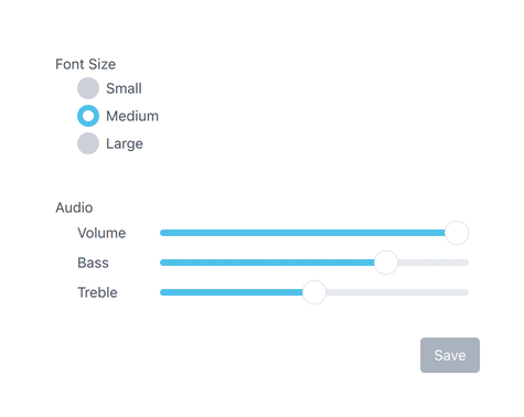
../_images/qtquickcontrols-imagine.png

使用默认图像的Imagine风格

要使用Imagine样式运行应用程序,请参阅在Qt Quick Controls中使用样式

文件名

图像文件使用以下命名约定:

--

部分是必需的,但 部分是可选的。例如,如果为 Button 提供了一个名为 "button-background.9.png" 的单一文件,它将用于 Button 支持的每个状态。由开发者决定他们将提供图像的哪些状态集。然而,建议尽可能为最常见的控件状态提供图像,例如 disabledpressed 等。这将确保交互式控件在视觉上表现得像最终用户期望的那样。

元素参考

下表列出了每个控件支持的元素,以及该元素可能的状态和预期的文件扩展名。元素是表示控件某个视觉部分的图像。例如,Button"background"元素表示其背景

控制

元素

状态

扩展

ApplicationWindow

背景

激活

.9.png (或 .png)

BusyIndicator

动画

禁用, 运行中, 镜像, 悬停

.webp

背景

同上

.webp

Button

背景

禁用, 按下, 选中, 可选, 聚焦, 高亮, 扁平, 镜像, 悬停

.9.png

CheckBox

背景

禁用, 按下, 选中, 部分选中, 聚焦, 镜像, 悬停

.9.png (或 .png)

指标

同上

.png

CheckDelegate

背景

禁用, 按下, 选中, 部分选中, 聚焦, 高亮, 镜像, 悬停

.9.png (或 .png)

指标

同上

.png

ComboBox

背景

禁用, 按下, 可编辑, 打开, 聚焦, 镜像, 悬停, 扁平

.9.png (或 .png)

指标

同上

.png

弹出窗口

同上

.9.png (或 .png)

DelayButton

背景

禁用, 按下, 选中, 可选, 聚焦, 镜像, 悬停

.9.png (或 .png)

进度

同上

.9.png (或 .png)

mask

同上

.9.png (或 .png)

Dial

背景 1

禁用, 按下, 聚焦, 镜像, 悬停

.9.png (或 .png)

handle

同上

.9.png (或 .png)

Dialog

背景

模态,暗淡

.9.png (或 .png)

标题

同上

.9.png (或 .png)

覆盖层

模态框

.9.png (或 .png)

DialogButtonBox

背景

禁用,镜像

.9.png (或 .png)

Drawer

背景

模态、暗淡、顶部、左侧、右侧、底部

.9.png (或 .png)

覆盖层

模态框

.9.png (或 .png)

Frame

背景

禁用,镜像

.9.png (或 .png)

GroupBox

背景

禁用,镜像

.9.png (或 .png)

标题

同上

.9.png (或 .png)

ItemDelegate

背景

禁用, 按下, 聚焦, 高亮, 镜像, 悬停

.9.png (或 .png)

Label

背景

禁用,镜像,悬停

.9.png (或 .png)

Menu

背景

模态,暗淡

.9.png (或 .png)

覆盖层

模态框

.9.png (或 .png)

MenuItem

箭头

禁用, 按下, 选中, 聚焦, 高亮, 镜像, 悬停

.png

背景

同上

.9.png (或 .png)

指标

同上

.png

MenuSeparator

背景

禁用,镜像

.9.png (或 .png)

分隔符

同上

.9.png (或 .png)

Page

背景

禁用,镜像

.9.png (或 .png)

PageIndicator

背景

禁用, 镜像, 悬停

.9.png (或 .png)

委托

禁用, 按下, 当前, 镜像, 悬停

.png

Pane

背景

禁用,镜像

.9.png (或 .png)

Popup

背景

模态,暗淡

.9.png (或 .png)

覆盖层

模态框

.9.png (或 .png)

ProgressBar

动画

禁用, 镜像, 悬停

.png

背景

禁用、不确定、镜像、悬停

.9.png (或 .png)

mask

同上

.9.png (或 .png)

进度

同上

.9.png (或 .png)

RadioButton

背景

禁用, 按下, 选中, 聚焦, 镜像, 悬停

.9.png (或 .png)

指标

同上

.png

RadioDelegate

背景

禁用, 按下, 选中, 聚焦, 高亮, 镜像, 悬停

.9.png (或 .png)

指标

同上

.png

RangeSlider

背景

垂直、水平、禁用、聚焦、镜像、悬停

.9.png (或 .png)

RangeSlider

进度

同上

.9.png (或 .png)

句柄

第一, 第二, 垂直, 水平, 禁用, 按下, 聚焦, 镜像, 悬停

.png

RoundButton

背景

禁用, 按下, 选中, 可选, 聚焦, 高亮, 扁平, 镜像, 悬停

.9.png (或 .png)

ScrollBar

背景

垂直、水平、禁用、交互、按下、镜像、悬停

.9.png (或 .png)

handle

同上

.9.png (或 .png)

ScrollIndicator

背景

垂直、水平、禁用、镜像、悬停

.9.png (或 .png)

handle

同上

.9.png (或 .png)

ScrollView

背景

禁用,镜像

.9.png (或 .png)

Slider

背景

垂直、水平、禁用、按下、聚焦、镜像、悬停

.9.png (或 .png)

handle

同上

.9.png (或 .png)

进度

同上

.9.png (或 .png)

SpinBox

背景

禁用, 可编辑, 聚焦, 镜像, 悬停

.9.png (或 .png)

编辑器

禁用, 聚焦, 镜像, 悬停

.9.png (或 .png)

指示器

上, 下, 禁用, 可编辑, 按下, 聚焦, 镜像, 悬停

.9.png (或 .png)

StackView

背景

禁用,镜像

.9.png (或 .png)

SwipeDelegate

背景

禁用, 按下, 聚焦, 高亮, 镜像, 悬停

.9.png (或 .png)

SwipeView

背景

垂直、水平、禁用、交互、聚焦、镜像

.9.png (或 .png)

Switch

背景

禁用, 按下, 选中, 聚焦, 镜像, 悬停

.9.png (或 .png)

handle

同上

.9.png (或 .png)

指标

同上

.9.png (或 .png)

SwitchDelegate

背景

禁用, 按下, 选中, 聚焦, 高亮, 镜像, 悬停

.9.png (或 .png)

handle

同上

.9.png (或 .png)

指标

同上

.9.png (或 .png)

TabBar

背景

禁用, 头部, 底部, 镜像

.9.png (或 .png)

TabButton

背景

禁用, 按下, 选中, 聚焦, 镜像, 悬停

.9.png (或 .png)

TextArea

背景

禁用, 聚焦, 镜像, 悬停

.9.png (或 .png)

TextField

背景

禁用, 聚焦, 镜像, 悬停

.9.png (或 .png)

ToolBar

背景

禁用, 头部, 底部, 镜像

.9.png (或 .png)

ToolButton

背景

禁用, 按下, 选中, 可选, 聚焦, 高亮, 扁平, 镜像, 悬停

.9.png (或 .png)

ToolSeparator

背景

垂直、水平、禁用、镜像

.9.png (或 .png)

分隔符

同上

.9.png (或 .png)

ToolTip

背景

.9.png (或 .png)

Tumbler

背景

禁用, 聚焦, 镜像, 悬停

.9.png (或 .png)

注意

1) Imagine 风格的 Dial 目前还不支持在 Qt 6.6 中引入的 startAngleendAngle 属性,而是使用固定的背景图像。

资产示例

下表列出了所有控件的资产示例(取自默认Imagine样式资产)。该列表并非详尽无遗,因为并非所有元素都需要资产,但在创建自己的资产时,它可以作为指南使用。

这些资产导出的模板可作为Sketch项目使用。

控制

元素

状态

资产

备注

ApplicationWindow

背景

../_images/applicationwindow-background.png

参见脚注 1

覆盖

../_images/applicationwindow-overlay.png

参见脚注 1

覆盖

模态

../_images/applicationwindow-overlay-modal.png

参见脚注 1

Button

背景

../_images/button-background.9.png

背景

禁用

../_images/button-background-disabled.9.png

背景

聚焦

../_images/button-background-focused.9.png

背景

按下

../_images/button-background-pressed.9.png

背景

已选中

../_images/button-background-checked.9.png

背景

已选中, 已禁用

../_images/button-background-checked-disabled.9.png

背景

已选中,已聚焦

../_images/button-background-checked-focused.9.png

背景

已选中,悬停

../_images/button-background-checked-hovered.9.png

背景

高亮

../_images/button-background-highlighted.9.png

背景

高亮显示,禁用

../_images/button-background-highlighted-disabled.9.png

背景

高亮,聚焦

../_images/button-background-highlighted-focused.9.png

背景

高亮,悬停

../_images/button-background-highlighted-hovered.9.png

背景

高亮,按下

../_images/button-background-highlighted-pressed.9.png

背景

高亮,已选中

../_images/button-background-highlighted-checked.9.png

背景

悬停

../_images/button-background-hovered.9.png

背景

平面

../_images/button-background-flat.9.png

背景

平面,禁用

../_images/button-background-flat-disabled.9.png

背景

平面,悬停

../_images/button-background-flat-hovered.9.png

背景

平面,按压

../_images/button-background-flat-pressed.9.png

背景

平面,已选中

../_images/button-background-flat-checked.9.png

CheckBox

指示器

../_images/checkbox-indicator.png

指标

禁用

../_images/checkbox-indicator-disabled.png

指标

按下

../_images/checkbox-indicator-pressed.png

指标

已检查

../_images/checkbox-indicator-checked.png

指标

已选中,已按下

../_images/checkbox-indicator-checked-pressed.png

指标

已选中,悬停

../_images/checkbox-indicator-checked-hovered.png

指标

已选中,已聚焦

../_images/checkbox-indicator-checked-focused.png

指标

部分,已检查

../_images/checkbox-indicator-partially-checked.png

指标

部分, 已检查, 已按下

../_images/checkbox-indicator-partially-checked-pressed.png

指标

部分, 已检查, 已聚焦

../_images/checkbox-indicator-partially-checked-focused.png

指标

部分,已检查,悬停

../_images/checkbox-indicator-partially-checked-hovered.png

指标

聚焦

../_images/checkbox-indicator-focused.png

指标

悬停

../_images/checkbox-indicator-hovered.png

CheckDelegate

背景

../_images/checkdelegate-background.9.png

背景

禁用

../_images/checkdelegate-background-disabled.9.png

背景

按下

../_images/checkdelegate-background-pressed.9.png

背景

聚焦

../_images/checkdelegate-background-focused.9.png

背景

悬停

../_images/checkdelegate-background-hovered.9.png

指标

../_images/checkdelegate-indicator.png

指标

禁用

../_images/checkdelegate-indicator-disabled.png

指标

按下

../_images/checkdelegate-indicator-pressed.png

指标

已检查

../_images/checkdelegate-indicator-checked.png

指标

已选中,已按下

../_images/checkdelegate-indicator-checked-pressed.png

指标

已选中,已聚焦

../_images/checkdelegate-indicator-checked-focused.png

指标

已选中,悬停

../_images/checkdelegate-indicator-checked-hovered.png

指标

聚焦

../_images/checkdelegate-indicator-focused.png

指标

悬停

../_images/checkdelegate-indicator-hovered.png

指标

部分,已检查

../_images/checkdelegate-indicator-partially-checked.png

指标

部分, 已检查, 已按下

../_images/checkdelegate-indicator-partially-checked-pressed.png

指标

部分, 已检查, 已聚焦

../_images/checkdelegate-indicator-partially-checked-focused.png

指标

部分,已检查,悬停

../_images/checkdelegate-indicator-partially-checked-hovered.png

指标

悬停

../_images/checkdelegate-indicator-hovered.png

ComboBox

背景

../_images/combobox-background.9.png

背景

禁用

../_images/combobox-background-disabled.9.png

背景

聚焦

../_images/combobox-background-focused.9.png

背景

悬停

../_images/combobox-background-hovered.9.png

背景

按下

../_images/combobox-background-pressed.9.png

背景

打开

../_images/combobox-background-open.9.png

背景

可编辑

../_images/combobox-background-editable.9.png

背景

可编辑,已聚焦

../_images/combobox-background-editable-focused.9.png

背景

可编辑,禁用

../_images/combobox-background-editable-disabled.9.png

指标

../_images/combobox-indicator.png

指标

禁用

../_images/combobox-indicator-disabled.png

指标

可编辑

../_images/combobox-indicator-editable.png

指标

可编辑, 禁用

../_images/combobox-indicator-editable-disabled.png

指标

可编辑,镜像

../_images/combobox-indicator-editable-mirrored.png

指标

可编辑,镜像,禁用

../_images/combobox-indicator-editable-mirrored-disabled.png

弹出窗口

../_images/combobox-popup.9.png

DelayButton

背景

../_images/delaybutton-background.9.png

背景

禁用

../_images/delaybutton-background-disabled.9.png

背景

禁用, 选中

../_images/delaybutton-background-disabled-checked.9.png

背景

聚焦

../_images/delaybutton-background-focused.9.png

背景

按下

../_images/delaybutton-background-pressed.9.png

背景

已选中

../_images/delaybutton-background-checked.9.png

背景

已选中,已聚焦

../_images/delaybutton-background-checked-focused.9.png

背景

已选中,悬停

../_images/delaybutton-background-checked-hovered.9.png

背景

悬停

../_images/delaybutton-background-hovered.9.png

进度

../_images/delaybutton-progress.9.png

进度

禁用

../_images/delaybutton-progress-disabled.9.png

掩码

../_images/delaybutton-mask.9.png

Dial

背景

../_images/dial-background.png

背景

禁用

../_images/dial-background-disabled.png

背景

聚焦

../_images/dial-background-focused.png

处理

../_images/dial-handle.png

处理

禁用

../_images/dial-handle-disabled.png

处理

聚焦

../_images/dial-handle-focused.png

手柄

聚焦的,按下的

../_images/dial-handle-focused-pressed.png

手柄

聚焦的,悬停的

../_images/dial-handle-focused-hovered.png

手柄

按下

../_images/dial-handle-pressed.png

手柄

悬停

../_images/dial-handle-hovered.png

Dialog

背景

../_images/dialog-background.9.png

覆盖

../_images/dialog-overlay.png

参见脚注 1

覆盖

模态

../_images/dialog-overlay-modal.png

参见脚注 1

DialogButtonBox

背景

../_images/dialogbuttonbox-background.9.png

Drawer

背景

左侧

../_images/drawer-background-left.9.png

背景

右侧

../_images/drawer-background-right.9.png

背景

顶部

../_images/drawer-background-top.9.png

背景

底部

../_images/drawer-background-bottom.9.png

覆盖

../_images/drawer-overlay.png

参见脚注 1

覆盖

模态

../_images/drawer-overlay-modal.png

参见脚注 1

Frame

背景

../_images/frame-background.9.png

GroupBox

背景

../_images/groupbox-background.9.png

标题

../_images/groupbox-title.9.png

ItemDelegate

背景

../_images/itemdelegate-background.9.png

背景

禁用

../_images/itemdelegate-background-disabled.9.png

背景

按下

../_images/itemdelegate-background-pressed.9.png

背景

聚焦

../_images/itemdelegate-background-focused.9.png

背景

悬停

../_images/itemdelegate-background-hovered.9.png

背景

高亮

../_images/itemdelegate-background-highlighted.9.png

Menu

背景

../_images/menu-background.9.png

MenuItem

背景

../_images/menuitem-background.9.png

背景

高亮

../_images/menuitem-background-highlighted.9.png

箭头

../_images/menuitem-arrow.png

箭头

镜像

../_images/menuitem-arrow-mirrored.png

箭头

禁用

../_images/menuitem-arrow-disabled.png

箭头

镜像,禁用

../_images/menuitem-arrow-mirrored-disabled.png

指标

../_images/menuitem-indicator.png

指标

禁用

../_images/menuitem-indicator-disabled.png

指标

按下

../_images/menuitem-indicator-pressed.png

指标

已检查

../_images/menuitem-indicator-checked.png

指标

已选中,已按下

../_images/menuitem-indicator-checked-pressed.png

指标

已选中,已聚焦

../_images/menuitem-indicator-checked-focused.png

指标

已选中,悬停

../_images/menuitem-indicator-checked-hovered.png

指标

聚焦

../_images/menuitem-indicator-focused.png

指标

悬停

../_images/menuitem-indicator-hovered.png

MenuSeparator

分隔符

../_images/menuseparator-separator.9.png

Page

背景

../_images/page-background.png

参见脚注 1

PageIndicator

委托

../_images/pageindicator-delegate.png

委托

禁用

../_images/pageindicator-delegate-disabled.png

委托

禁用, 当前

../_images/pageindicator-delegate-disabled-current.png

委托

按下

../_images/pageindicator-delegate-pressed.png

代表

当前

../_images/pageindicator-delegate-current.png

Pane

背景

../_images/pane-background.9.png

Popup

背景

../_images/popup-background.9.png

参见脚注 1

覆盖

../_images/popup-overlay.png

参见脚注 1

覆盖层

模态框

../_images/popup-overlay-modal.png

ProgressBar

背景

../_images/progressbar-background.9.png

进度

../_images/progressbar-progress.png

掩码

../_images/progressbar-mask.9.png

RadioButton

指示器

../_images/radiobutton-indicator.png

指标

禁用

../_images/radiobutton-indicator-disabled.png

指标

按下

../_images/radiobutton-indicator-pressed.png

指标

已检查

../_images/radiobutton-indicator-checked.png

指标

已选中,已聚焦

../_images/radiobutton-indicator-checked-focused.png

指标

已选中,悬停

../_images/radiobutton-indicator-checked-hovered.png

指标

已选中,已按下

../_images/radiobutton-indicator-checked-pressed.png

指标

聚焦

../_images/radiobutton-indicator-focused.png

指标

悬停

../_images/radiobutton-indicator-hovered.png

RadioDelegate

背景

../_images/radiodelegate-background.9.png

背景

禁用

../_images/radiodelegate-background-disabled.9.png

背景

按下

../_images/radiodelegate-background-pressed.9.png

背景

聚焦

../_images/radiodelegate-background-focused.9.png

背景

悬停

../_images/radiodelegate-background-hovered.9.png

指标

../_images/radiodelegate-indicator.png

指标

禁用

../_images/radiodelegate-indicator-disabled.png

指标

按下

../_images/radiodelegate-indicator-pressed.png

指标

已检查

../_images/radiodelegate-indicator-checked.png

指标

已选中,已聚焦

../_images/radiodelegate-indicator-checked-focused.png

指标

已选中,悬停

../_images/radiodelegate-indicator-checked-hovered.png

指标

已选中,已按下

../_images/radiodelegate-indicator-checked-pressed.png

指标

聚焦

../_images/radiodelegate-indicator-focused.png

指标

悬停

../_images/radiodelegate-indicator-hovered.png

RangeSlider

背景

垂直

../_images/rangeslider-background-vertical.9.png

背景

水平

../_images/rangeslider-background-horizontal.9.png

进度

垂直

../_images/rangeslider-progress-vertical.9.png

进度

垂直,禁用

../_images/rangeslider-progress-vertical-disabled.9.png

进度

水平

../_images/rangeslider-progress-horizontal.9.png

进度

水平,禁用

../_images/rangeslider-progress-horizontal-disabled.9.png

处理

../_images/rangeslider-handle.png

处理

禁用

../_images/rangeslider-handle-disabled.png

处理

聚焦

../_images/rangeslider-handle-focused.png

手柄

聚焦的,悬停的

../_images/rangeslider-handle-focused-hovered.png

手柄

聚焦的,按下的

../_images/rangeslider-handle-focused-pressed.png

手柄

悬停

../_images/rangeslider-handle-hovered.png

手柄

按下

../_images/rangeslider-handle-pressed.png

RoundButton

背景

../_images/roundbutton-background.png

背景

禁用

../_images/roundbutton-background-disabled.png

背景

禁用, 选中

../_images/roundbutton-background-disabled-checked.png

背景

聚焦

../_images/roundbutton-background-focused.png

背景

按下

../_images/roundbutton-background-pressed.png

背景

已选中

../_images/roundbutton-background-checked.png

背景

已选中,已聚焦

../_images/roundbutton-background-checked-focused.png

背景

已选中,悬停

../_images/roundbutton-background-checked-hovered.png

背景

高亮

../_images/roundbutton-background-highlighted.png

背景

高亮,按下

../_images/roundbutton-background-highlighted-pressed.png

背景

高亮,聚焦

../_images/roundbutton-background-highlighted-focused.png

背景

高亮,悬停

../_images/roundbutton-background-highlighted-hovered.png

背景

悬停

../_images/roundbutton-background-hovered.png

ScrollBar

手柄

../_images/scrollbar-handle.png

处理

禁用

../_images/scrollbar-handle-disabled.png

处理

交互式

../_images/scrollbar-handle-interactive.png

手柄

交互式,禁用

../_images/scrollbar-handle-interactive-disabled.png

手柄

交互式,按下

../_images/scrollbar-handle-interactive-pressed.png

句柄

交互式,悬停

../_images/scrollbar-handle-interactive-hovered.png

ScrollIndicator

处理

../_images/scrollindicator-handle.png

Slider

背景

垂直

../_images/slider-background-vertical.9.png

背景

水平

../_images/slider-background-horizontal.9.png

进度

垂直

../_images/slider-progress-vertical.9.png

进度

垂直,禁用

../_images/slider-progress-vertical-disabled.9.png

进度

水平

../_images/slider-progress-horizontal.9.png

进度

水平,禁用

../_images/slider-progress-horizontal-disabled.9.png

处理

../_images/slider-handle.png

处理

禁用

../_images/slider-handle-disabled.png

处理

聚焦

../_images/slider-handle-focused.png

手柄

聚焦的,悬停的

../_images/slider-handle-focused-hovered.png

手柄

聚焦的,按下的

../_images/slider-handle-focused-pressed.png

手柄

悬停

../_images/slider-handle-hovered.png

手柄

按下

../_images/slider-handle-pressed.png

SpinBox

背景

../_images/spinbox-background.9.png

背景

禁用

../_images/spinbox-background-disabled.9.png

背景

聚焦

../_images/spinbox-background-focused.9.png

背景

可编辑

../_images/spinbox-background-editable.9.png

指标

上升

../_images/spinbox-indicator-up.9.png

指标

向上,禁用

../_images/spinbox-indicator-up-disabled.9.png

指标

向上,按下

../_images/spinbox-indicator-up-pressed.9.png

指标

向上,聚焦

../_images/spinbox-indicator-up-focused.9.png

指标

向上,镜像

../_images/spinbox-indicator-up-mirrored.9.png

指标

向上,悬停

../_images/spinbox-indicator-up-hovered.9.png

指标

向上,可编辑

../_images/spinbox-indicator-up-editable.9.png

指标

向上,可编辑,按下

../_images/spinbox-indicator-up-editable-pressed.9.png

指标

向上,可编辑,聚焦

../_images/spinbox-indicator-up-editable-focused.9.png

指标

向上,可编辑,镜像

../_images/spinbox-indicator-up-editable-mirrored.9.png

指标

向上,可编辑,悬停

../_images/spinbox-indicator-up-editable-hovered.9.png

指标

下降

../_images/spinbox-indicator-down.9.png

指标

下降,禁用

../_images/spinbox-indicator-down-disabled.9.png

指标

向下,按下

../_images/spinbox-indicator-down-pressed.9.png

指标

向下,聚焦

../_images/spinbox-indicator-down-focused.9.png

指标

向下,镜像

../_images/spinbox-indicator-down-mirrored.9.png

指标

向下,悬停

../_images/spinbox-indicator-down-hovered.9.png

指标

向下,可编辑

../_images/spinbox-indicator-down-editable.9.png

指标

向下,可编辑,按下

../_images/spinbox-indicator-down-editable-pressed.9.png

指标

向下,可编辑,聚焦

../_images/spinbox-indicator-down-editable-focused.9.png

指标

向下,可编辑,镜像

../_images/spinbox-indicator-down-editable-mirrored.9.png

指标

向下,可编辑,悬停

../_images/spinbox-indicator-down-editable-hovered.9.png

SwipeDelegate

背景

../_images/swipedelegate-background.9.png

背景

禁用

../_images/swipedelegate-background-disabled.9.png

背景

按下

../_images/swipedelegate-background-pressed.9.png

背景

聚焦

../_images/swipedelegate-background-focused.9.png

背景

悬停

../_images/swipedelegate-background-hovered.9.png

Switch

指标

../_images/switch-indicator.png

指标

禁用

../_images/switch-indicator-disabled.png

指标

按下

../_images/switch-indicator-pressed.png

指标

已检查

../_images/switch-indicator-checked.png

指标

已选中,已聚焦

../_images/switch-indicator-checked-focused.png

指标

已选中,悬停

../_images/switch-indicator-checked-hovered.png

指标

已选中,已按下

../_images/switch-indicator-checked-pressed.png

指标

聚焦

../_images/switch-indicator-focused.png

指标

悬停

../_images/switch-indicator-hovered.png

处理

../_images/switch-handle.png

处理

禁用

../_images/switch-handle-disabled.png

手柄

按下

../_images/switch-handle-pressed.png

SwitchDelegate

背景

../_images/switchdelegate-background.9.png

背景

禁用

../_images/switchdelegate-background-disabled.9.png

背景

按下

../_images/switchdelegate-background-pressed.9.png

背景

聚焦

../_images/switchdelegate-background-focused.9.png

背景

悬停

../_images/switchdelegate-background-hovered.9.png

指标

../_images/switchdelegate-indicator.png

指标

禁用

../_images/switchdelegate-indicator-disabled.png

指标

按下

../_images/switchdelegate-indicator-pressed.png

指标

已检查

../_images/switchdelegate-indicator-checked.png

指标

已选中,已聚焦

../_images/switchdelegate-indicator-checked-focused.png

指标

已选中,悬停

../_images/switchdelegate-indicator-checked-hovered.png

指标

已选中,已按下

../_images/switchdelegate-indicator-checked-pressed.png

指标

聚焦

../_images/switchdelegate-indicator-focused.png

指标

悬停

../_images/switchdelegate-indicator-hovered.png

处理

../_images/switchdelegate-handle.png

处理

禁用

../_images/switchdelegate-handle-disabled.png

TabBar

背景

../_images/tabbar-background.png

TabButton

背景

../_images/tabbutton-background.9.png

背景

禁用

../_images/tabbutton-background-disabled.9.png

背景

按下

../_images/tabbutton-background-pressed.9.png

背景

已选中

../_images/tabbutton-background-checked.9.png

背景

悬停

../_images/tabbutton-background-hovered.9.png

背景

禁用, 选中

../_images/tabbutton-background-disabled-checked.9.png

TextArea

背景

../_images/textarea-background.9.png

背景

禁用

../_images/textarea-background-disabled.9.png

背景

聚焦

../_images/textarea-background-focused.9.png

TextField

背景

../_images/textfield-background.9.png

背景

禁用

../_images/textfield-background-disabled.9.png

背景

聚焦

../_images/textfield-background-focused.9.png

ToolBar

背景

../_images/toolbar-background.png

ToolButton

背景

../_images/toolbutton-background.9.png

背景

禁用, 选中

../_images/toolbutton-background-disabled-checked.9.png

背景

聚焦

../_images/toolbutton-background-focused.9.png

背景

按下

../_images/toolbutton-background-pressed.9.png

背景

已选中

../_images/toolbutton-background-checked.9.png

背景

已选中,已聚焦

../_images/toolbutton-background-checked-focused.9.png

背景

已选中,悬停

../_images/toolbutton-background-checked-hovered.9.png

背景

悬停

../_images/toolbutton-background-hovered.9.png

ToolSeparator

分隔符

水平

../_images/toolseparator-separator-horizontal.9.png

分隔符

垂直

../_images/toolseparator-separator-vertical.9.png

ToolTip

背景

../_images/tooltip-background.9.png

1 一个包含一种颜色的1x1图像,拉伸以填充控件。
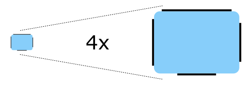
9-Patch 图片

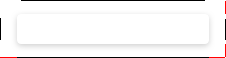
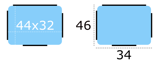
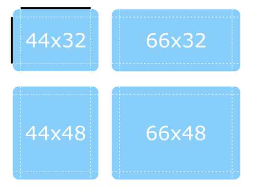
Imagine 风格使用 9-patch 图像,以便设计师能够控制特定元素在调整大小时的反应。以下是一个表示 按钮背景 的 9-patch 图像示例,以及一个放大版本(以便更容易看到 9-patch 线条):

../_images/qtquickcontrols-imagine-9-patch-4x.png

图像的内容宽度为44像素,高度为32像素。每个9-patch图像需要在每侧有一个像素厚的线(统称为“9-patch线”),因此图像的实际大小变为宽度46像素,高度34像素。请注意,无论图像的目标DPI如何,9-patch线必须是一个像素厚。例如,button-background.9.png和button-background@2x.9.png的9-patch线都必须是一个像素厚。

9-patch线条必须是黑色的,其余区域必须是透明或白色的:
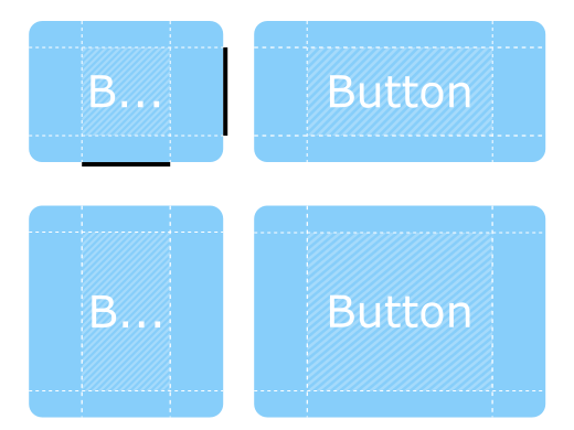
../_images/qtquickcontrols-imagine-9-patch-size.png

可拉伸区域

顶部和左侧边缘的9-patch线条决定了图像在调整大小时哪些部分会被拉伸。

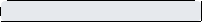
以下是9-patch图像在不同维度上调整为其原始大小的一倍半的示例:

../_images/qtquickcontrols-imagine-9-patch-resized-stretchable.png

注意圆角如何保持其原始大小,因为它们在线条范围之外。

填充区域

右侧和底部的9-patch线条决定了控件contentItem可用的空间大小,这意味着它也可以被视为控制padding。有关说明填充的图表,请参见Control Layout

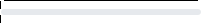
以下是9-patch图像调整大小的更多示例,但这次展示了填充9-patch线的工作原理。

../_images/qtquickcontrols-imagine-9-patch-resized-padding.png

contentItem 可以在阴影区域内占据所需的空间。如果省略填充线,contentItem 将占据所需的空间,但不会超过可拉伸区域。

插入区域

在某些情况下,控件需要有阴影效果,例如。然而,如果我们给上面的按钮添加阴影,它会影响其大小,这会给布局和鼠标/触摸输入边界带来问题。

插入区域通过告诉控件9-patch图像的某个区域应该超出控件来解决这个问题:

../_images/qtquickcontrols-imagine-9-patch-inset.png

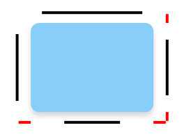
在下图中,虚线表示按钮的可点击区域,以及它在布局中占用的空间。阴影由后面的条纹区域标记:

../_images/qtquickcontrols-imagine-9-patch-inset-boundaries.png

导出9-Patch图像

可以使用各种矢量和位图编辑器来创建适合与Imagine样式一起使用的9-patch图像。以下部分简要解释了每个编辑器的导出过程,最后一部分解释了如何确保导出的图像符合9-patch规范。

Affinity Designer

请参阅Affinity的导出设置文档。

Adobe Illustrator

参见Adobe的Asset Export panel文档。

Adobe Photoshop

请参阅Adobe的从图层生成图像资源文档。

Inkscape

Inkscape 9-Patch Export Extension 可以用于导出 Inkscape 的资源。

草图

请参阅Sketch的导出文档。

Qt Quick Controls 还提供了一个用于 Sketch 的 插件,该插件在资源导出后自动修复 9-patch 线条的厚度。要安装此文件,请双击它。一旦 Sketch 确认 9-patch 导出插件已安装,插件将在图像导出时自动处理它们。

修复9-Patch线条

当导出多种DPI变体的9-patch图像时(@2x, @3x等),9-patch线通常会随着图像一起放大。有几种方法可以解决这个问题,但也许最简单的方法是使用ImageMagick的mogrify工具。该工具具有-shave功能,可用于裁剪图像以减少9-patch线的厚度:

mogrify -shave 1x1 -path path/to/images *@2x.9.png
mogrify -shave 2x2 -path path/to/images *@3x.9.png
mogrify -shave 3x3 -path path/to/images *@4x.9.png

常规DPI图像(那些没有@Nx前缀的图像)不受影响,因此只需对用于高DPI显示的图像运行该命令。

动画图像

WebP 和 GIF 动画图像格式由 Imagine 样式支持。

自定义

路径

Imagine 样式允许自定义用于进行图像资源选择的 路径。可以为任何窗口或项目指定路径,并且它会像 字体 一样自动传播到子元素。在以下示例中,窗口和所有三个单选按钮都显示为深色图像资源(位于“qrc:/themes/dark”中的文件)。

++——————————————————————–+ || .. 图片:: images/qtquickcontrols-imagine-customization-dark.png| ++——————————————————————–+

除了在QML中指定路径外,还可以通过环境变量或在配置文件中指定。在QML中指定的属性优先于所有其他方法。

配置文件

变量

描述

Path

指定包含Imagine样式资源的目录的路径。如果未指定,则使用内置资源。

例如,指定存储在资源系统中的目录的路径:

[Imagine]
Path=:/imagine-assets

指定本地目录的相对路径:

[Imagine]
Path=imagine-assets

注意

由于技术限制,如果路径相对于qtquickcontrols2.conf文件,则不应命名为“imagine”

有关配置文件的更多详细信息,请参见Qt Quick Controls 配置文件

环境变量

变量

描述

QT_QUICK_CONTROLS_IMAGINE_PATH

指定包含Imagine样式资源的目录路径。如果未指定,则使用内置资源。

例如,指定存储在资源系统中的目录路径:

QT_QUICK_CONTROLS_IMAGINE_PATH=:/imagine-assets

指定本地目录的相对路径:

QT_QUICK_CONTROLS_IMAGINE_PATH=imagine-assets

注意

由于技术限制,如果路径相对于qtquickcontrols2.conf文件,则不应命名为“imagine”

QT_QUICK_CONTROLS_IMAGINE_SMOOTH

设置为 1 以启用9-patch图像的平滑缩放。此环境变量在Qt 6.5中添加。

查看Qt Quick Controls中支持的环境变量以获取支持的环境变量的完整列表。

调色板

Imagine 样式支持通过 palette 属性和 qtquickcontrols2.conf 文件进行调色板自定义。与其他样式一样,Imagine 样式使用的确切调色板角色取决于样式。然而,由于控件的大部分视觉外观(例如:背景)是通过图像资源管理的,通常只有用于文本的角色才会产生影响。

字体

可以通过font属性和configuration文件设置自定义字体。

依赖

必须单独导入Imagine样式才能访问特定于Imagine样式的属性。需要注意的是,无论是否引用Imagine样式,相同的应用程序代码都可以与其他样式一起运行。特定于Imagine的属性仅在应用程序以Imagine样式运行时才有效。

如果在始终加载的QML文件中导入了Imagine样式,则必须将Imagine样式与应用程序一起部署,以便无论应用程序使用哪种样式运行,都能运行应用程序。通过使用文件选择器,可以应用特定于样式的调整,而无需创建对样式的硬依赖。

另请参阅 Styling Qt Quick Controls

附加属性文档

此附加属性保存图像资源的路径…

Button {
    Imagine.path: "qrc:/themes/dark"
}