statsmodels.graphics.boxplots.violinplot
-
statsmodels.graphics.boxplots.violinplot(data, ax=
None, labels=None, positions=None, side='both', show_boxplot=True, plot_opts=None)[source]¶ 绘制data序列中每个数据集的小提琴图。
小提琴图是箱线图与每个点的概率密度函数的核密度估计的结合。
- Parameters:
- datasequence[array_like]
数据数组,每个位置对应一个数组。
- ax
AxesSubplot,optional 如果指定,此子图将用于绘图,而不是创建新图形。
- labels
list[str],optional 水平轴的刻度标签。如果没有给出,则使用整数
1..len(data)。- positionsarray_like,
optional 位置数组,用作图形的横轴。如果没有给出,小提琴图的间距将是等距的。
- side{‘both’, ‘left’, ‘right’},
optional 如何绘制小提琴图。默认是‘both’。可以使用‘left’、‘right’选项来创建非对称的小提琴图。
- show_boxplotbool,
optional 是否在小提琴图上方显示普通的箱线图。 默认值为 True。
- plot_opts
dict,optional 一个包含绘图选项的字典。 如果以下任何一项未在plot_opts中提供,将使用默认值:
- 'violin_fc', MPL color.  Fill color for violins.  Default is 'y'.
- 'violin_ec', MPL color.  Edge color for violins.  Default is 'k'.
- 'violin_lw', scalar.  Edge linewidth for violins.  Default is 1.
- 'violin_alpha', float.  Transparancy of violins.  Default is 0.5.
- 'cutoff', bool.  If True, limit violin range to data range.
      Default is False.
- 'cutoff_val', scalar.  Where to cut off violins if `cutoff` is
      True.  Default is 1.5 standard deviations.
- 'cutoff_type', {'std', 'abs'}.  Whether cutoff value is absolute,
      or in standard deviations.  Default is 'std'.
- 'violin_width' : float.  Relative width of violins.  Max available
      space is 1, default is 0.8.
- 'label_fontsize', MPL fontsize.  Adjusts fontsize only if given.
- 'label_rotation', scalar.  Adjusts label rotation only if given.
      Specify in degrees.
- 'bw_factor', Adjusts the scipy gaussian_kde kernel. default: None.
      Options for scalar or callable.
- Returns:
Figure如果 ax 为 None,则创建图形。否则为 ax 连接的图形。
另请参阅
beanplot豆图,基于小提琴图构建。
matplotlib.pyplot.boxplot标准箱线图。
注释
小提琴图的外观可以通过plot_opts进行自定义。如果需要自定义箱线图元素,请将show_boxplot设置为False,并通过直接调用Matplotlib的boxplot函数在小提琴图上绘制它。例如:
violinplot(data, ax=ax, show_boxplot=False)
ax.boxplot(data, sym='cv', whis=2.5)
可能会发生轴标签或刻度标签超出绘图区域的情况,尤其是在水平轴上旋转标签时。使用 Matplotlib 1.1 或更高版本,可以通过调用
ax.tight_layout()轻松解决此问题。对于较旧的 Matplotlib 版本,需要使用plt.rc或plt.rcParams来解决此问题,例如:plt.rc('figure.subplot', bottom=0.25) violinplot(data, ax=ax)参考文献
J.L. Hintze 和 R.D. Nelson, “小提琴图:箱线图-密度轨迹协同作用”, 《美国统计学家》, 第52卷, 第181-84页, 1998年。
示例
我们使用了1996年美国国家选举调查数据集,其中受访者的党派认同作为自变量,以及其他数据(包括年龄)作为因变量。
>>> data = sm.datasets.anes96.load_pandas()
>>> party_ID = np.arange(7)
>>> labels = ["Strong Democrat", "Weak Democrat", "Independent-Democrat",
...           "Independent-Indpendent", "Independent-Republican",
...           "Weak Republican", "Strong Republican"]
按党派ID分组年龄,并创建一个小提琴图:
>>> plt.rcParams['figure.subplot.bottom'] = 0.23  # keep labels visible
>>> age = [data.exog['age'][data.endog == id] for id in party_ID]
>>> fig = plt.figure()
>>> ax = fig.add_subplot(111)
>>> sm.graphics.violinplot(age, ax=ax, labels=labels,
...                        plot_opts={'cutoff_val':5, 'cutoff_type':'abs',
...                                   'label_fontsize':'small',
...                                   'label_rotation':30})
>>> ax.set_xlabel("Party identification of respondent.")
>>> ax.set_ylabel("Age")
>>> plt.show()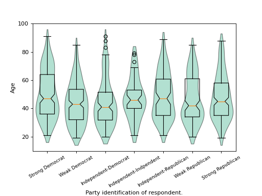