statsmodels.graphics.factorplots.interaction_plot
-
statsmodels.graphics.factorplots.interaction_plot(x, trace, response, func=
'mean', ax=None, plottype='b', xlabel=None, ylabel=None, colors=None, markers=None, linestyles=None, legendloc='best', legendtitle=None, **kwargs)[source]¶ 因子水平统计的交互图。
注意:如果提供了分类因子,级别将被内部重新编码为整数。这确保了与matplotlib的兼容性。使用DataFrame计算由trace给定的因子或组的每个级别的aggregate统计量。
- Parameters:
- xarray_like
因子水平构成x轴。如果给定一个pandas.Series,如果xlabel为None,将使用其名称作为xlabel。
- tracearray_like
轨迹因子水平将在图中绘制为线条。如果轨迹是pandas.Series,其名称将用作图例标题,如果图例标题为空。
- responsearray_like
响应变量或因变量。如果给定的是pandas.Series,并且ylabel为None,则将使用其名称作为ylabel。
- func
function 由 pandas.DataFrame.aggregate 接受的任何内容。这是应用于按轨迹级别分组的响应变量的。
- ax
axes,optional Matplotlib 轴实例
- plottype
str{‘line’, ‘scatter’, ‘both’},optional 要返回的图的类型。可以是‘l’,‘s’,或‘b’
- xlabel
str,optional 用于 x 的标签。默认是‘X’。如果 x 是一个 pandas.Series,它将使用系列的名称。
- ylabel
str,optional 用于响应的标签。默认是‘响应的函数’。如果响应是一个pandas.Series,它将使用序列的名称。
- colors
list,optional 如果给出,长度必须等于跟踪中的层数。
- markers
list,optional 如果给出,长度必须等于跟踪中的层数
- linestyles
list,optional 如果给出,长度必须等于跟踪中的层数。
- legendloc{
None,str,int} 传递给 legend 命令的位置。
- legendtitle{
None,str} 图例的标题。
- **kwargs
这些将被传递给用于绘图或散点的绘图命令。 如果你想控制整体绘图选项,请使用kwargs。
- Returns:
Figure由 ax.figure 给出的图形或一个新的实例。
示例
>>> import numpy as np
>>> np.random.seed(12345)
>>> weight = np.random.randint(1,4,size=60)
>>> duration = np.random.randint(1,3,size=60)
>>> days = np.log(np.random.randint(1,30, size=60))
>>> fig = interaction_plot(weight, duration, days,
...             colors=['red','blue'], markers=['D','^'], ms=10)
>>> import matplotlib.pyplot as plt
>>> plt.show()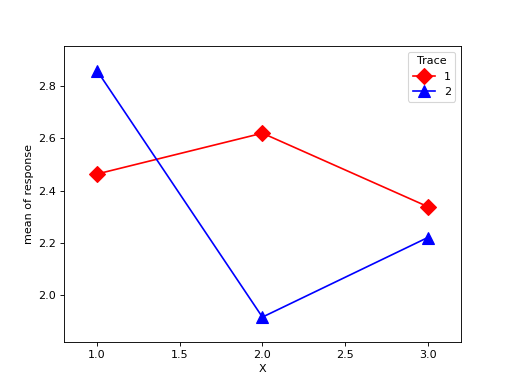
Last update:
Oct 16, 2024