Permutation 解释器
本笔记本演示了如何在某些简单数据集上使用排列解释器。排列解释器是模型无关的,因此它可以计算任何模型的Shapley值和Owen值。它通过迭代特征的完整排列及其反向来工作。通过这样做,我们可以一次改变一个特征,从而最小化所需的模型评估次数,并始终确保无论我们选择使用多少次原始模型执行来近似特征归属值,都能满足效率要求。因此,计算出的SHAP值虽然是近似的,但确实完全加起来等于每个解释实例的模型基础值与模型输出之间的差异。
由于排列解释器具有重要的性能优化,并且不需要像核解释器那样调整正则化参数,因此排列解释器是用于特征数量多于适合精确解释器的表格数据集的默认模型不可知解释器。
下面我们演示如何在一个简单的成人收入分类数据集和模型上使用排列解释器。
[1]:
import xgboost

import shap

# get a dataset on income prediction
X, y = shap.datasets.adult()

# train an XGBoost model (but any other model type would also work)
model = xgboost.XGBClassifier()
model.fit(X, y);
带有独立(Shapley 值)掩码的表格数据
[2]:
# build a Permutation explainer and explain the model predictions on the given dataset
explainer = shap.explainers.Permutation(model.predict_proba, X)
shap_values = explainer(X[:100])

# get just the explanations for the positive class
shap_values = shap_values[..., 1]
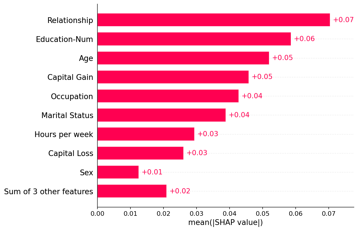
绘制全球概览
[3]:
shap.plots.bar(shap_values)
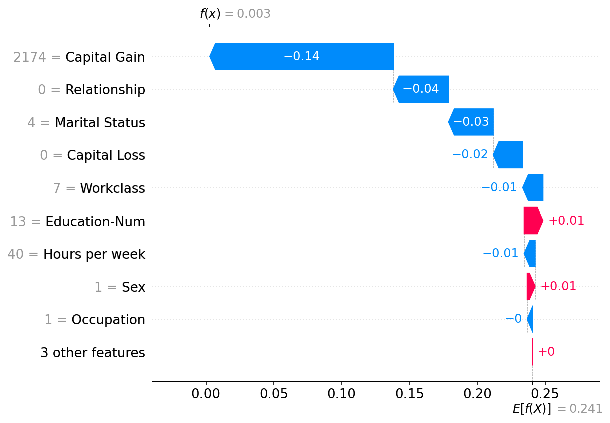
绘制单个实例
[4]:
shap.plots.waterfall(shap_values[0])
带有分区(Owen 值)掩码的表格数据
虽然Shapley值是通过独立处理每个特征得出的,但通常在模型输入上强制执行某种结构是有用的。强制执行这种结构会产生一个结构博弈(即一个关于有效输入特征联盟规则的博弈),当该结构是特征分组的嵌套集时,我们通过将Shapley值递归应用于该组来得到Owen值。在SHAP中,我们将分区推向极限,并构建一个二叉层次聚类树来表示数据的结构。这种结构可以通过多种方式选择,但对于表格数据,通常从输入特征与输出标签之间的信息冗余中构建结构是有帮助的。下面我们就是这样做的:
[5]:
# build a clustering of the features based on shared information about y
clustering = shap.utils.hclust(X, y)
[6]:
# above we implicitly used shap.maskers.Independent by passing a raw dataframe as the masker
# now we explicitly use a Partition masker that uses the clustering we just computed
masker = shap.maskers.Partition(X, clustering=clustering)

# build a Permutation explainer and explain the model predictions on the given dataset
explainer = shap.explainers.Permutation(model.predict_proba, masker)
shap_values2 = explainer(X[:100])

# get just the explanations for the positive class
shap_values2 = shap_values2[..., 1]
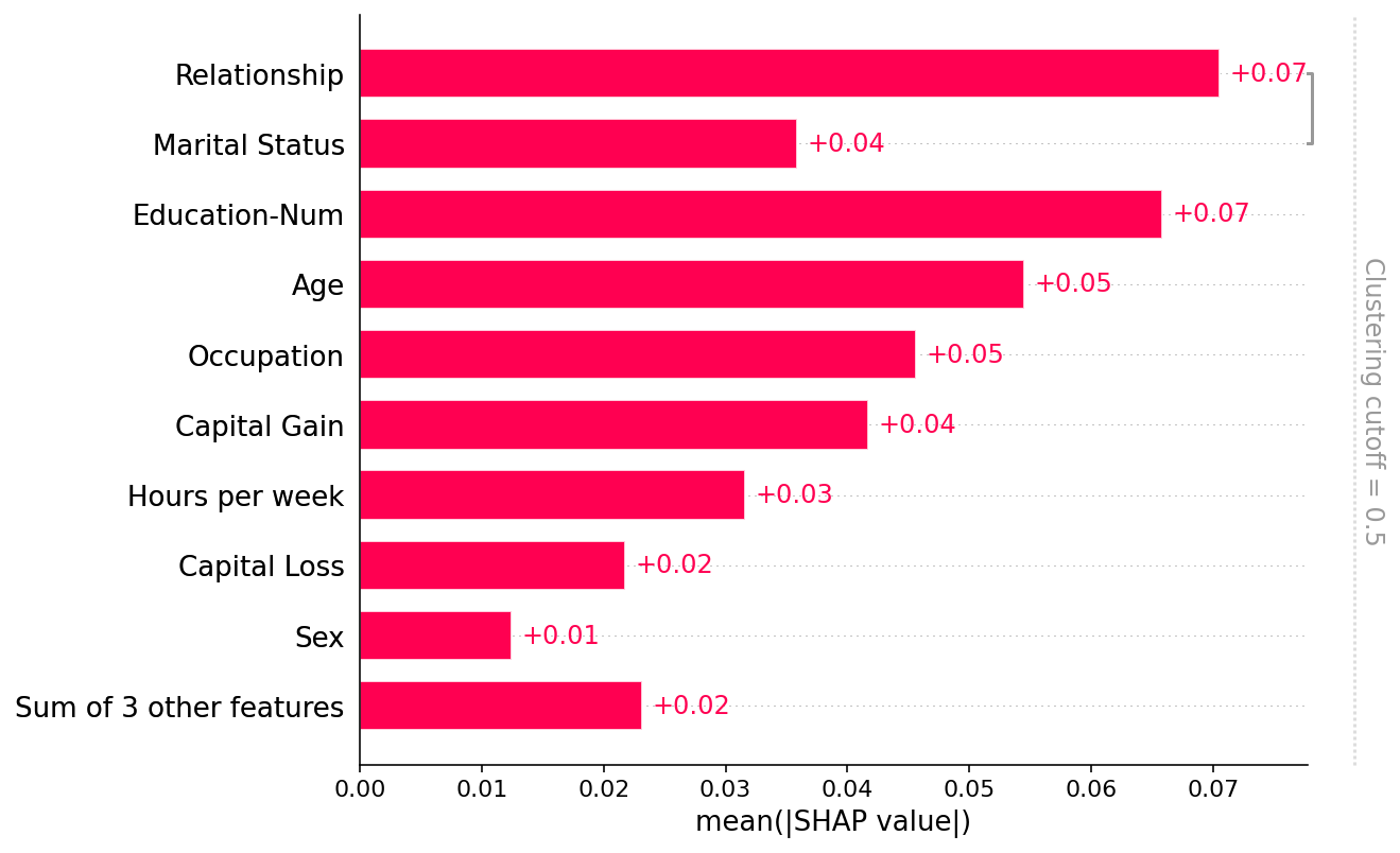
绘制全球概览
请注意,只有“关系”和“婚姻状况”特征之间共享了超过50%的解释力(通过R2衡量),因此所有其他部分的聚类树都被默认的 clustering_cutoff=0.5 设置移除了:
[7]:
shap.plots.bar(shap_values2)
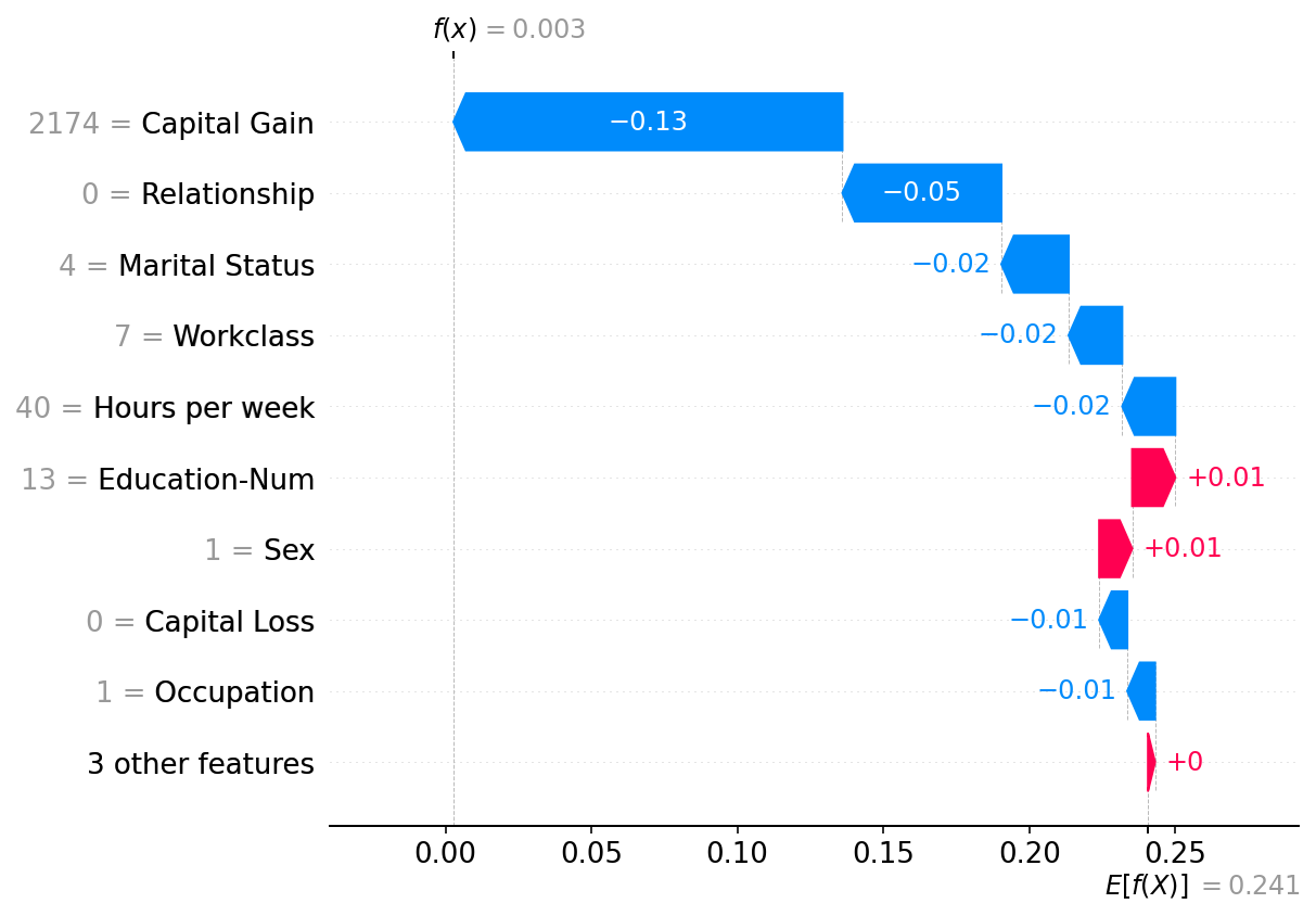
绘制单个实例
注意,上面来自Independent masker的解释与这里的Partition masker有很强的相似性。一般来说,这些方法在表格数据上的区别不大,尽管Partition masker允许更快的运行时间和可能更现实的模型输入操作(因为特征簇组可以一起被掩码/取消掩码)。
[8]:
shap.plots.waterfall(shap_values2[0])
有更多有用示例的想法吗?我们鼓励提交增加此文档笔记本的拉取请求!