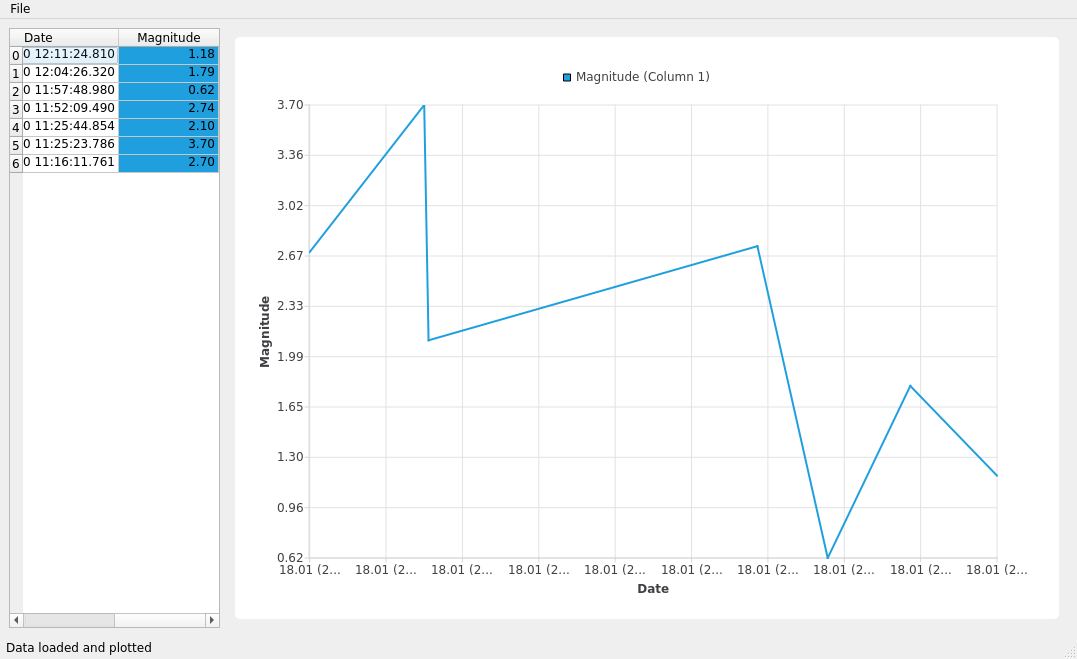
第6章 - 在ChartView中绘制数据
本教程的最后一步是在我们的QChart中绘制CSV数据。为此,您需要遍历我们的数据并将数据包含在QLineSeries中。
将数据添加到系列后,您可以修改轴以正确显示X轴上的QDateTime和Y轴上的幅度值。
这是更新后的 main_widget.py,它包含了一个额外的功能,用于使用 QLineSeries 绘制数据:
 1from __future__ import annotations
 2
 3from PySide6.QtCore import QDateTime, Qt
 4from PySide6.QtGui import QPainter
 5from PySide6.QtWidgets import (QWidget, QHeaderView, QHBoxLayout, QTableView,
 6                               QSizePolicy)
 7from PySide6.QtCharts import QChart, QChartView, QLineSeries, QDateTimeAxis, QValueAxis
 8
 9from table_model import CustomTableModel
10
11
12class Widget(QWidget):
13    def __init__(self, data):
14        QWidget.__init__(self)
15
16        # Getting the Model
17        self.model = CustomTableModel(data)
18
19        # Creating a QTableView
20        self.table_view = QTableView()
21        self.table_view.setModel(self.model)
22
23        # QTableView Headers
24        resize = QHeaderView.ResizeToContents
25        self.horizontal_header = self.table_view.horizontalHeader()
26        self.vertical_header = self.table_view.verticalHeader()
27        self.horizontal_header.setSectionResizeMode(resize)
28        self.vertical_header.setSectionResizeMode(resize)
29        self.horizontal_header.setStretchLastSection(True)
30
31        # Creating QChart
32        self.chart = QChart()
33        self.chart.setAnimationOptions(QChart.AllAnimations)
34        self.add_series("Magnitude (Column 1)", [0, 1])
35
36        # Creating QChartView
37        self.chart_view = QChartView(self.chart)
38        self.chart_view.setRenderHint(QPainter.Antialiasing)
39
40        # QWidget Layout
41        self.main_layout = QHBoxLayout()
42        size = QSizePolicy(QSizePolicy.Preferred, QSizePolicy.Preferred)
43
44        # Left layout
45        size.setHorizontalStretch(1)
46        self.table_view.setSizePolicy(size)
47        self.main_layout.addWidget(self.table_view)
48
49        # Right Layout
50        size.setHorizontalStretch(4)
51        self.chart_view.setSizePolicy(size)
52        self.main_layout.addWidget(self.chart_view)
53
54        # Set the layout to the QWidget
55        self.setLayout(self.main_layout)
56
57    def add_series(self, name, columns):
58        # Create QLineSeries
59        self.series = QLineSeries()
60        self.series.setName(name)
61
62        # Filling QLineSeries
63        for i in range(self.model.rowCount()):
64            # Getting the data
65            t = self.model.index(i, 0).data()
66            date_fmt = "yyyy-MM-dd HH:mm:ss.zzz"
67
68            x = QDateTime().fromString(t, date_fmt).toSecsSinceEpoch()
69            y = float(self.model.index(i, 1).data())
70
71            if x > 0 and y > 0:
72                self.series.append(x, y)
73
74        self.chart.addSeries(self.series)
75
76        # Setting X-axis
77        self.axis_x = QDateTimeAxis()
78        self.axis_x.setTickCount(10)
79        self.axis_x.setFormat("dd.MM (h:mm)")
80        self.axis_x.setTitleText("Date")
81        self.chart.addAxis(self.axis_x, Qt.AlignBottom)
82        self.series.attachAxis(self.axis_x)
83        # Setting Y-axis
84        self.axis_y = QValueAxis()
85        self.axis_y.setTickCount(10)
86        self.axis_y.setLabelFormat("%.2f")
87        self.axis_y.setTitleText("Magnitude")
88        self.chart.addAxis(self.axis_y, Qt.AlignLeft)
89        self.series.attachAxis(self.axis_y)
90
91        # Getting the color from the QChart to use it on the QTableView
92        color_name = self.series.pen().color().name()
93        self.model.color = f"{color_name}"
94
现在,运行应用程序以可视化不同时间的地震震级数据。
尝试修改源代码以获得不同的输出。例如,您可以尝试从CSV中绘制更多数据。