绘制分类因子的交互作用
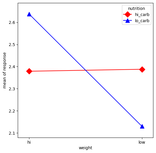
在这个示例中,我们将可视化分类因子之间的交互作用。首先,我们将创建一些分类数据。然后,我们将使用interaction_plot函数绘制它,该函数内部将x轴因子类别重新编码为整数。
[1]:
%matplotlib inline

import numpy as np
import matplotlib.pyplot as plt
import pandas as pd
from statsmodels.graphics.factorplots import interaction_plot
[2]:
np.random.seed(12345)
weight = pd.Series(np.repeat(["low", "hi", "low", "hi"], 15), name="weight")
nutrition = pd.Series(np.repeat(["lo_carb", "hi_carb"], 30), name="nutrition")
days = np.log(np.random.randint(1, 30, size=60))
[3]:
fig, ax = plt.subplots(figsize=(6, 6))
fig = interaction_plot(
    x=weight,
    trace=nutrition,
    response=days,
    colors=["red", "blue"],
    markers=["D", "^"],
    ms=10,
    ax=ax,
)
Last update:
Oct 16, 2024