控制图形美学#
绘制吸引人的图表很重要。当你为自己探索数据集时,拥有看起来令人愉悦的图表是很好的。可视化也是向观众传达定量见解的核心,在这种情况下,拥有吸引注意力和吸引观众的图表就更加必要了。
Matplotlib 具有高度的可定制性,但要知道调整哪些设置以获得吸引人的图表可能很困难。Seaborn 自带了许多定制的主题和高级接口,用于控制 matplotlib 图表的外观。
import numpy as np
import seaborn as sns
import matplotlib.pyplot as plt
让我们定义一个简单的函数来绘制一些偏移的正弦波,这将帮助我们了解可以调整的不同风格参数。
def sinplot(n=10, flip=1):
    x = np.linspace(0, 14, 100)
    for i in range(1, n + 1):
        plt.plot(x, np.sin(x + i * .5) * (n + 2 - i) * flip)
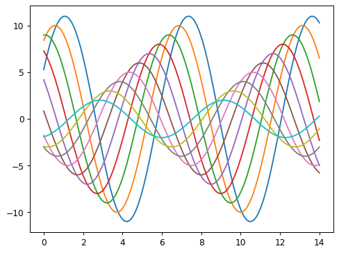
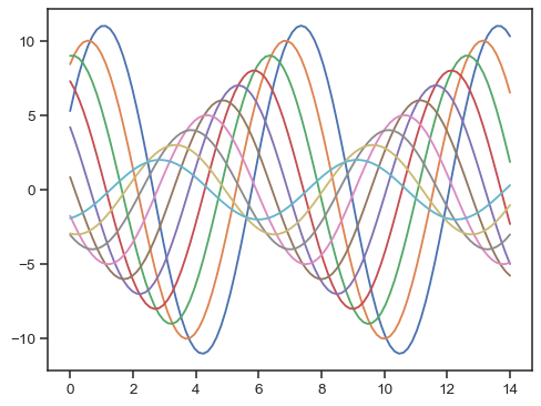
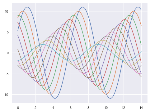
这是使用 matplotlib 默认设置的图表效果:
sinplot()
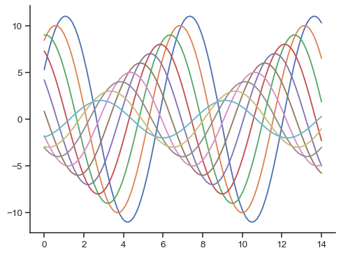
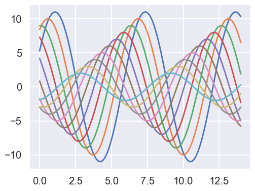
要切换到 seaborn 默认设置,只需调用 set_theme() 函数。
sns.set_theme()
sinplot()
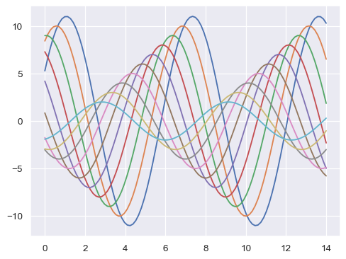
(请注意,在seaborn 0.8之前的版本中,set_theme() 在导入时被调用。在后续版本中,必须显式调用它。)
Seaborn 将 matplotlib 参数分为两组。第一组设置图的美学风格,第二组缩放图形的各个元素,以便它可以轻松地融入不同的上下文中。
操作这些参数的接口是两对函数。要控制样式,请使用 axes_style() 和 set_style() 函数。要缩放图表,请使用 plotting_context() 和 set_context() 函数。在这两种情况下,第一个函数返回一个参数字典,第二个函数设置 matplotlib 的默认值。
Seaborn 图形样式#
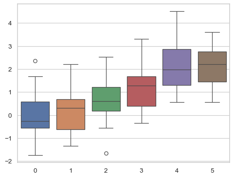
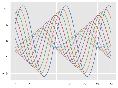
seaborn 有五个预设主题:darkgrid、whitegrid、dark、white 和 ticks。它们各自适用于不同的应用和个人偏好。默认主题是 darkgrid。如上所述,网格有助于图表作为定量信息的查找表,而白底灰格有助于防止网格与代表数据的线条竞争。whitegrid 主题类似,但它更适合数据元素较多的图表:
sns.set_style("whitegrid")
data = np.random.normal(size=(20, 6)) + np.arange(6) / 2
sns.boxplot(data=data);
对于许多图表(尤其是像在演讲这样的场景中,你主要想用图表来展示数据中的模式印象),网格线就没那么必要了。
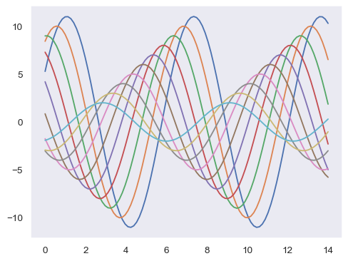
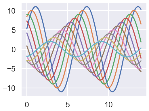
sns.set_style("dark")
sinplot()
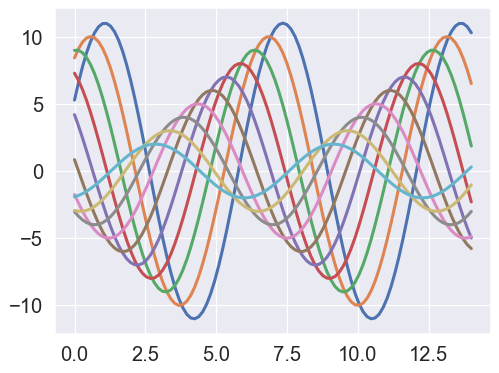
sns.set_style("white")
sinplot()

有时你可能想给图表增加一点额外的结构,这时刻度就派上用场了:
sns.set_style("ticks")
sinplot()
移除轴脊#
white 和 ticks 样式都可以通过移除不需要的顶部和右侧轴脊来获益。可以通过调用 seaborn 函数 despine() 来移除它们:
sinplot()
sns.despine()
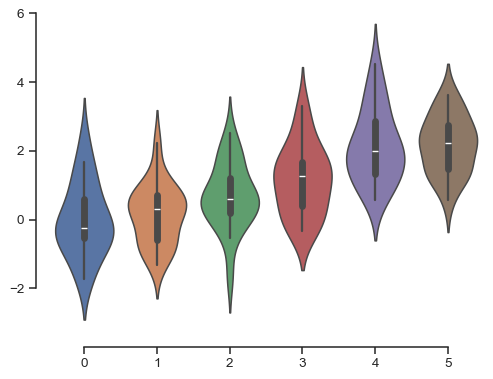
一些图表受益于将脊线从数据中移开,这也可以在调用 despine() 时完成。当刻度不覆盖整个轴的范围时,trim 参数将限制剩余脊线的范围。
f, ax = plt.subplots()
sns.violinplot(data=data)
sns.despine(offset=10, trim=True);
你也可以通过向 despine() 添加额外参数来控制哪些脊线被移除:
sns.set_style("whitegrid")
sns.boxplot(data=data, palette="deep")
sns.despine(left=True)

临时设置图形样式#
虽然来回切换很容易,但你也可以在 with 语句中使用 axes_style() 函数来临时设置绘图参数。这也允许你制作具有不同样式轴的图表:
f = plt.figure(figsize=(6, 6))
gs = f.add_gridspec(2, 2)

with sns.axes_style("darkgrid"):
    ax = f.add_subplot(gs[0, 0])
    sinplot(6)

with sns.axes_style("white"):
    ax = f.add_subplot(gs[0, 1])
    sinplot(6)

with sns.axes_style("ticks"):
    ax = f.add_subplot(gs[1, 0])
    sinplot(6)

with sns.axes_style("whitegrid"):
    ax = f.add_subplot(gs[1, 1])
    sinplot(6)

f.tight_layout()

覆盖 seaborn 样式中的元素#
如果你想自定义 seaborn 样式,你可以将参数的字典传递给 axes_style() 和 set_style() 的 rc 参数。请注意,你只能通过这种方法覆盖样式定义中的参数。(然而,更高级别的 set_theme() 函数接受任何 matplotlib 参数的字典)。
如果你想查看包含哪些参数,你可以不带参数调用该函数,这将返回当前的设置:
sns.axes_style()
然后,您可以设置这些参数的不同版本:
sns.set_style("darkgrid", {"axes.facecolor": ".9"})
sinplot()
缩放绘图元素#
一组独立的参数控制绘图元素的缩放比例,这应该允许你使用相同的代码制作适合在需要较大或较小图形的场合使用的图表。
首先,通过调用 set_theme() 来重置默认参数:
sns.set_theme()
四个预设的上下文,按相对大小顺序排列,分别是 paper、notebook、talk 和 poster。notebook 样式是默认样式,并在上面的图中使用。
sns.set_context("paper")
sinplot()
sns.set_context("talk")
sinplot()
sns.set_context("poster")
sinplot()
你现在对样式函数的了解大部分应该可以转移到上下文函数中。
你可以使用这些名称之一调用 set_context() 来设置参数,并且可以通过提供一个参数值的字典来覆盖这些参数。
在更改上下文时,您还可以独立调整字体元素的大小。(此选项也可以通过顶层的 set() 函数获得)。
sns.set_context("notebook", font_scale=1.5, rc={"lines.linewidth": 2.5})
sinplot()
同样地,你可以使用 with 语句临时控制嵌套在其中的图形的比例。
样式和上下文可以通过 set() 函数快速配置。此函数还设置了默认的颜色调色板,但这将在教程的 下一节 中更详细地介绍。