HelloGraphs 示例
该示例展示了如何制作一个简单的2D条形图和折线图。
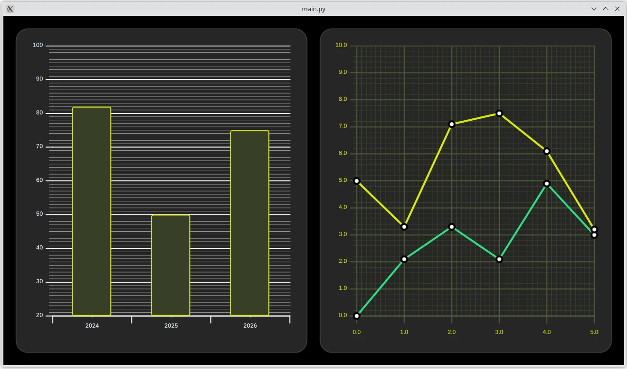
柱状图
示例中的第一个图表是条形图。创建它首先需要一个GraphsView组件,并将主题设置为适合深色背景的主题。此主题调整了图表背景网格、轴线以及标签。
要将其转换为条形图,请添加一个BarSeries。 该系列的X轴是一个具有3个类别的BarCategoryAxis。我们隐藏了垂直网格和轴线。该系列的Y轴是ValueAxis,可见范围在20到100之间。使用tickInterval属性,每10个值将显示带有标签的主刻度。通过将minorTickCount属性设置为9,每1个值将显示次刻度,这意味着每两个主刻度之间将有9个次刻度。
然后数据被添加到BarSeries中,使用BarSet.。这里有3个条形图,我们定义了自定义的条形图颜色和边框属性。这些属性将覆盖可能为AbstractSeries.设置的主题。
折线图
示例中的第二个图表是折线图。它同样从定义一个GraphsView元素开始。创建了一个自定义的GraphTheme以获得自定义外观。GraphTheme为背景网格和轴提供了相当广泛的定制可能性,这些定制在colorTheme之后应用。
一个自定义的Marker组件用于可视化数据点。
之前的条形图没有定义单独的SeriesTheme,因此它使用了默认主题。这个折线图使用了自定义主题,具有所需的线条颜色。
要将此图转换为折线图,请添加一个LineSeries。 第一个系列定义了此图的axisX和axisY。它还设置了pointMarker以使用之前创建的自定义Marker组件。数据点使用XYPoint元素添加。
第二个线条系列与第一个类似。axisX 和 axisY 不需要定义,因为图表已经包含了它们。由于这是 GraphsView 中的第二个 LineSeries,因此会自动从 seriesTheme 中选择第二种颜色。
# Copyright (C) 2024 The Qt Company Ltd.
# SPDX-License-Identifier: LicenseRef-Qt-Commercial OR BSD-3-Clause
from __future__ import annotations

"""PySide6 port of the Qt Hello Graphs example from Qt v6.x"""

from pathlib import Path
import sys
from PySide6.QtGui import QGuiApplication
from PySide6.QtQuick import QQuickView


if __name__ == '__main__':
    app = QGuiApplication(sys.argv)

    viewer = QQuickView()
    viewer.engine().addImportPath(Path(__file__).parent)
    viewer.setColor("black")
    viewer.loadFromModule("HelloGraphs", "Main")
    viewer.show()
    r = app.exec()
    del viewer
    sys.exit(r)
// Copyright (C) 2024 The Qt Company Ltd.
// SPDX-License-Identifier: LicenseRef-Qt-Commercial OR BSD-3-Clause

import QtQuick
import QtQuick.Layouts
import QtGraphs

Item {
    id: mainView
    width: 1280
    height: 720

    RowLayout  {
        id: graphsRow

        readonly property real margin:  mainView.width * 0.02

        anchors.fill: parent
        anchors.margins: margin
        spacing: margin

        Rectangle {
            Layout.fillHeight: true
            Layout.fillWidth: true
            color: "#262626"
            border.color: "#4d4d4d"
            border.width: 1
            radius: graphsRow.margin
            //! [bargraph]
            GraphsView {
                anchors.fill: parent
                anchors.margins: 16
                axisX: BarCategoryAxis {
                    categories: [2024, 2025, 2026]
                    gridVisible: false
                    subGridVisible: false
                }
                axisY: ValueAxis {
                    min: 20
                    max: 100
                    tickInterval: 10
                    subTickCount: 9
                }
                theme: GraphsTheme {
                    colorScheme: Qt.Dark
                    theme: GraphsTheme.Theme.QtGreen
                }
                //! [bargraph]
                //! [barseries]
                BarSeries {
                    //! [barseries]
                    //! [barset]
                    BarSet {
                        values: [82, 50, 75]
                        borderWidth: 2
                        color: "#373F26"
                        borderColor: "#DBEB00"
                    }
                    //! [barset]
                }
            }
        }

        Rectangle {
            Layout.fillHeight: true
            Layout.fillWidth: true
            color: "#262626"
            border.color: "#4d4d4d"
            border.width: 1
            radius: graphsRow.margin

            //! [linegraph]
            GraphsView {
                anchors.fill: parent
                anchors.margins: 16
                theme: GraphsTheme {
                    readonly property color c1: "#DBEB00"
                    readonly property color c2: "#373F26"
                    readonly property color c3: Qt.lighter(c2, 1.5)
                    colorScheme: Qt.Dark
                    seriesColors: ["#2CDE85", "#DBEB00"]
                    grid.mainColor: c3
                    grid.subColor: c2
                    axisX.mainColor: c3
                    axisY.mainColor: c3
                    axisX.subColor: c2
                    axisY.subColor: c2
                    axisX.labelTextColor: c1
                    axisY.labelTextColor: c1
                }
                axisX: ValueAxis {
                    max: 5
                    tickInterval: 1
                    subTickCount: 9
                    labelDecimals: 1
                }
                axisY: ValueAxis {
                    max: 10
                    tickInterval: 1
                    subTickCount: 4
                    labelDecimals: 1
                }
                //! [linegraph]

                //! [linemarker]
                component Marker : Rectangle {
                    width: 16
                    height: 16
                    color: "#ffffff"
                    radius: width * 0.5
                    border.width: 4
                    border.color: "#000000"
                }
                //! [linemarker]

                //! [lineseries1]
                LineSeries {
                    id: lineSeries1
                    width: 4
                    pointDelegate: Marker { }
                    XYPoint { x: 0; y: 0 }
                    XYPoint { x: 1; y: 2.1 }
                    XYPoint { x: 2; y: 3.3 }
                    XYPoint { x: 3; y: 2.1 }
                    XYPoint { x: 4; y: 4.9 }
                    XYPoint { x: 5; y: 3.0 }
                }
                //! [lineseries1]

                //! [lineseries2]
                LineSeries {
                    id: lineSeries2
                    width: 4
                    pointDelegate: Marker { }
                    XYPoint { x: 0; y: 5.0 }
                    XYPoint { x: 1; y: 3.3 }
                    XYPoint { x: 2; y: 7.1 }
                    XYPoint { x: 3; y: 7.5 }
                    XYPoint { x: 4; y: 6.1 }
                    XYPoint { x: 5; y: 3.2 }
                }
                //! [lineseries2]
            }
        }
    }
}
module HelloGraphs
Main 1.0 Main.qml