备注
前往结尾 以下载完整示例代码。
紧凑布局指南#
如何使用 tight-layout 来使图表在你的图形中整洁地适应。
tight_layout 自动调整子图参数,使子图适应图形区域。这是一个实验性功能,可能不适用于某些情况。它仅检查刻度标签、轴标签和标题的范围。
一个替代 tight_layout 的选择是 constrained_layout。
简单示例#
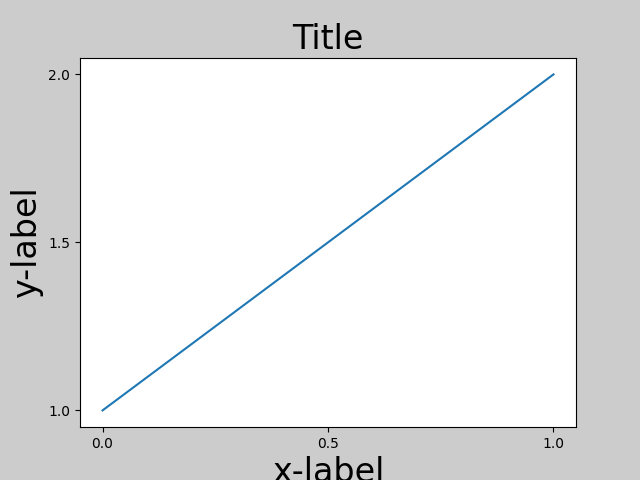
在使用默认的坐标轴定位时,坐标轴标题、轴标签或刻度标签有时会超出图形区域,从而被裁剪。
import matplotlib.pyplot as plt
import numpy as np

plt.rcParams['savefig.facecolor'] = "0.8"


def example_plot(ax, fontsize=12):
    ax.plot([1, 2])

    ax.locator_params(nbins=3)
    ax.set_xlabel('x-label', fontsize=fontsize)
    ax.set_ylabel('y-label', fontsize=fontsize)
    ax.set_title('Title', fontsize=fontsize)

plt.close('all')
fig, ax = plt.subplots()
example_plot(ax, fontsize=24)
为了防止这种情况,需要调整 Axes 的位置。对于子图,可以通过使用 Figure.subplots_adjust 手动调整子图参数来实现。Figure.tight_layout 可以自动完成此操作。
fig, ax = plt.subplots()
example_plot(ax, fontsize=24)
plt.tight_layout()
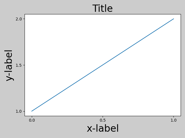
注意,matplotlib.pyplot.tight_layout() 只有在被调用时才会调整子图参数。为了在每次重绘图形时执行此调整,你可以调用 fig.set_tight_layout(True),或者等效地,将 rcParams["figure.autolayout"] (default: False) 设置为 True。
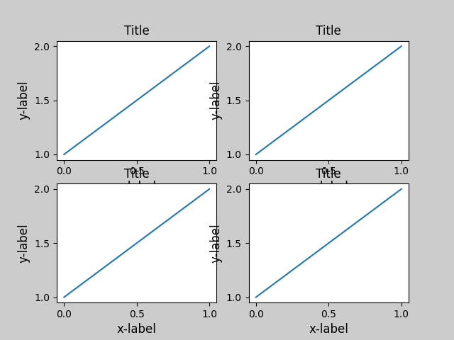
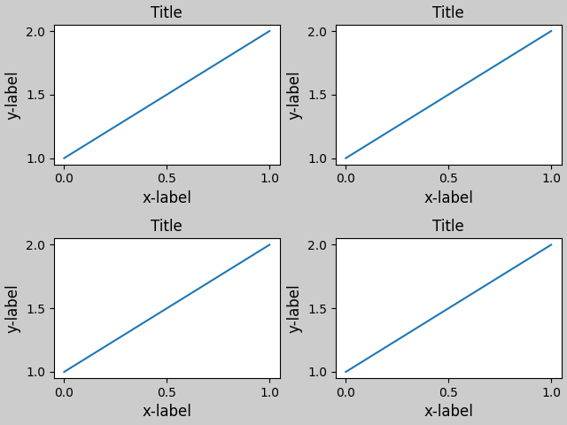
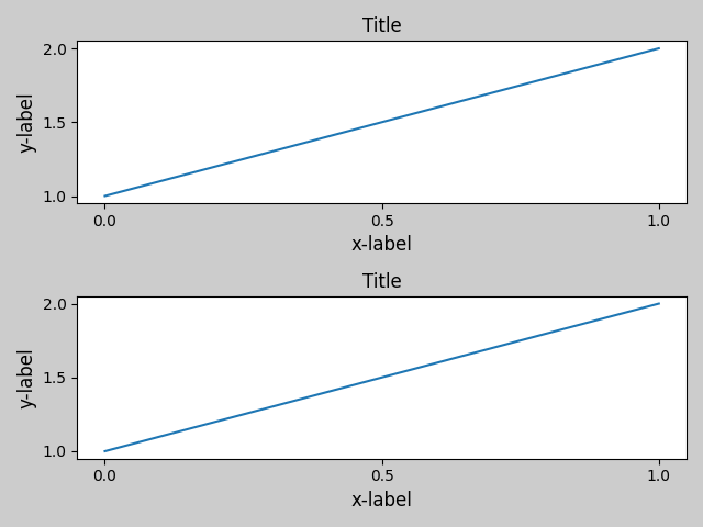
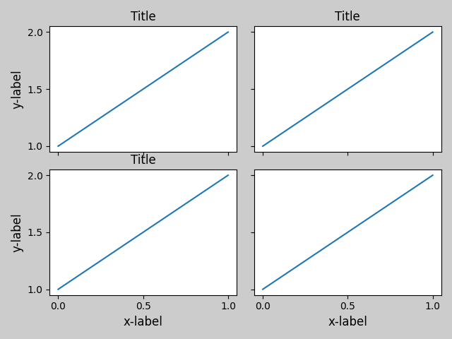
当你有多个子图时,通常你会看到不同Axes的标签相互重叠。
plt.close('all')

fig, ((ax1, ax2), (ax3, ax4)) = plt.subplots(nrows=2, ncols=2)
example_plot(ax1)
example_plot(ax2)
example_plot(ax3)
example_plot(ax4)
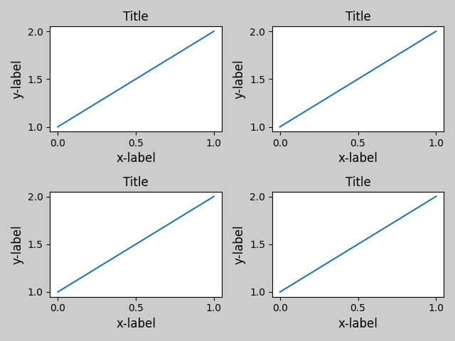
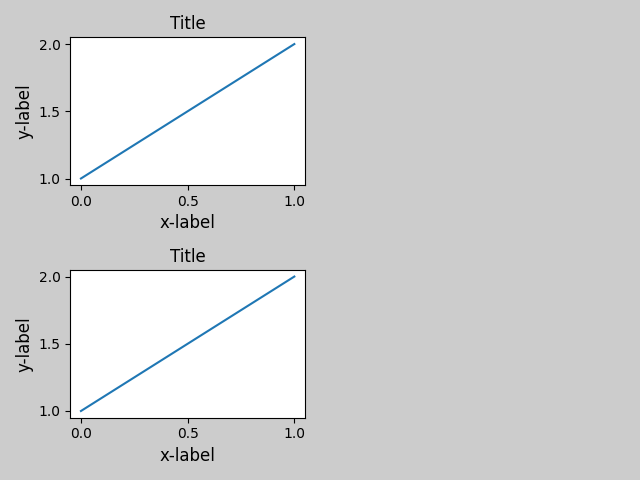
tight_layout() 还会调整子图之间的间距,以最小化重叠。
fig, ((ax1, ax2), (ax3, ax4)) = plt.subplots(nrows=2, ncols=2)
example_plot(ax1)
example_plot(ax2)
example_plot(ax3)
example_plot(ax4)
plt.tight_layout()
tight_layout() 可以接受 pad、w_pad 和 h_pad 的关键字参数。这些参数控制图形边框周围的额外填充以及子图之间的间距。填充以字体大小的分数指定。
fig, ((ax1, ax2), (ax3, ax4)) = plt.subplots(nrows=2, ncols=2)
example_plot(ax1)
example_plot(ax2)
example_plot(ax3)
example_plot(ax4)
plt.tight_layout(pad=0.4, w_pad=0.5, h_pad=1.0)
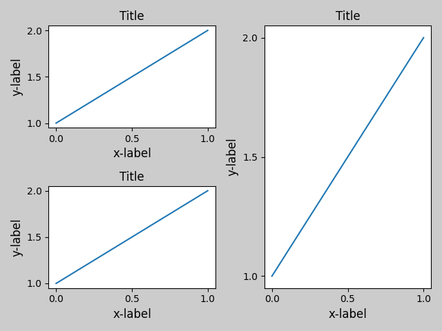
tight_layout() 即使子图的大小不同,只要它们的网格规范兼容,也能正常工作。在下面的例子中,ax1 和 ax2 是 2x2 网格的子图,而 ax3 是 1x2 网格的子图。
plt.close('all')
fig = plt.figure()

ax1 = plt.subplot(221)
ax2 = plt.subplot(223)
ax3 = plt.subplot(122)

example_plot(ax1)
example_plot(ax2)
example_plot(ax3)

plt.tight_layout()
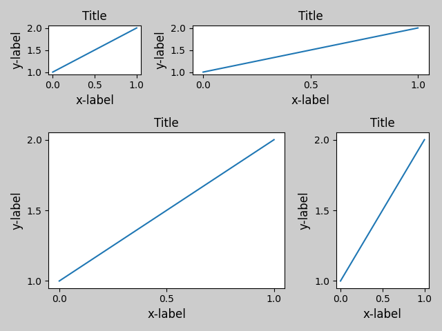
它与使用 subplot2grid() 创建的子图一起工作。通常,从网格规格创建的子图(在图形中排列多个轴)将会工作。
plt.close('all')
fig = plt.figure()

ax1 = plt.subplot2grid((3, 3), (0, 0))
ax2 = plt.subplot2grid((3, 3), (0, 1), colspan=2)
ax3 = plt.subplot2grid((3, 3), (1, 0), colspan=2, rowspan=2)
ax4 = plt.subplot2grid((3, 3), (1, 2), rowspan=2)

example_plot(ax1)
example_plot(ax2)
example_plot(ax3)
example_plot(ax4)

plt.tight_layout()
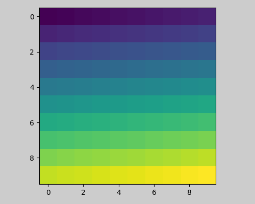
虽然未经过彻底测试,但对于 aspect != "auto" 的子图(例如带有图像的 Axes),它似乎可以工作。
arr = np.arange(100).reshape((10, 10))

plt.close('all')
fig = plt.figure(figsize=(5, 4))

ax = plt.subplot()
im = ax.imshow(arr, interpolation="none")

plt.tight_layout()
注意事项#
tight_layout默认情况下会考虑 Axes 上的所有艺术家。要从布局计算中移除一个艺术家,你可以调用Artist.set_in_layout。tight_layout假设艺术家所需的额外空间与 Axes 的原始位置无关。这通常是正确的,但在极少数情况下并非如此。pad=0可能会通过几个像素裁剪一些文本。这可能是当前算法的错误或限制,目前尚不清楚为什么会发生这种情况。同时,建议使用大于0.3的pad值。
与 GridSpec 一起使用#
GridSpec 有自己的 GridSpec.tight_layout 方法(pyplot api pyplot.tight_layout 也可以使用)。
import matplotlib.gridspec as gridspec

plt.close('all')
fig = plt.figure()

gs1 = gridspec.GridSpec(2, 1)
ax1 = fig.add_subplot(gs1[0])
ax2 = fig.add_subplot(gs1[1])

example_plot(ax1)
example_plot(ax2)

gs1.tight_layout(fig)
您可以提供一个可选的 rect 参数,该参数指定子图将适配的边界框。坐标是标准化图形坐标,默认为 (0, 0, 1, 1)(整个图形)。
fig = plt.figure()

gs1 = gridspec.GridSpec(2, 1)
ax1 = fig.add_subplot(gs1[0])
ax2 = fig.add_subplot(gs1[1])

example_plot(ax1)
example_plot(ax2)

gs1.tight_layout(fig, rect=[0, 0, 0.5, 1.0])
然而,我们不建议使用这种方法手动构建更复杂的布局,例如在图形的左侧和右侧各有一个 GridSpec。对于这些用例,应该利用 嵌套的网格规格,或者 图子图。
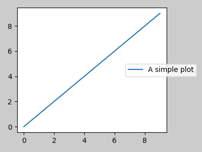
图例和注释#
在 Matplotlib 2.2 之前,图例和注释不包括在决定布局的边界框计算中。随后,这些艺术家被添加到计算中,但有时包含它们是不希望的。例如在这种情况下,让 Axes 稍微缩小一点为图例腾出空间可能是好的:
fig, ax = plt.subplots(figsize=(4, 3))
lines = ax.plot(range(10), label='A simple plot')
ax.legend(bbox_to_anchor=(0.7, 0.5), loc='center left',)
fig.tight_layout()
plt.show()
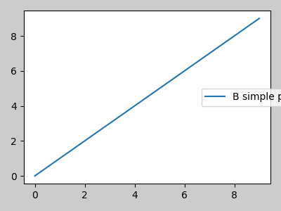
然而,有时这并不是期望的(当使用 fig.savefig('outname.png', bbox_inches='tight') 时非常常见)。为了从边界框计算中移除图例,我们只需将其边界 leg.set_in_layout(False) 设置,图例将被忽略。
fig, ax = plt.subplots(figsize=(4, 3))
lines = ax.plot(range(10), label='B simple plot')
leg = ax.legend(bbox_to_anchor=(0.7, 0.5), loc='center left',)
leg.set_in_layout(False)
fig.tight_layout()
plt.show()
与 AxesGrid1 一起使用#
提供对 mpl_toolkits.axes_grid1 的有限支持。
from mpl_toolkits.axes_grid1 import Grid

plt.close('all')
fig = plt.figure()
grid = Grid(fig, rect=111, nrows_ncols=(2, 2),
            axes_pad=0.25, label_mode='L',
            )

for ax in grid:
    example_plot(ax)
ax.title.set_visible(False)

plt.tight_layout()
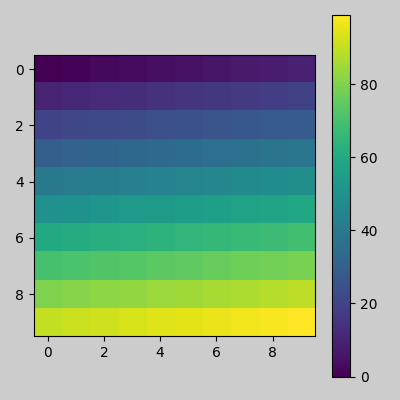
颜色条#
如果你使用 Figure.colorbar 创建一个颜色条,只要父坐标轴也是一个子图,那么创建的颜色条就会在子图中绘制,因此 Figure.tight_layout 将会生效。
plt.close('all')
arr = np.arange(100).reshape((10, 10))
fig = plt.figure(figsize=(4, 4))
im = plt.imshow(arr, interpolation="none")

plt.colorbar(im)

plt.tight_layout()
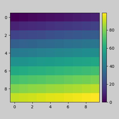
另一个选项是使用 AxesGrid1 工具包来显式创建颜色条的 Axes。
from mpl_toolkits.axes_grid1 import make_axes_locatable

plt.close('all')
arr = np.arange(100).reshape((10, 10))
fig = plt.figure(figsize=(4, 4))
im = plt.imshow(arr, interpolation="none")

divider = make_axes_locatable(plt.gca())
cax = divider.append_axes("right", "5%", pad="3%")
plt.colorbar(im, cax=cax)

plt.tight_layout()
脚本的总运行时间: (0 分钟 1.899 秒)