备注
前往结尾 下载完整示例代码。
图像重采样#
图像由分配了颜色值的离散像素表示,无论是在屏幕上还是在图像文件中。当用户使用数据数组调用 imshow 时,数据数组的大小很少与图中分配给图像的像素数量完全匹配,因此 Matplotlib 会重新采样或 缩放 数据或图像以适应。如果数据数组大于渲染图中分配的像素数量,则图像将被“下采样”,图像信息将会丢失。相反,如果数据数组小于输出像素的数量,则每个数据点将获得多个像素,图像将被“上采样”。
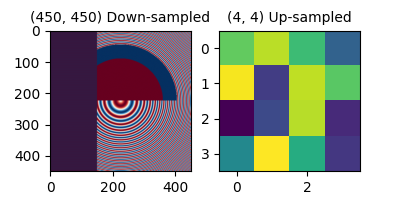
在下图中,第一个数据数组的大小为 (450, 450),但在图中由远少于实际数量的像素表示,因此被下采样。第二个数据数组的大小为 (4, 4),由远多于实际数量的像素表示,因此被上采样。
import matplotlib.pyplot as plt
import numpy as np

fig, axs = plt.subplots(1, 2, figsize=(4, 2))

# First we generate a 450x450 pixel image with varying frequency content:
N = 450
x = np.arange(N) / N - 0.5
y = np.arange(N) / N - 0.5
aa = np.ones((N, N))
aa[::2, :] = -1

X, Y = np.meshgrid(x, y)
R = np.sqrt(X**2 + Y**2)
f0 = 5
k = 100
a = np.sin(np.pi * 2 * (f0 * R + k * R**2 / 2))
# make the left hand side of this
a[:int(N / 2), :][R[:int(N / 2), :] < 0.4] = -1
a[:int(N / 2), :][R[:int(N / 2), :] < 0.3] = 1
aa[:, int(N / 3):] = a[:, int(N / 3):]
alarge = aa

axs[0].imshow(alarge, cmap='RdBu_r')
axs[0].set_title('(450, 450) Down-sampled', fontsize='medium')

np.random.seed(19680801+9)
asmall = np.random.rand(4, 4)
axs[1].imshow(asmall, cmap='viridis')
axs[1].set_title('(4, 4) Up-sampled', fontsize='medium')
Matplotlib 的 imshow 方法有两个关键字参数,允许用户控制重采样的方式。interpolation 关键字参数允许选择用于重采样的内核,如果降采样则允许使用 抗锯齿 过滤,如果升采样则允许平滑像素。interpolation_stage 关键字参数,决定这个平滑内核是应用于底层数据,还是应用于 RGBA 像素。
interpolation_stage='rgba': 数据 -> 归一化 -> RGBA -> 插值/重采样
interpolation_stage='data': 数据 -> 插值/重采样 -> 归一化 -> RGBA
对于这两个关键字参数,Matplotlib 有一个默认的“抗锯齿”设置,这在大多数情况下是推荐的,下面将进行描述。请注意,如果图像被缩小或放大,此默认设置的行为会有所不同,如下所述。
下采样和适度上采样#
在降采样数据时,我们通常希望先通过平滑图像来去除混叠,然后再进行子采样。在 Matplotlib 中,我们可以在将数据映射到颜色之前进行平滑处理,或者我们可以在 RGB(A) 图像像素上进行平滑处理。这些差异如下所示,并通过 interpolation_stage 关键字参数进行控制。
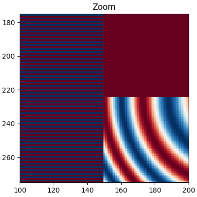
以下图像从450个数据像素下采样到大约125像素或250像素(取决于您的显示器)。底层图像的左侧有交替的+1, -1条纹,其余部分是变化的波长(chirp)模式。如果我们放大,我们可以在没有任何下采样的情况下看到这个细节:
fig, ax = plt.subplots(figsize=(4, 4), layout='compressed')
ax.imshow(alarge, interpolation='nearest', cmap='RdBu_r')
ax.set_xlim(100, 200)
ax.set_ylim(275, 175)
ax.set_title('Zoom')
如果我们进行下采样,最简单的算法是使用 最近邻插值 对数据进行抽取。我们可以在数据空间或RGBA空间中执行此操作:
fig, axs = plt.subplots(1, 2, figsize=(5, 2.7), layout='compressed')
for ax, interp, space in zip(axs.flat, ['nearest', 'nearest'],
                                       ['data', 'rgba']):
    ax.imshow(alarge, interpolation=interp, interpolation_stage=space,
              cmap='RdBu_r')
    ax.set_title(f"interpolation='{interp}'\nstage='{space}'")
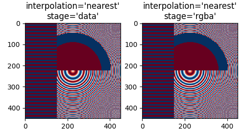
最近插值在数据和RGBA空间中是相同的,并且两者都表现出 Moiré 图案,因为高频数据正在被下采样,并以较低频率的图案显示。我们可以在渲染前对图像应用抗锯齿滤波器来减少Moiré图案:
fig, axs = plt.subplots(1, 2, figsize=(5, 2.7), layout='compressed')
for ax, interp, space in zip(axs.flat, ['hanning', 'hanning'],
                                       ['data', 'rgba']):
    ax.imshow(alarge, interpolation=interp, interpolation_stage=space,
              cmap='RdBu_r')
    ax.set_title(f"interpolation='{interp}'\nstage='{space}'")
plt.show()
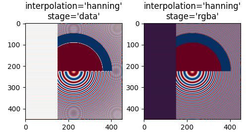
Hanning 滤波器平滑底层数据,使得每个新像素是原始底层像素的加权平均值。这大大减少了莫尔条纹。然而,当 interpolation_stage 设置为 'data' 时,它还会在图像中引入原始数据中不存在的白色区域,这些区域出现在图像左侧的交替带中,以及图像中间大圆的红蓝边界之间。在 'rgba' 阶段进行插值时,会产生不同的伪影,交替带呈现出紫色阴影;尽管紫色不在原始色图中,但当蓝色和红色条纹彼此靠近时,我们感知到的就是这种颜色。
interpolation 关键字参数的默认值是 'auto',如果图像被下采样或上采样小于三倍,则会选择 Hanning 滤波器。interpolation_stage 关键字参数的默认值也是 'auto',对于下采样或上采样小于三倍的图像,它默认使用 'rgba' 插值。
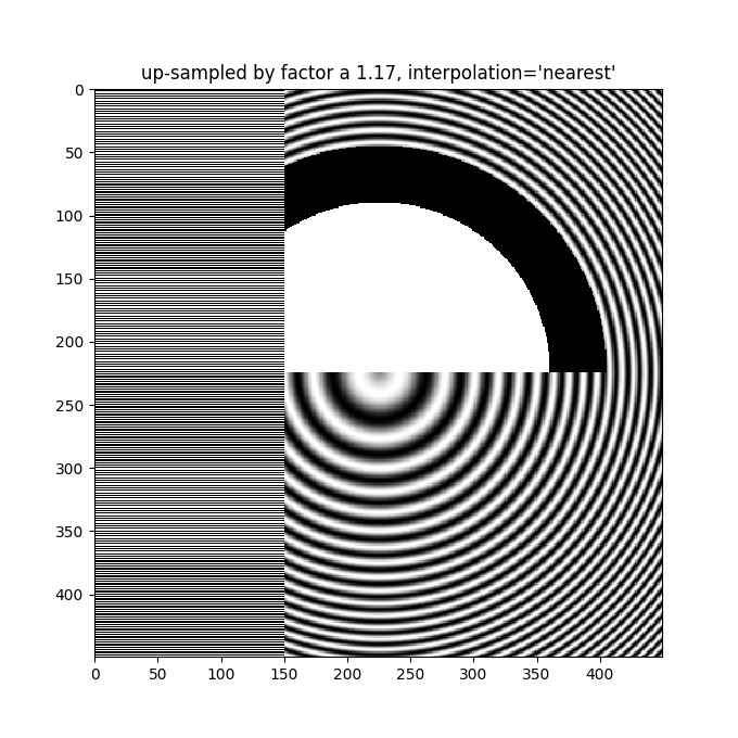
即使在上采样时,也需要抗锯齿滤波。下图将450个数据像素上采样到530个渲染像素。您可能会注意到类似线条的伪影网格,这些伪影源于必须生成的额外像素。由于插值方式为'最近邻',它们与相邻的一行像素相同,因此局部拉伸图像,使其看起来失真。
fig, ax = plt.subplots(figsize=(6.8, 6.8))
ax.imshow(alarge, interpolation='nearest', cmap='grey')
ax.set_title("up-sampled by factor a 1.17, interpolation='nearest'")
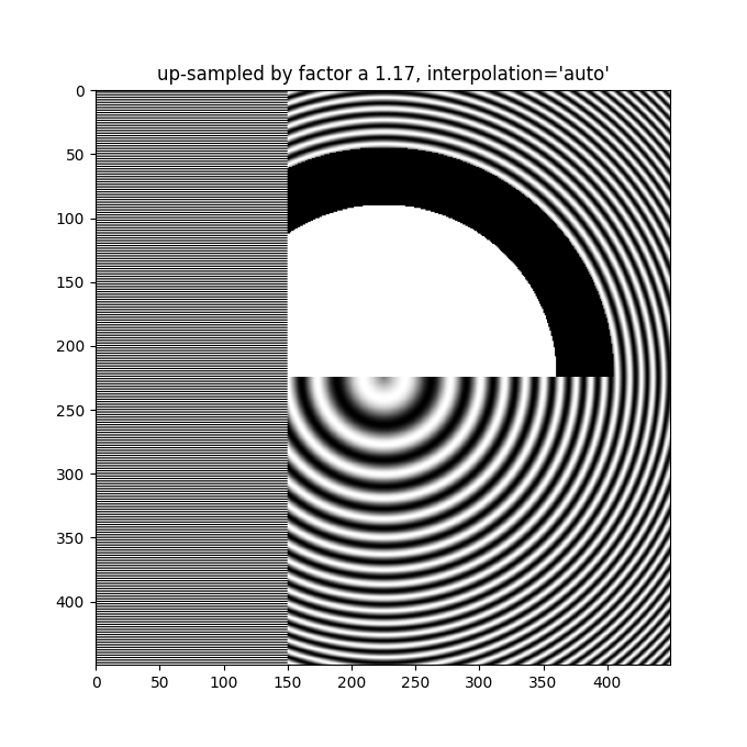
更好的抗锯齿算法可以减少这种效果:
fig, ax = plt.subplots(figsize=(6.8, 6.8))
ax.imshow(alarge, interpolation='auto', cmap='grey')
ax.set_title("up-sampled by factor a 1.17, interpolation='auto'")
除了默认的 'hanning' 抗锯齿外,imshow 支持多种不同的插值算法,这些算法的效果可能因底层数据而异。
fig, axs = plt.subplots(1, 2, figsize=(7, 4), layout='constrained')
for ax, interp in zip(axs, ['hanning', 'lanczos']):
    ax.imshow(alarge, interpolation=interp, cmap='gray')
    ax.set_title(f"interpolation='{interp}'")

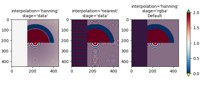
最后一个示例展示了在使用非平凡插值核时,在RGBA阶段进行抗锯齿处理的必要性。在下文中,前100行的数据恰好为0.0,内圆中的数据恰好为2.0。如果在'data'空间中执行*interpolation_stage*并使用抗锯齿滤波器(第一个面板),那么浮点精度误差会使一些数据值略小于零或略大于2.0,并且它们会被分配为欠色或过色。如果不使用抗锯齿滤波器(*interpolation*设置为'nearest'),则可以避免这种情况,但这会使数据部分更容易受到摩尔纹的影响(第二个面板)。因此,我们推荐大多数降采样情况下的默认*interpolation*为'hanning'/'auto',以及*interpolation_stage*为'rgba'/'auto'(最后一个面板)。
a = alarge + 1
cmap = plt.get_cmap('RdBu_r')
cmap.set_under('yellow')
cmap.set_over('limegreen')

fig, axs = plt.subplots(1, 3, figsize=(7, 3), layout='constrained')
for ax, interp, space in zip(axs.flat,
                             ['hanning', 'nearest', 'hanning', ],
                             ['data', 'data', 'rgba']):
    im = ax.imshow(a, interpolation=interp, interpolation_stage=space,
                   cmap=cmap, vmin=0, vmax=2)
    title = f"interpolation='{interp}'\nstage='{space}'"
    if ax == axs[2]:
        title += '\nDefault'
    ax.set_title(title, fontsize='medium')
fig.colorbar(im, ax=axs, extend='both', shrink=0.8)
上采样#
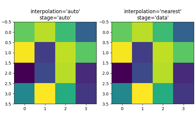
如果我们进行上采样,那么我们可以用许多图像或屏幕像素来表示一个数据像素。在下面的例子中,我们对小数据矩阵进行了过采样。
np.random.seed(19680801+9)
a = np.random.rand(4, 4)

fig, axs = plt.subplots(1, 2, figsize=(6.5, 4), layout='compressed')
axs[0].imshow(asmall, cmap='viridis')
axs[0].set_title("interpolation='auto'\nstage='auto'")
axs[1].imshow(asmall, cmap='viridis', interpolation="nearest",
              interpolation_stage="data")
axs[1].set_title("interpolation='nearest'\nstage='data'")
plt.show()
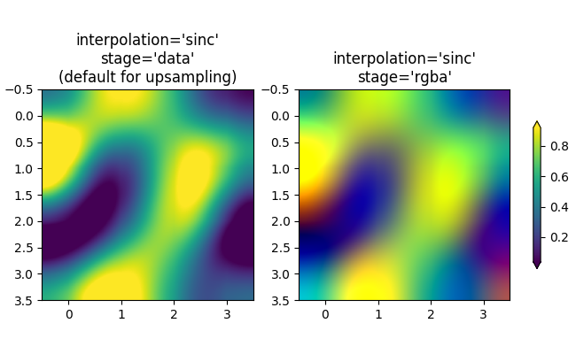
可以使用 interpolation 关键字参数来平滑像素(如果需要)。然而,这几乎总是在数据空间中完成,而不是在 RGBA 空间中,因为在 RGBA 空间中,过滤器可能会导致插值结果中出现颜色图表中没有的颜色。在下面的示例中,请注意当插值为 'rgba' 时,红色作为插值伪影出现。因此,当上采样大于三倍时,interpolation_stage 的默认 'auto' 选择被设置为与 'data' 相同:
fig, axs = plt.subplots(1, 2, figsize=(6.5, 4), layout='compressed')
im = axs[0].imshow(a, cmap='viridis', interpolation='sinc', interpolation_stage='data')
axs[0].set_title("interpolation='sinc'\nstage='data'\n(default for upsampling)")
axs[1].imshow(a, cmap='viridis', interpolation='sinc', interpolation_stage='rgba')
axs[1].set_title("interpolation='sinc'\nstage='rgba'")
fig.colorbar(im, ax=axs, shrink=0.7, extend='both')
避免重采样#
在制作图像时,可以避免对数据进行重采样。一种方法是简单地保存到矢量后端(pdf、eps、svg)并使用 interpolation='none'。矢量后端允许嵌入图像,但请注意,一些矢量图像查看器可能会平滑图像像素。
第二种方法是精确匹配坐标轴的大小与数据的大小。下图的尺寸正好是2英寸乘2英寸,如果dpi是200,那么400x400的数据完全没有重新采样。如果你下载这张图片并在图像查看器中放大,你应该能看到左侧的单个条纹(注意,如果你的屏幕不是高DPI或“视网膜”屏幕,HTML可能会提供100x100版本的图像,这将会被下采样。)
fig = plt.figure(figsize=(2, 2))
ax = fig.add_axes([0, 0, 1, 1])
ax.imshow(aa[:400, :400], cmap='RdBu_r', interpolation='nearest')
plt.show()

脚本的总运行时间: (0 分钟 2.824 秒)