注意
Go to the end 下载完整示例代码。
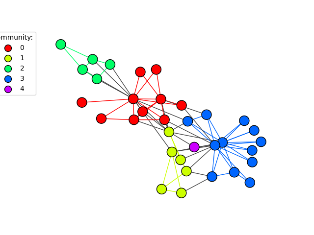
社区
此示例展示了如何可视化图的社区或集群。
import igraph as ig
import matplotlib.pyplot as plt
首先,我们生成一个图。为了简单起见,我们在这里使用一个著名的图:
g = ig.Graph.Famous("Zachary")
边介数是一种检测社区的标准方法。然后我们将其转换为一个igraph.VertexClustering对象,以便后续使用更加方便:
communities = g.community_edge_betweenness()
communities = communities.as_clustering()
接下来,我们根据每个顶点和边的社区成员资格进行着色:
num_communities = len(communities)
palette = ig.RainbowPalette(n=num_communities)
for i, community in enumerate(communities):
    g.vs[community]["color"] = i
    community_edges = g.es.select(_within=community)
    community_edges["color"] = i
最后,我们绘制图表。我们使用了一种称为代理艺术家的高级技术来创建图例。你可以在 matplotlib 的 Legend guide 中找到更多相关信息:
fig, ax = plt.subplots()
ig.plot(
    communities,
    palette=palette,
    edge_width=1,
    target=ax,
    vertex_size=20,
)

# Create a custom color legend
legend_handles = []
for i in range(num_communities):
    handle = ax.scatter(
        [], [],
        s=100,
        facecolor=palette.get(i),
        edgecolor="k",
        label=i,
    )
    legend_handles.append(handle)
ax.legend(
    handles=legend_handles,
    title='Community:',
    bbox_to_anchor=(0, 1.0),
    bbox_transform=ax.transAxes,
)
plt.show()
有关如何从顶点集群生成集群图的示例,请查看生成集群图。
脚本的总运行时间: (0 分钟 1.079 秒)