语义分割#
![]()
使用FLUSS和FLOSS分析动脉血压数据#
这个例子利用了Matrix Profile VIII研究论文的主要要点。为了获取正确的背景,我们强烈建议您首先阅读该论文,但请知道我们的实现与此论文密切相关。
根据上述出版物,“可以对[捕获的越来越多的时间序列数据]进行的最基本分析之一是将其划分为同质区域。” 换句话说,如果你能将你的长时间序列数据划分或切割成k个区域(其中k很小),并以仅向人类(或机器)注释者呈现k个短的代表性模式为最终目标,以便为整个数据集生成标签,那将是多么美好。这些分段区域也被称为“ regime”。此外,作为一种探索工具,人们可能会在数据中发现以前未被发现的新可行见解。快速低成本单一语义分割(FLUSS)是一种生成被称为“弧曲线”的算法,该算法用有关 regime 变化可能性的 информацию 注释原始时间序列。快速低成本在线语义分割(FLOSS)是 FLUSS 的一种变体,根据原始论文,它与领域无关,提供具有潜在实时干预可行性的流式处理能力,并适用于现实世界数据(即不假设数据的每个区域都属于明确定义的语义分段)。
为了演示API和基本原理,我们将查看来自一名健康志愿者在医疗倾斜台上静息时的动脉血压(ABP)数据,并观察我们是否能够检测到当台子从水平位置倾斜到垂直位置时。这是原始论文中展示的相同数据(如上所述)。
开始使用#
让我们导入需要加载、分析和绘制数据的包。
%matplotlib inline
import pandas as pd
import numpy as np
import stumpy
from stumpy.floss import _cac
import matplotlib.pyplot as plt
from matplotlib.patches import Rectangle, FancyArrowPatch
from matplotlib import animation
from IPython.display import HTML
import os
plt.style.use('https://raw.githubusercontent.com/TDAmeritrade/stumpy/main/docs/stumpy.mplstyle')
获取数据#
df = pd.read_csv("https://zenodo.org/record/4276400/files/Semantic_Segmentation_TiltABP.csv?download=1")
df.head()
| 时间 | abp | |
|---|---|---|
| 0 | 0 | 6832.0 |
| 1 | 1 | 6928.0 |
| 2 | 2 | 6968.0 |
| 3 | 3 | 6992.0 |
| 4 | 4 | 6980.0 |
可视化原始数据#
plt.plot(df['time'], df['abp'])
rect = Rectangle((24000,2400),2000,6000,facecolor='lightgrey')
plt.gca().add_patch(rect)
plt.show()
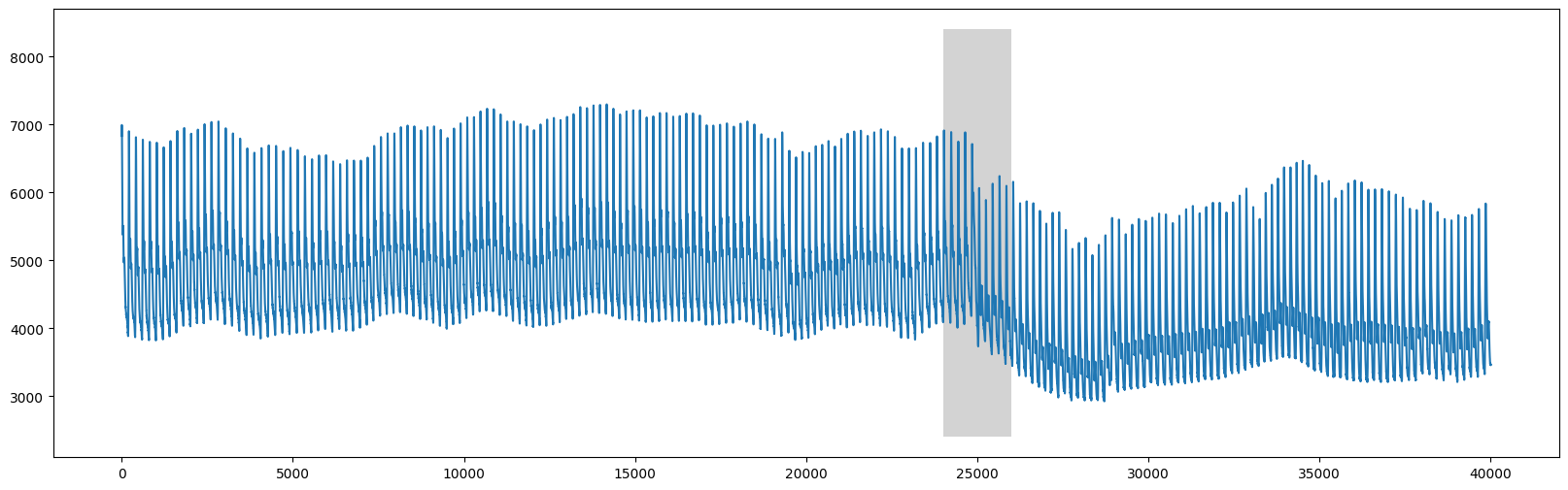
我们可以清楚地看到,在 time=25000 周围发生了变化,这与表格被竖直倾斜的时刻相对应。
流量#
与其使用整个数据集,不如聚焦并直接分析在x=25000之前和之后的2,500个数据点(见论文中的图5)。
start = 25000 - 2500
stop = 25000 + 2500
abp = df.iloc[start:stop, 1]
plt.plot(range(abp.shape[0]), abp)
plt.ylim(2800, 8500)
plt.axvline(x=2373, linestyle="dashed")
style="Simple, tail_width=0.5, head_width=6, head_length=8"
kw = dict(arrowstyle=style, color="k")
# regime 1
rect = Rectangle((55,2500), 225, 6000, facecolor='lightgrey')
plt.gca().add_patch(rect)
rect = Rectangle((470,2500), 225, 6000, facecolor='lightgrey')
plt.gca().add_patch(rect)
rect = Rectangle((880,2500), 225, 6000, facecolor='lightgrey')
plt.gca().add_patch(rect)
rect = Rectangle((1700,2500), 225, 6000, facecolor='lightgrey')
plt.gca().add_patch(rect)
arrow = FancyArrowPatch((75, 7000), (490, 7000), connectionstyle="arc3, rad=-.5", **kw)
plt.gca().add_patch(arrow)
arrow = FancyArrowPatch((495, 7000), (905, 7000), connectionstyle="arc3, rad=-.5", **kw)
plt.gca().add_patch(arrow)
arrow = FancyArrowPatch((905, 7000), (495, 7000), connectionstyle="arc3, rad=.5", **kw)
plt.gca().add_patch(arrow)
arrow = FancyArrowPatch((1735, 7100), (490, 7100), connectionstyle="arc3, rad=.5", **kw)
plt.gca().add_patch(arrow)
# regime 2
rect = Rectangle((2510,2500), 225, 6000, facecolor='moccasin')
plt.gca().add_patch(rect)
rect = Rectangle((2910,2500), 225, 6000, facecolor='moccasin')
plt.gca().add_patch(rect)
rect = Rectangle((3310,2500), 225, 6000, facecolor='moccasin')
plt.gca().add_patch(rect)
arrow = FancyArrowPatch((2540, 7000), (3340, 7000), connectionstyle="arc3, rad=-.5", **kw)
plt.gca().add_patch(arrow)
arrow = FancyArrowPatch((2960, 7000), (2540, 7000), connectionstyle="arc3, rad=.5", **kw)
plt.gca().add_patch(arrow)
arrow = FancyArrowPatch((3340, 7100), (3540, 7100), connectionstyle="arc3, rad=-.5", **kw)
plt.gca().add_patch(arrow)
plt.show()
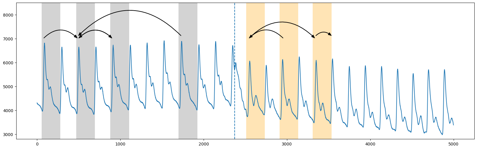
大致上,在上面的截断图中,我们看到两个区域之间的分割发生在 time=2373(垂直虚线)附近,第一区域(灰色)的模式没有跨越到第二区域(橙色)(请参见原始论文中的图2)。因此,“弧曲线”是通过沿时间序列滑动并简单地计算其他模式“跨越”该特定时间点的次数(即“弧”)来计算的。本质上,这些信息可以通过查看矩阵轮廓指数来提取(这告诉你在时间序列中离你最近的邻居在哪里)。因此,我们预期在重复模式彼此接近的地方弧计数会很高,而在没有交叉弧的地方会很低。
在我们计算“弧曲线”之前,我们需要首先计算标准矩阵剖面,并且我们可以大致看到窗口大小约为210个数据点(感谢领域专家的知识)。
m = 210
mp = stumpy.stump(abp, m=m)
现在,为了计算“弧线”并确定制度变化的位置,我们可以直接调用 fluss 函数。然而,请注意 fluss 需要以下输入:
矩阵轮廓索引
mp[:, 1](不是矩阵轮廓距离)一个适当的子序列长度,
L(为了方便,我们将其选择为等于窗口大小,m=210)要搜索的体制数量,
n_regimes(在这种情况下为2个区域)一个排除因子,
excl_factor,用于消除弧线曲线的开始和结束(根据论文,任何在1到5之间的值都是合理的)
L = 210
cac, regime_locations = stumpy.fluss(mp[:, 1], L=L, n_regimes=2, excl_factor=1)
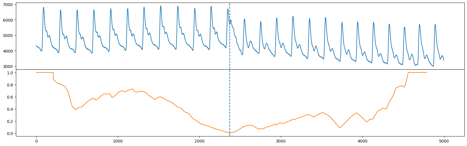
请注意,fluss 实际上返回一个叫做“校正弧曲线”(CAC)的东西,它规范了在时间序列的开始和结束附近通常有较少的弧交叉一个时间点,而在时间序列中间附近则有更多的交叉潜力。此外,fluss 返回的是虚线的状态或位置。让我们将原始时间序列(顶部)与校正弧曲线(橙色)和单一状态(垂直虚线)一起绘制。
fig, axs = plt.subplots(2, sharex=True, gridspec_kw={'hspace': 0})
axs[0].plot(range(abp.shape[0]), abp)
axs[0].axvline(x=regime_locations[0], linestyle="dashed")
axs[1].plot(range(cac.shape[0]), cac, color='C1')
axs[1].axvline(x=regime_locations[0], linestyle="dashed")
plt.show()
在STUMPY版本1.12.0之后添加
可以通过 P_ 属性直接访问矩阵谱距离,通过 I_ 属性访问矩阵谱索引:
mp = stumpy.stump(T, m)
print(mp.P_, mp.I_) # print the matrix profile and the matrix profile indices
此外,左侧和右侧矩阵轮廓索引还可以通过 left_I_ 和 right_I_ 属性分别访问。
自由/开放源代码软件#
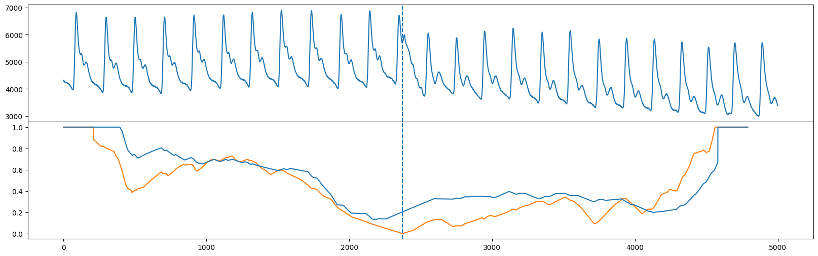
与FLUSS不同,FLOSS关注于流数据,因此它计算了一种修正版本的修正弧曲线(CAC),该曲线是严格单向的(CAC_1D),而不是双向的。也就是说,期待交叉点从两个方向同样可能的期望不再成立,我们期待更多的交叉点指向未来(而较少指向过去)。因此,我们可以手动计算CAC_1D
cac_1d = _cac(mp[:, 3], L, bidirectional=False, excl_factor=1) # This is for demo purposes only. Use floss() below!
并将 CAC_1D(蓝色)与双向 CAC(橙色)进行比较,我们看到全局最小值大致位于相同的位置(请参见原文中的图10)。
fig, axs = plt.subplots(2, sharex=True, gridspec_kw={'hspace': 0})
axs[0].plot(np.arange(abp.shape[0]), abp)
axs[0].axvline(x=regime_locations[0], linestyle="dashed")
axs[1].plot(range(cac.shape[0]), cac, color='C1')
axs[1].axvline(x=regime_locations[0], linestyle="dashed")
axs[1].plot(range(cac_1d.shape[0]), cac_1d)
plt.show()
在STUMPY版本1.12.0之后添加
可以通过 left_I_ 和 right_I_ 属性访问左侧和右侧矩阵轮廓指数,替代 mp[:, 2] 和 mp[:, 3]:
mp = stumpy.stump(T, m)
print(mp.left_I_, mp.right_I_) # print the left and right matrix profile indices
使用FLOSS流式数据#
我们可以直接调用 floss 函数来实例化一个流对象,而不是像我们上面那样手动计算 CAC_1D 处理流数据。为了演示 floss 的使用,假设我们有一些 old_data,并计算它的矩阵轮廓索引,如我们之前所做的:
old_data = df.iloc[20000:20000+5000, 1].values # This is well before the regime change has occurred
mp = stumpy.stump(old_data, m=m)
现在,我们可以像之前一样计算双向修正弧线曲线,但我们想看看增加新数据点后的弧线曲线如何变化。因此,让我们定义一些要流入的新数据:
new_data = df.iloc[25000:25000+5000, 1].values
最后,我们调用 floss 函数来初始化一个流对象并传入:
从
old_data生成的矩阵轮廓(仅使用索引)旧数据用于生成矩阵轮廓于 1。
矩阵轮廓窗口大小,
m=210子序列长度,
L=210排除因子
stream = stumpy.floss(mp, old_data, m=m, L=L, excl_factor=1)
您现在可以通过 stream.update(t) 函数使用新数据点 t 更新 stream,这样您的窗口将滑动一个数据点并自动更新:
该
CAC_1D(通过.cac_1d_属性访问)矩阵特征(通过
.P_属性访问)矩阵剖面索引(通过
.I_属性访问)用于生成
CAC_1D的滑动窗口数据(通过.T_属性访问 - 这个大小应该与 `old_data` 的长度相同)
让我们不断地用下一个值更新我们的 stream,并将它们存储在一个列表中(你稍后会明白原因):
windows = []
for i, t in enumerate(new_data):
stream.update(t)
if i % 100 == 0:
windows.append((stream.T_, stream.cac_1d_))
下面,您可以看到一个动画,它随着用新数据更新流而变化。作为参考,我们还绘制了从上面手动生成的 CAC_1D (橙色),用于静态数据。您将看到在动画进行到一半时,制度变化发生,更新后的 CAC_1D (蓝色)将与橙色曲线完美对齐。
fig, axs = plt.subplots(2, sharex=True, gridspec_kw={'hspace': 0})
axs[0].set_xlim((0, mp.shape[0]))
axs[0].set_ylim((-0.1, max(np.max(old_data), np.max(new_data))))
axs[1].set_xlim((0, mp.shape[0]))
axs[1].set_ylim((-0.1, 1.1))
lines = []
for ax in axs:
line, = ax.plot([], [], lw=2)
lines.append(line)
line, = axs[1].plot([], [], lw=2)
lines.append(line)
def init():
for line in lines:
line.set_data([], [])
return lines
def animate(window):
data_out, cac_out = window
for line, data in zip(lines, [data_out, cac_out, cac_1d]):
line.set_data(np.arange(data.shape[0]), data)
return lines
anim = animation.FuncAnimation(fig, animate, init_func=init,
frames=windows, interval=100,
blit=True)
anim_out = anim.to_jshtml()
plt.close() # Prevents duplicate image from displaying
if os.path.exists("None0000000.png"):
os.remove("None0000000.png") # Delete rogue temp file
HTML(anim_out)
# anim.save('/tmp/semantic.mp4')
总结#
就这样!您刚刚学习了如何使用矩阵剖面索引在数据中识别段落的基本知识,并利用 fluss 和 floss。