


婴儿出生模型与HSGPs#
本笔记本提供了一个使用希尔伯特空间高斯过程(HSGP)技术的示例,该技术在[Solin 和 Särkkä, 2020]中引入,用于时间序列建模的背景下。该技术已被证明在加速具有高斯过程组件的模型方面非常成功。
为了说明主要概念,我们使用了经典的生日示例数据集(参见[Gelman 等人, 2013] [第21章] 和 这里 关于数据来源的评论),并重现了Aki Vehtari在优秀案例研究[Vehtari, 2022]中提出的模型之一(你可以在这个仓库中找到Stan代码)。在他的阐述中,作者提出了一个广泛的迭代方法,使用HSGPs分析1969-1988年美国每天出生人数的相对数量,包括长期趋势、季节性、每周、年度和特殊浮动日变化。由于这个资源非常详细并提供了许多相关的解释,我们不会重现整个过程,而是专注于重现其中一个中间模型。即,具有缓慢趋势、年度季节性趋势和周内日成分的模型(原始案例研究中的模型3)。重现一个比最终模型更简单的模型的原因是使这个笔记本成为愿意学习这项技术的用户的入门教程。我们将在后续示例中实现包含所有组件的最终模型。
在本笔记本中,我们不打算深入探讨数学细节,而是专注于实现以及如何使用 PyMC 的 HSGP 和 HSGPPeriodic API。此类为在 PyMC 模型中使用 HSGP 提供了便捷的方式。用户需要输入某些参数来控制近似中的项数和定义域。当然,理解这些参数的作用很重要,因此让我们简要地探讨一下近似的主要思想和最相关的参数:
近似的主要思想#
回想一下,核(与协方差函数相关联)是高斯过程的主要组成部分,因为它编码了点之间的相似性(和光滑性)度量(参见均值和协方差函数)。希尔伯特空间近似的思想是将这样的核分解为正交基的线性组合,以便在用这种展开替换核时,我们可以在这些基函数方面拟合线性模型。从截断展开中采样的速度将比原始高斯过程公式快得多。关键的观察是,近似中的基函数不依赖于高斯过程协方差函数的超参数,从而使计算速度大大加快。
希尔伯特空间从何而来?事实证明,正交基来自于紧集上拉普拉斯算子的谱分解(例如,可以考虑圆上的傅里叶分解)。换句话说,基函数是平方可积函数空间 \(L^{2}([-L, L])\) 上拉普拉斯算子的特征向量,这是一个希尔伯特空间。回到类 HSGP,两个最重要的参数是:
\(m\): 在近似中使用的基向量的数量。
\(L\): 定义域的边界。选择L,使得定义域 \([-L, L]\) 包含所有域中的点。(注意,紧集是闭区间 \([-L, L]\) 😉)
还可以使用一个比例扩展因子 \(c > 0\),用于从高斯过程\(X\)的定义域中构造\(L\)。具体来说,\(L\)可以指定为乘积\(cS\),其中\(S = \max|X|\)。
我们推荐这篇论文 [Riutort-Mayol 等人, 2022] 以获得对该技术的实际讨论。
注意
你可以在 Numpyro 的文档中找到类似的示例:[示例:高斯过程的希尔伯特空间近似, n.d.]。这个示例是学习该方法内部原理的绝佳资源。
注意
本笔记本基于博客文章 [Orduz, 2024]。
Show code cell source
import warnings

from collections.abc import Callable

import arviz as az
import matplotlib.pyplot as plt
import numpy as np
import pandas as pd
import preliz as pz
import pymc as pm
import pytensor.tensor as pt
import seaborn as sns
import xarray as xr

from matplotlib.ticker import MaxNLocator
from sklearn.pipeline import Pipeline
from sklearn.preprocessing import FunctionTransformer, StandardScaler

warnings.filterwarnings("ignore")

az.style.use("arviz-darkgrid")
plt.rcParams["figure.figsize"] = [12, 7]
plt.rcParams["figure.dpi"] = 100
plt.rcParams["figure.facecolor"] = "white"

%load_ext autoreload
%autoreload 2
%config InlineBackend.figure_format = "retina"
WARNING (pytensor.tensor.blas): Using NumPy C-API based implementation for BLAS functions.
Show code cell source
seed: int = sum(map(ord, "birthdays"))
rng: np.random.Generator = np.random.default_rng(seed=seed)
读取数据#
我们从贝叶斯工作流程书籍 - 生日中读取数据,作者是Aki Vehtari。
raw_df = pd.read_csv(
    "https://raw.githubusercontent.com/avehtari/casestudies/master/Birthdays/data/births_usa_1969.csv",
)

raw_df.info()
<class 'pandas.core.frame.DataFrame'>
RangeIndex: 7305 entries, 0 to 7304
Data columns (total 8 columns):
 #   Column        Non-Null Count  Dtype
---  ------        --------------  -----
 0   year          7305 non-null   int64
 1   month         7305 non-null   int64
 2   day           7305 non-null   int64
 3   births        7305 non-null   int64
 4   day_of_year   7305 non-null   int64
 5   day_of_week   7305 non-null   int64
 6   id            7305 non-null   int64
 7   day_of_year2  7305 non-null   int64
dtypes: int64(8)
memory usage: 456.7 KB
数据集包含1969-1988年间美国每天的出生人数。所有列都很容易理解,除了day_of_year2,它表示一年中的第几天(从1到366),其中闰日为60,非闰年3月1日也为61。
raw_df.head()
| year | month | day | births | day_of_year | day_of_week | id | day_of_year2 | |
|---|---|---|---|---|---|---|---|---|
| 0 | 1969 | 1 | 1 | 8486 | 1 | 3 | 1 | 1 |
| 1 | 1969 | 1 | 2 | 9002 | 2 | 4 | 2 | 2 |
| 2 | 1969 | 1 | 3 | 9542 | 3 | 5 | 3 | 3 |
| 3 | 1969 | 1 | 4 | 8960 | 4 | 6 | 4 | 4 |
| 4 | 1969 | 1 | 5 | 8390 | 5 | 7 | 5 | 5 |
EDA和特征工程#
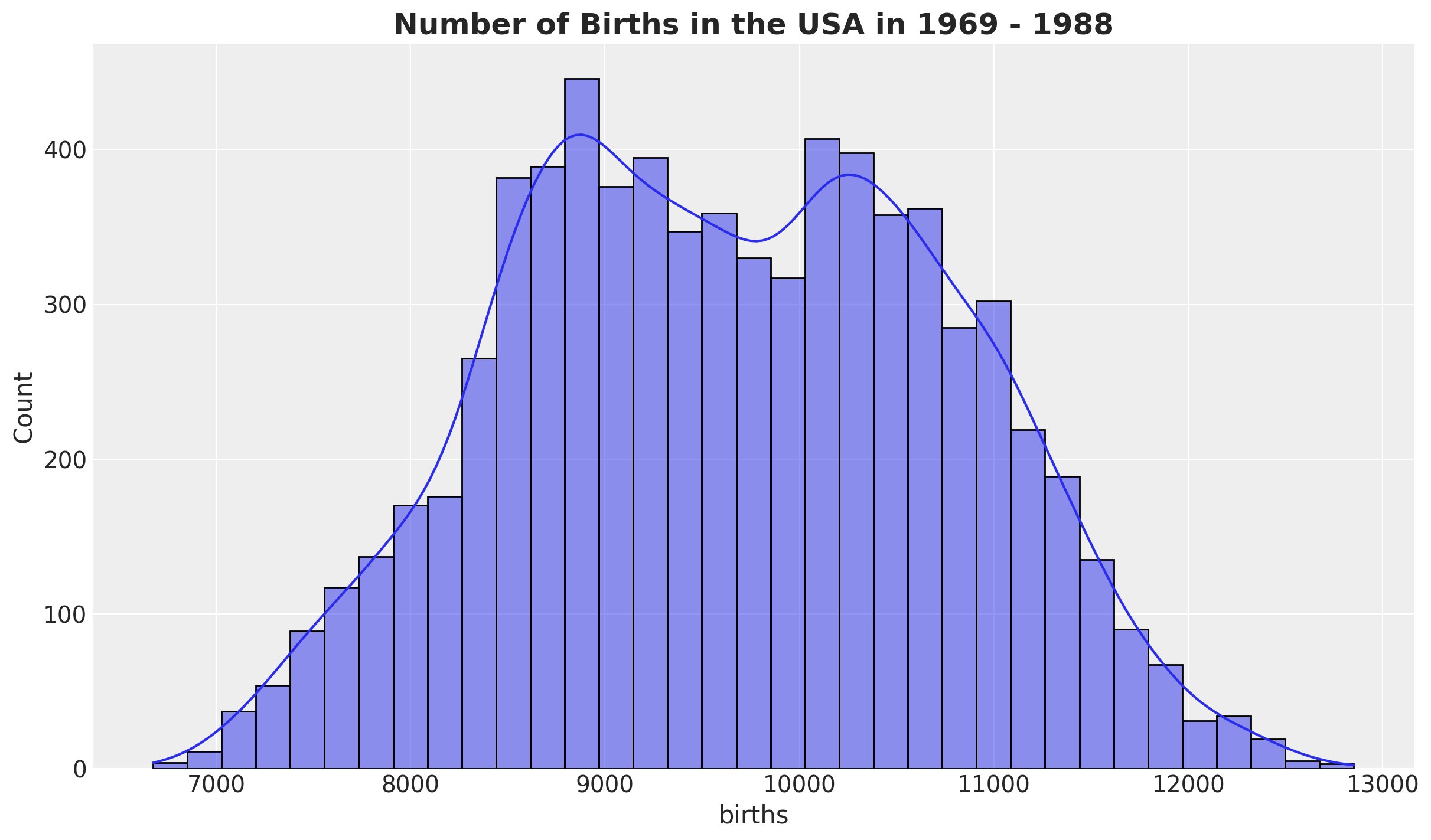
首先,我们查看 births 分布:
fig, ax = plt.subplots()
sns.histplot(data=raw_df, x="births", kde=True, ax=ax)
ax.set_title(
    label="Number of Births in the USA in 1969 - 1988",
    fontsize=18,
    fontweight="bold",
);
我们创建了几个特征:
一个
日期戳。births_relative100: 相对于\(100\)的出生人数。time: 数据索引。
data_df = raw_df.copy().assign(
    date=lambda x: pd.to_datetime(x[["year", "month", "day"]]),
    births_relative100=lambda x: x["births"] / x["births"].mean() * 100,
    time=lambda x: x.index,
)
注意
我们将数据缩放得尽可能接近Aki的案例研究。我们不需要为HSGP模型工作而缩放数据。
现在,让我们来看看相对出生率随时间的发展情况,这是我们将要建模的目标变量。
fig, ax = plt.subplots()
sns.scatterplot(data=data_df, x="date", y="births_relative100", c="C0", s=8, ax=ax)
ax.axhline(100, color="black", linestyle="--", label="mean level")
ax.legend()
ax.set(xlabel="date", ylabel="relative number of births")
ax.set_title(label="Relative Births in the USA in 1969 - 1988", fontsize=18, fontweight="bold");
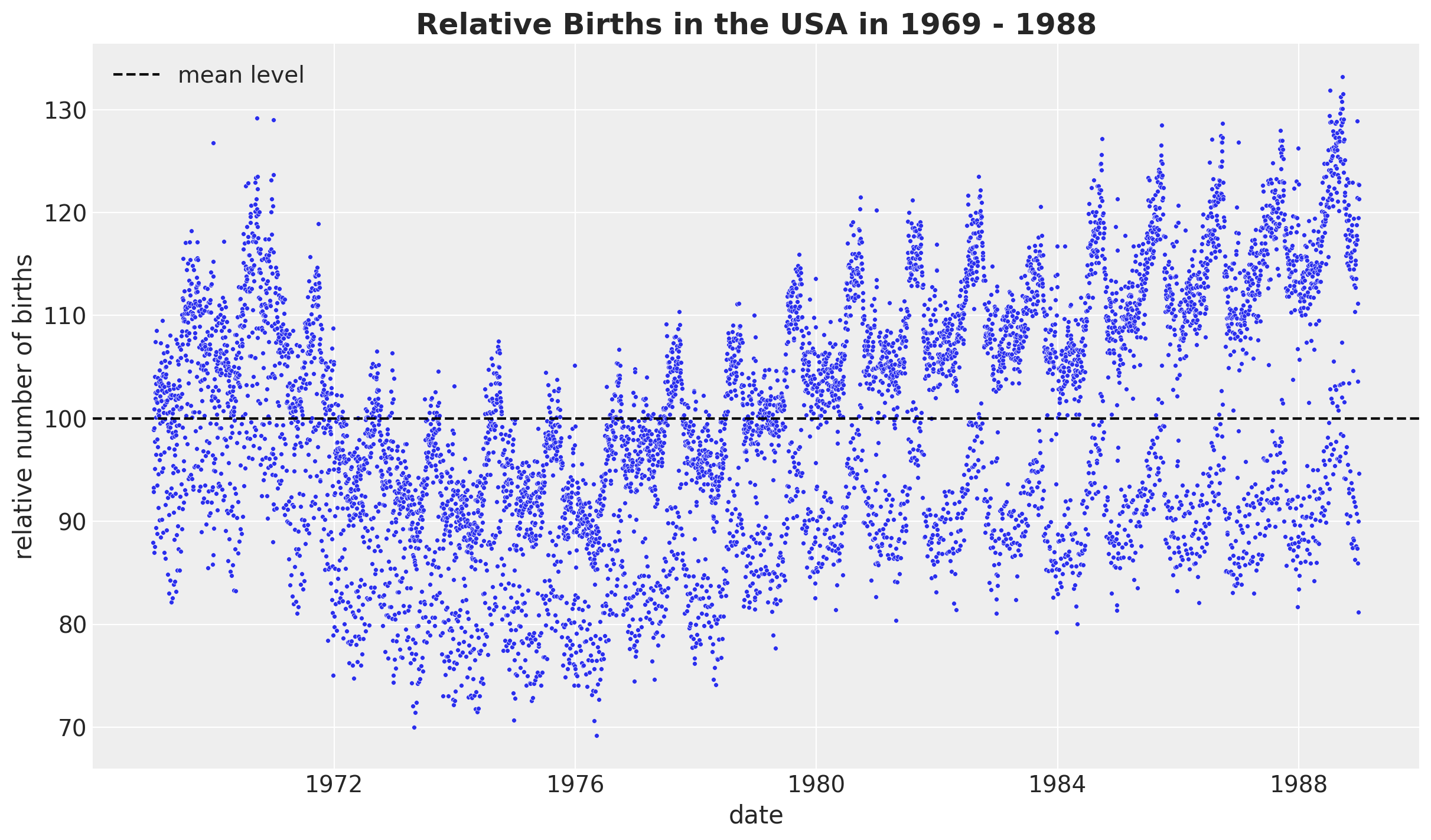
我们观察到一个明显的长期趋势成分和一个明显的年度季节性。我们还看到方差随时间增长,这被称为异方差性。
上图中有许多数据点,我们希望确保我们理解不同层次的季节性模式(这些模式可能隐藏在上图中)。因此,我们系统地检查了各个层次的季节性。
让我们继续通过平均每年的某一天来观察:
fig, ax = plt.subplots()
(
    data_df.groupby(["day_of_year2"], as_index=False)
    .agg(meanbirths=("births_relative100", "mean"))
    .pipe((sns.scatterplot, "data"), x="day_of_year2", y="meanbirths", c="C0", ax=ax)
)
ax.axhline(100, color="black", linestyle="--", label="mean level")
ax.legend()
ax.set(xlabel="day of year", ylabel="relative number of births per day of year")
ax.set_title(
    label="Relative Births in the USA in 1969 - 1988\nMean over Day of Year",
    fontsize=18,
    fontweight="bold",
);
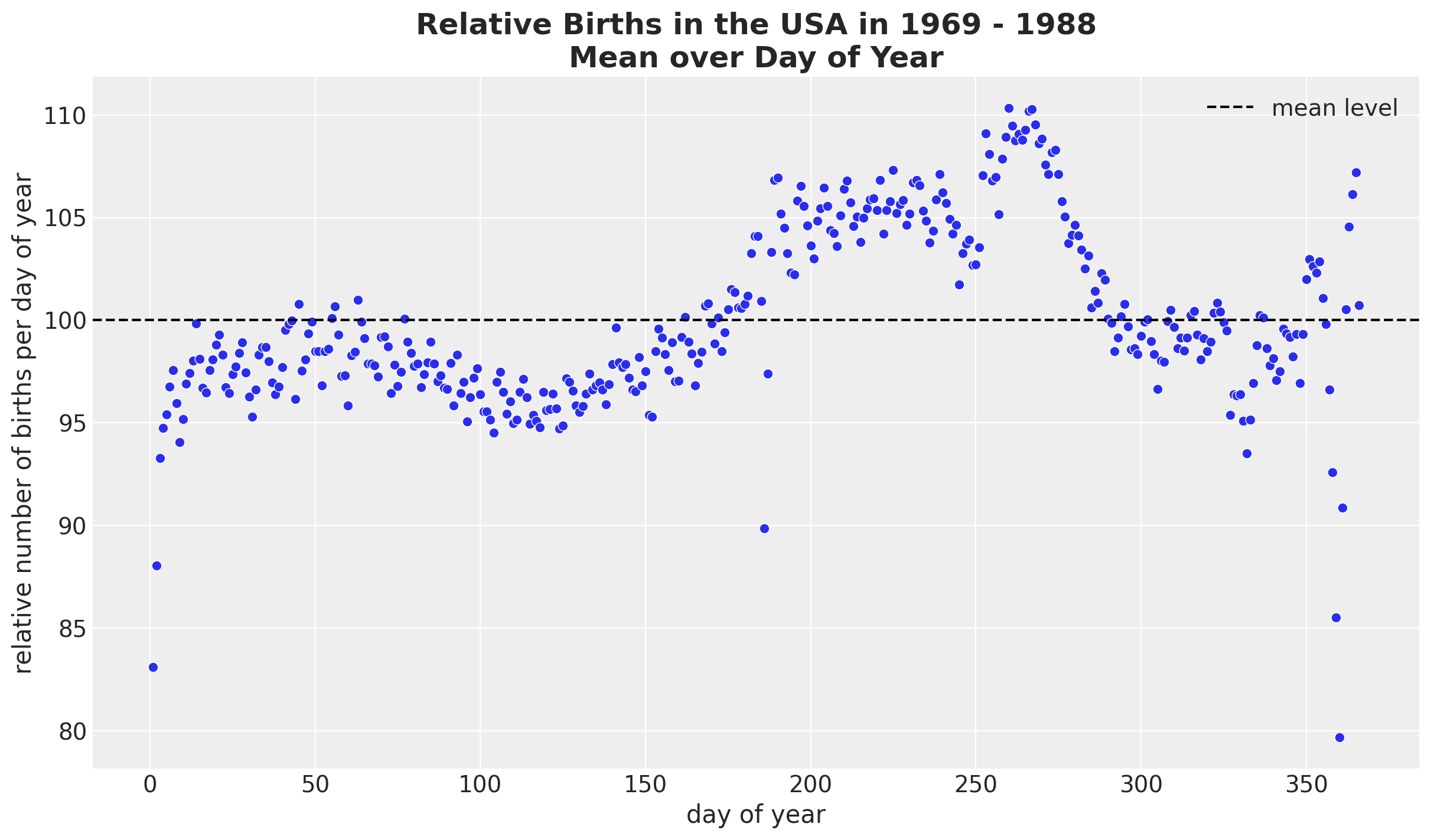
总体而言,我们看到的行为相对平稳,除了某些节假日(阵亡将士纪念日、感恩节和劳动节)和新年第一天。
接下来,我们按月和年进行拆分,以查看我们是否能发现随着时间的推移模式中的任何变化。
fig, ax = plt.subplots()
(
    data_df.groupby(["year", "month"], as_index=False)
    .agg(meanbirths=("births_relative100", "mean"))
    .assign(month=lambda x: pd.Categorical(x["month"]))
    .pipe(
        (sns.lineplot, "data"),
        x="year",
        y="meanbirths",
        marker="o",
        markersize=7,
        hue="month",
        palette="tab20",
    )
)
ax.xaxis.set_major_locator(MaxNLocator(integer=True))
ax.legend(title="month", loc="center left", bbox_to_anchor=(1, 0.5))
ax.set(xlabel="year", ylabel="relative number of births")
ax.set_title(
    label="Relative Births in the USA in 1969 - 1988\nMean over Month and Year",
    fontsize=18,
    fontweight="bold",
);
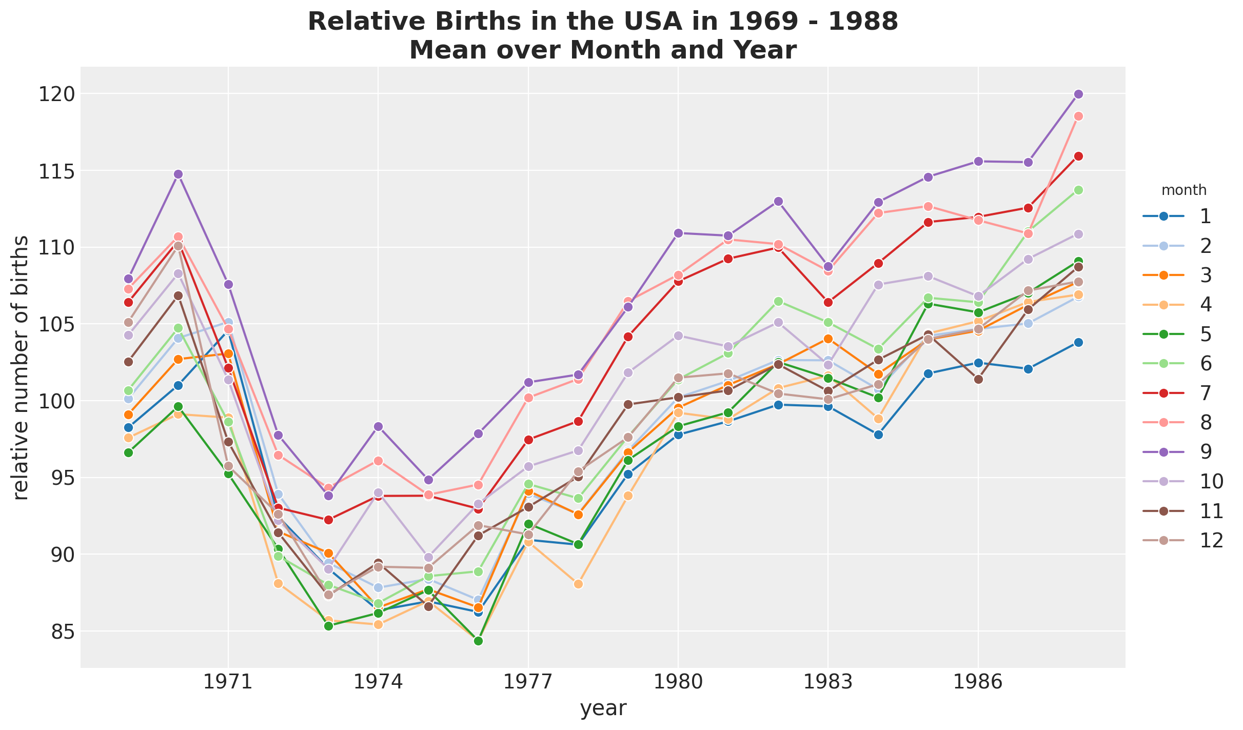
除了全球趋势外,我们没有看到月份之间有任何明显的差异。
我们继续研究每周的季节性。
fig, ax = plt.subplots()
(
    sns.lineplot(
        data=data_df,
        x="day_of_week",
        y="births_relative100",
        marker="o",
        c="C0",
        markersize=10,
        ax=ax,
    )
)
ax.axhline(100, color="black", linestyle="--", label="mean level")
ax.legend()
ax.set(xlabel="day of week", ylabel="relative number of births per day of week")
ax.set_title(
    label="Relative Births in the USA in 1969 - 1988\nMean over Day of Week",
    fontsize=18,
    fontweight="bold",
);
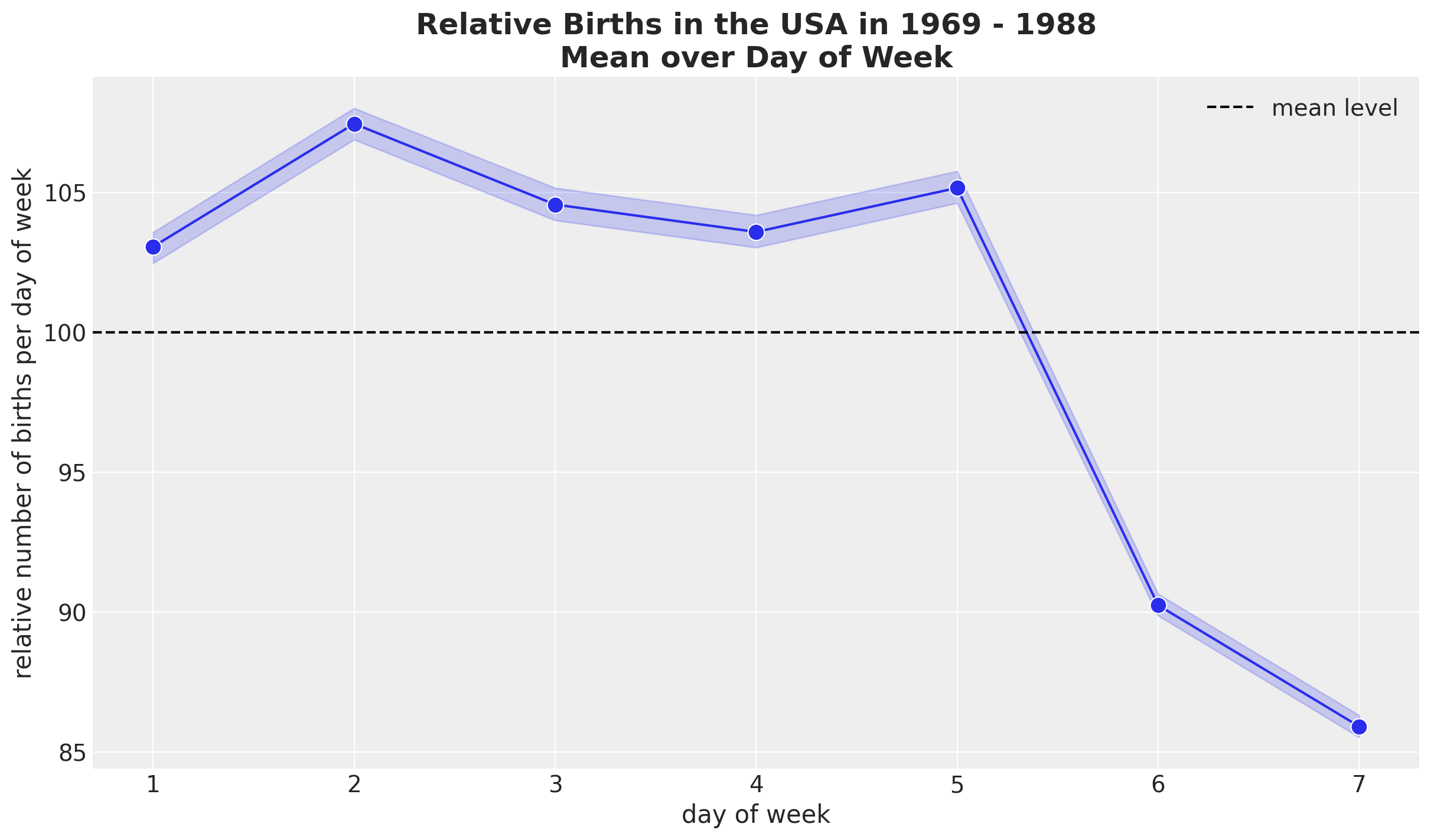
似乎周末的平均出生人数较少。
EDA 总结
让我们总结一下EDA的主要发现:
存在一个明显的非线性长期趋势。
有一个明显的平滑年度季节性变化,直到一些特殊节日和年底的下降。
存在明显的每周季节性。
数据预处理#
在对数据和模型要捕捉的模式有了更好的理解之后,我们可以继续对数据进行预处理。
提取相关特征
n = data_df.shape[0]
time = data_df["time"].to_numpy()
date = data_df["date"].to_numpy()
year = data_df["year"].to_numpy()
day_of_week_idx, day_of_week = data_df["day_of_week"].factorize(sort=True)
day_of_week_no_monday = day_of_week[day_of_week != 1]
day_of_year2_idx, day_of_year2 = data_df["day_of_year2"].factorize(sort=True)
births_relative100 = data_df["births_relative100"].to_numpy()
data_df.head(10)
| year | month | day | births | day_of_year | day_of_week | id | day_of_year2 | date | births_relative100 | time | |
|---|---|---|---|---|---|---|---|---|---|---|---|
| 0 | 1969 | 1 | 1 | 8486 | 1 | 3 | 1 | 1 | 1969-01-01 | 87.947483 | 0 |
| 1 | 1969 | 1 | 2 | 9002 | 2 | 4 | 2 | 2 | 1969-01-02 | 93.295220 | 1 |
| 2 | 1969 | 1 | 3 | 9542 | 3 | 5 | 3 | 3 | 1969-01-03 | 98.891690 | 2 |
| 3 | 1969 | 1 | 4 | 8960 | 4 | 6 | 4 | 4 | 1969-01-04 | 92.859939 | 3 |
| 4 | 1969 | 1 | 5 | 8390 | 5 | 7 | 5 | 5 | 1969-01-05 | 86.952555 | 4 |
| 5 | 1969 | 1 | 6 | 9560 | 6 | 1 | 6 | 6 | 1969-01-06 | 99.078239 | 5 |
| 6 | 1969 | 1 | 7 | 9738 | 7 | 2 | 7 | 7 | 1969-01-07 | 100.923001 | 6 |
| 7 | 1969 | 1 | 8 | 9734 | 8 | 3 | 8 | 8 | 1969-01-08 | 100.881546 | 7 |
| 8 | 1969 | 1 | 9 | 9434 | 9 | 4 | 9 | 9 | 1969-01-09 | 97.772396 | 8 |
| 9 | 1969 | 1 | 10 | 10042 | 10 | 5 | 10 | 10 | 1969-01-10 | 104.073606 | 9 |
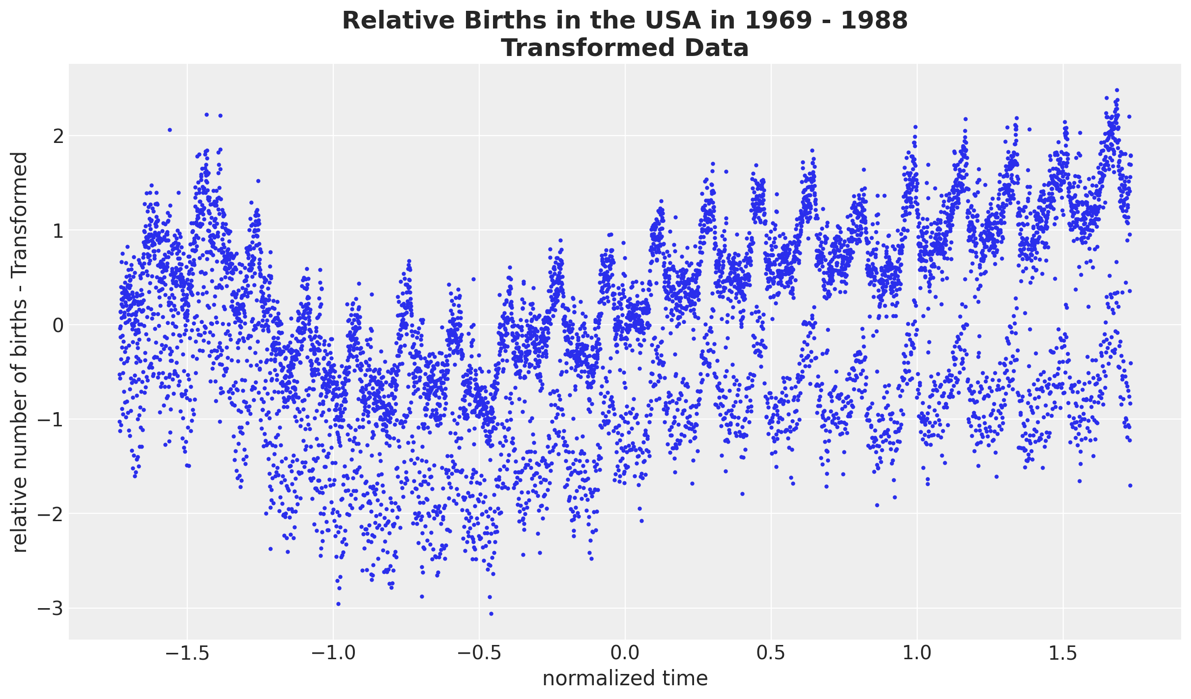
我们希望在相对出生率的归一化对数尺度上进行工作。这样做的理由是为了在一个更容易设置先验(缩放空间)的尺度上工作,并且减少异方差性(对数变换)。
# we want to use the scale of the data size to set up the priors.
# we are mainly interested in the standard deviation.
time_pipeline = Pipeline(steps=[("scaler", StandardScaler())])
time_pipeline.fit(time.reshape(-1, 1))
normalized_time = time_pipeline.transform(time.reshape(-1, 1)).flatten()
time_std = time_pipeline["scaler"].scale_.item()

# we first take a log transform and then normalize the data.
births_relative100_pipeline = Pipeline(
    steps=[
        ("log", FunctionTransformer(func=np.log, inverse_func=np.exp)),
        ("scaler", StandardScaler()),
    ]
)
births_relative100_pipeline.fit(births_relative100.reshape(-1, 1))
normalized_log_births_relative100 = births_relative100_pipeline.transform(
    births_relative100.reshape(-1, 1)
).flatten()
normalized_log_births_relative100_std = births_relative100_pipeline["scaler"].scale_.item()
fig, ax = plt.subplots()
ax.plot(normalized_time, normalized_log_births_relative100, "o", c="C0", markersize=2)
ax.set(xlabel="normalized time", ylabel="relative number of births - Transformed")
ax.set_title(
    label="Relative Births in the USA in 1969 - 1988\nTransformed Data",
    fontsize=18,
    fontweight="bold",
);
模型规范#
模型组件#
在这个示例笔记本中,我们实现了模型3: 缓慢趋势 + 年度季节性趋势 + 星期几,如[Vehtari, 2022]中所述。上述EDA应该帮助我们理解模型中每个组成部分的动机:
全球趋势。 我们使用带有指数二次核的高斯过程。
多年周期性:我们使用具有周期核的高斯过程。注意到,由于我们在归一化尺度上工作,周期应为
period=365.25 / time_std(而不是period=365.25!)。每周季节性:我们使用正态分布对一周中的某天进行独热编码的值。由于数据是标准化的,特别是围绕零中心化,我们不需要添加截距项。此外,我们将周一的系数设置为零,以避免可识别性问题。
似然性:我们使用高斯分布。
对于所有的高斯过程组件,我们使用希尔伯特空间高斯过程(HSGP)近似。
先验规范#
大多数先验信息并不十分丰富。这里唯一棘手的部分是考虑到我们正在处理相对出生数据的标准化对数尺度。例如,对于全球趋势,我们使用具有指数二次核的高斯过程。我们使用以下先验信息来确定长度尺度:
fig, ax = plt.subplots()
pz.LogNormal(mu=np.log(700 / time_std), sigma=1).plot_pdf(ax=ax)
ax.set(xlim=(None, 4))
ax.set_title(
    label="Prior distribution for the global trend Gaussian process",
    fontsize=18,
    fontweight="bold",
);
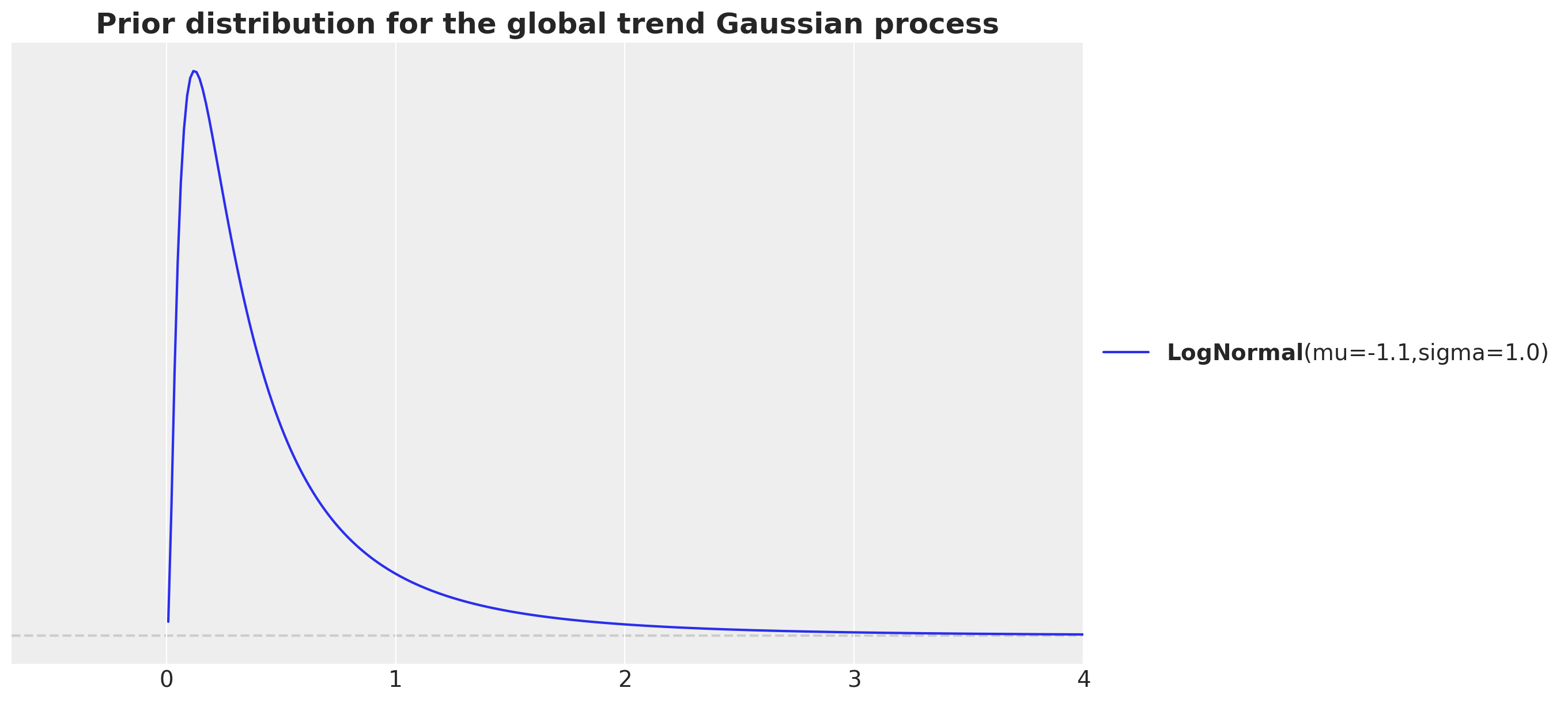
我们的动机是我们有大约\(7.3\)K的数据点,我们希望在归一化尺度上考虑数据点之间的距离。这就是我们考虑比率7_000 / time_str的原因。请注意,我们希望捕捉长期趋势,因此我们希望考虑的长度尺度应大于数据点之间的距离。我们通过除以\(10\)来增加数量级的顺序。最后,由于LogNormal分布具有正支持并且是长度尺度的常见选择,我们对结果量700 / time_str进行对数变换,以确保先验的均值接近此值。
模型实现#
我们现在在 PyMC 中指定模型。
coords = {
    "time": time,
    "day_of_week_no_monday": day_of_week_no_monday,
    "day_of_week": day_of_week,
    "day_of_year2": day_of_year2,
}

with pm.Model(coords=coords) as model:
    # --- Data Containers ---

    normalized_time_data = pm.Data(
        name="normalized_time_data", value=normalized_time, mutable=False, dims="time"
    )

    day_of_week_idx_data = pm.Data(
        name="day_of_week_idx_data", value=day_of_week_idx, mutable=False, dims="time"
    )
    normalized_log_births_relative100_data = pm.Data(
        name="log_births_relative100",
        value=normalized_log_births_relative100,
        mutable=False,
        dims="time",
    )

    # --- Priors ---

    # global trend
    amplitude_trend = pm.HalfNormal(name="amplitude_trend", sigma=1.0)
    ls_trend = pm.LogNormal(name="ls_trend", mu=np.log(700 / time_std), sigma=1)
    cov_trend = amplitude_trend * pm.gp.cov.ExpQuad(input_dim=1, ls=ls_trend)
    gp_trend = pm.gp.HSGP(m=[20], c=1.5, cov_func=cov_trend)
    f_trend = gp_trend.prior(name="f_trend", X=normalized_time_data[:, None], dims="time")

    ## year periodic
    amplitude_year_periodic = pm.HalfNormal(name="amplitude_year_periodic", sigma=1)
    ls_year_periodic = pm.LogNormal(name="ls_year_periodic", mu=np.log(7_000 / time_std), sigma=1)
    gp_year_periodic = pm.gp.HSGPPeriodic(
        m=20,
        scale=amplitude_year_periodic,
        cov_func=pm.gp.cov.Periodic(input_dim=1, period=365.25 / time_std, ls=ls_year_periodic),
    )
    f_year_periodic = gp_year_periodic.prior(
        name="f_year_periodic", X=normalized_time_data[:, None], dims="time"
    )

    ## day of week
    b_day_of_week_no_monday = pm.Normal(
        name="b_day_of_week_no_monday", sigma=1, dims="day_of_week_no_monday"
    )

    b_day_of_week = pm.Deterministic(
        name="b_day_of_week",
        var=pt.concatenate(([0], b_day_of_week_no_monday)),
        dims="day_of_week",
    )

    # global noise
    sigma = pm.HalfNormal(name="sigma", sigma=0.5)

    # --- Parametrization ---
    mu = pm.Deterministic(
        name="mu",
        var=f_trend
        + f_year_periodic
        + b_day_of_week[day_of_week_idx_data] * (day_of_week_idx_data > 0),
        dims="time",
    )

    # --- Likelihood ---
    pm.Normal(
        name="likelihood",
        mu=mu,
        sigma=sigma,
        observed=normalized_log_births_relative100_data,
        dims="time",
    )

pm.model_to_graphviz(model=model)

提示
有一种替代的星期几参数化方法,如[Orduz, 2024]中所述。我们可以使用ZeroSumNormal分布通过工作日之间的相对差异来进行参数化。我们只需将先验b_day_of_week替换为:
b_day_of_week = pm.ZeroSumNormal(name="b_day_of_week", sigma=1, dims="day_of_week")
先验预测检查#
我们使用先验预测检查来运行模型,以查看模型是否能够生成与数据相似尺度的数据。
with model:
    prior_predictive = pm.sample_prior_predictive(samples=2_000, random_seed=rng)
Sampling: [amplitude_trend, amplitude_year_periodic, b_day_of_week_no_monday, f_trend_hsgp_coeffs_, f_year_periodic_hsgp_coeffs_, likelihood, ls_trend, ls_year_periodic, sigma]
fig, ax = plt.subplots()
az.plot_ppc(data=prior_predictive, group="prior", kind="kde", ax=ax)
ax.set_title(label="Prior Predictive", fontsize=18, fontweight="bold");
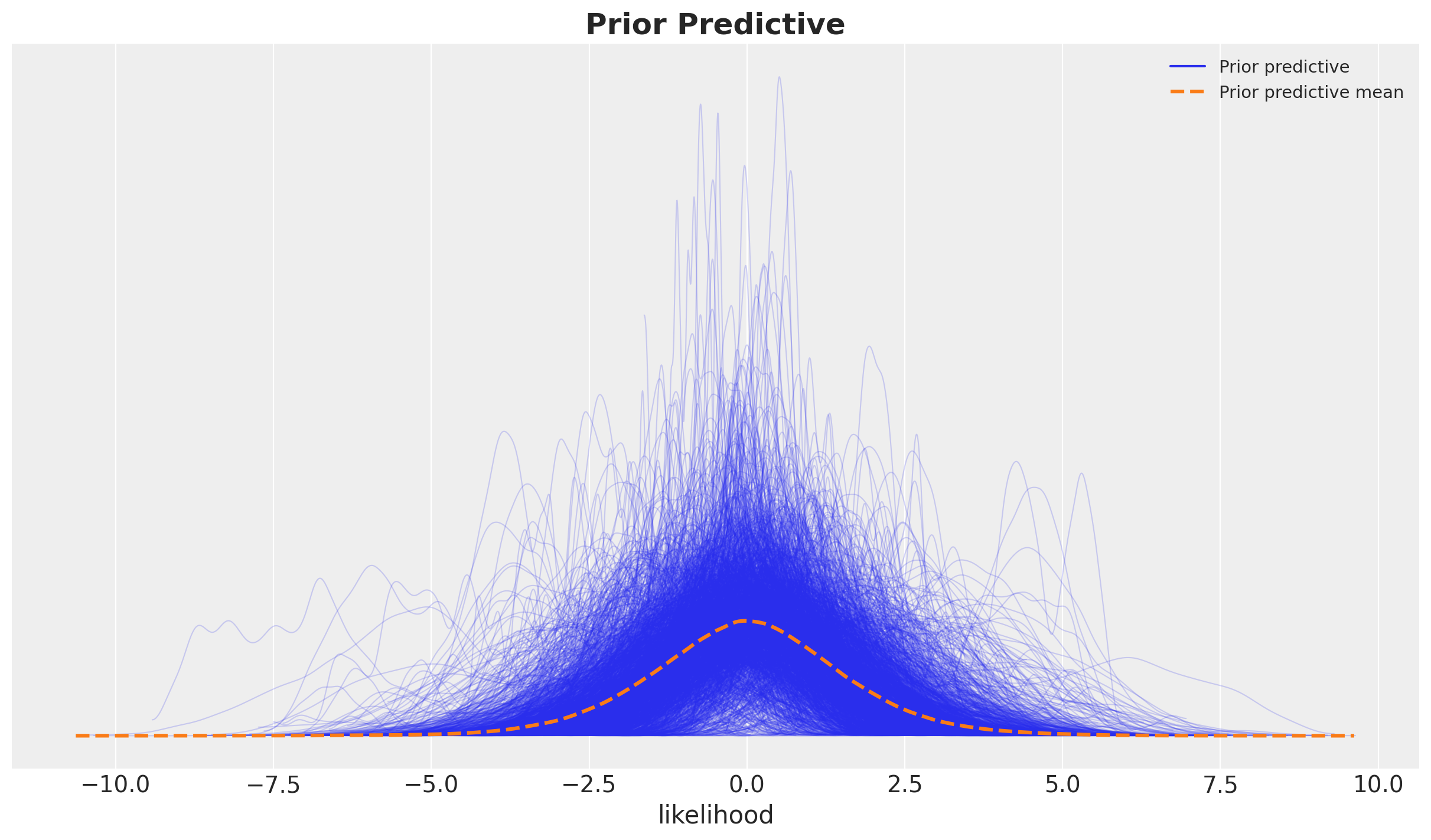
它看起来非常合理,因为先验样本在观测数据的合理范围内。
模型拟合与诊断#
我们现在使用NumPyro采样器来拟合模型。在本地运行模型大约需要\(5\)分钟(Intel MacBook Pro,\(4\)核,\(16\) GB内存)。
with model:
    idata = pm.sample(
        target_accept=0.9,
        draws=2_000,
        chains=4,
        nuts_sampler="numpyro",
        random_seed=rng,
    )
    idata.extend(pm.sample_posterior_predictive(trace=idata, random_seed=rng))
Sampling: [likelihood]
诊断#
我们没有看到任何发散或非常高的r-hat值:
idata["sample_stats"]["diverging"].sum().item()
0
var_names = [
    "amplitude_trend",
    "ls_trend",
    "amplitude_year_periodic",
    "ls_year_periodic",
    "b_day_of_week_no_monday",
    "sigma",
]

az.summary(data=idata, var_names=var_names, round_to=3)
| mean | sd | hdi_3% | hdi_97% | mcse_mean | mcse_sd | ess_bulk | ess_tail | r_hat | |
|---|---|---|---|---|---|---|---|---|---|
| amplitude_trend | 0.449 | 0.217 | 0.160 | 0.843 | 0.004 | 0.003 | 2285.167 | 3955.338 | 1.002 |
| ls_trend | 0.207 | 0.039 | 0.133 | 0.273 | 0.001 | 0.001 | 2335.080 | 1918.541 | 1.002 |
| amplitude_year_periodic | 0.997 | 0.146 | 0.749 | 1.272 | 0.005 | 0.003 | 852.840 | 1850.789 | 1.003 |
| ls_year_periodic | 0.151 | 0.013 | 0.127 | 0.177 | 0.000 | 0.000 | 1343.954 | 2863.197 | 1.006 |
| b_day_of_week_no_monday[2] | 0.356 | 0.014 | 0.328 | 0.383 | 0.000 | 0.000 | 4972.172 | 5667.910 | 1.000 |
| b_day_of_week_no_monday[3] | 0.125 | 0.014 | 0.099 | 0.152 | 0.000 | 0.000 | 4879.317 | 5806.933 | 1.001 |
| b_day_of_week_no_monday[4] | 0.040 | 0.015 | 0.013 | 0.068 | 0.000 | 0.000 | 4835.465 | 5425.332 | 1.001 |
| b_day_of_week_no_monday[5] | 0.172 | 0.014 | 0.145 | 0.199 | 0.000 | 0.000 | 4841.564 | 6091.857 | 1.000 |
| b_day_of_week_no_monday[6] | -1.108 | 0.014 | -1.135 | -1.081 | 0.000 | 0.000 | 4854.558 | 5582.573 | 1.002 |
| b_day_of_week_no_monday[7] | -1.525 | 0.014 | -1.553 | -1.499 | 0.000 | 0.000 | 4764.057 | 5827.166 | 1.000 |
| sigma | 0.331 | 0.003 | 0.325 | 0.336 | 0.000 | 0.000 | 14065.037 | 5381.733 | 1.001 |
我们也可以查看轨迹图。
axes = az.plot_trace(
    data=idata,
    var_names=var_names,
    compact=True,
    backend_kwargs={"figsize": (15, 12), "layout": "constrained"},
)
plt.gcf().suptitle("Model Trace", fontsize=18, fontweight="bold");
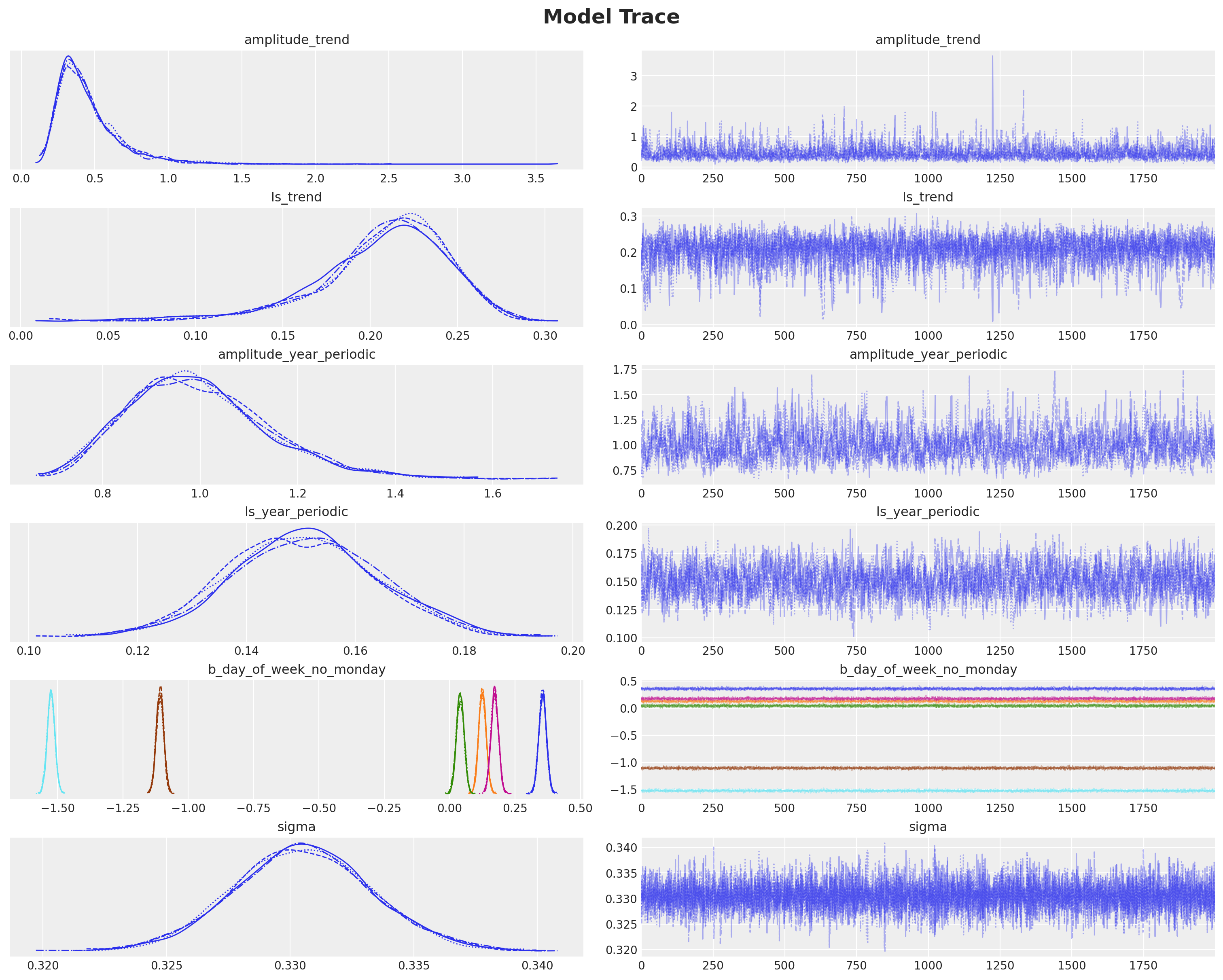
注意
观察我们得到与博客文章[Vehtari, 2022]中模型3:慢趋势+年度季节性趋势+星期几相同的结果。
后验分布分析#
现在我们想要深入研究模型及其组件的后验分布。我们希望在原始尺度上进行此操作。因此,第一步是将后验样本转换回原始尺度。为此,我们使用以下实用函数(代码不重要)。
Show code cell source
def apply_fn_along_dims(fn: Callable, a: xr.DataArray, dim: str) -> xr.DataArray:
    """Apply a function along a specific dimension.

    We need to expand the dimensions of the input array to make it compatible with the
    function which we assume acts on a matrix.
    """
    return xr.apply_ufunc(
        fn,
        a.expand_dims(
            dim={"_": 1}, axis=-1
        ),  # The auxiliary dimension `_` is used to broadcast the function.
        input_core_dims=[[dim, "_"]],
        output_core_dims=[[dim, "_"]],
        vectorize=True,
    ).squeeze(dim="_")
模型组件
pp_vars_original_scale = {
    var_name: apply_fn_along_dims(
        fn=births_relative100_pipeline.inverse_transform,
        a=idata["posterior"][var_name],
        dim="time",
    )
    for var_name in ["f_trend", "f_year_periodic"]
}
似然
pp_likelihood_original_scale = apply_fn_along_dims(
    fn=births_relative100_pipeline.inverse_transform,
    a=idata["posterior_predictive"]["likelihood"],
    dim="time",
)
我们首先绘制似然图。
Show code cell source
fig, ax = plt.subplots(figsize=(15, 9))
sns.scatterplot(data=data_df, x="date", y="births_relative100", c="C0", s=8, label="data", ax=ax)
ax.axhline(100, color="black", linestyle="--", label="mean level")
az.plot_hdi(
    x=date,
    y=pp_likelihood_original_scale,
    hdi_prob=0.94,
    color="C1",
    fill_kwargs={"alpha": 0.2, "label": r"likelihood $94\%$ HDI"},
    smooth=False,
    ax=ax,
)
az.plot_hdi(
    x=date,
    y=pp_likelihood_original_scale,
    hdi_prob=0.5,
    color="C1",
    fill_kwargs={"alpha": 0.6, "label": r"likelihood $50\%$ HDI"},
    smooth=False,
    ax=ax,
)

ax.legend(loc="upper center", bbox_to_anchor=(0.5, -0.07), ncol=4)
ax.set(xlabel="date", ylabel="relative number of births")
ax.set_title(
    label="""Relative Births in the USA in 1969 - 1988
    Posterior Predictive (Likelihood)""",
    fontsize=18,
    fontweight="bold",
);
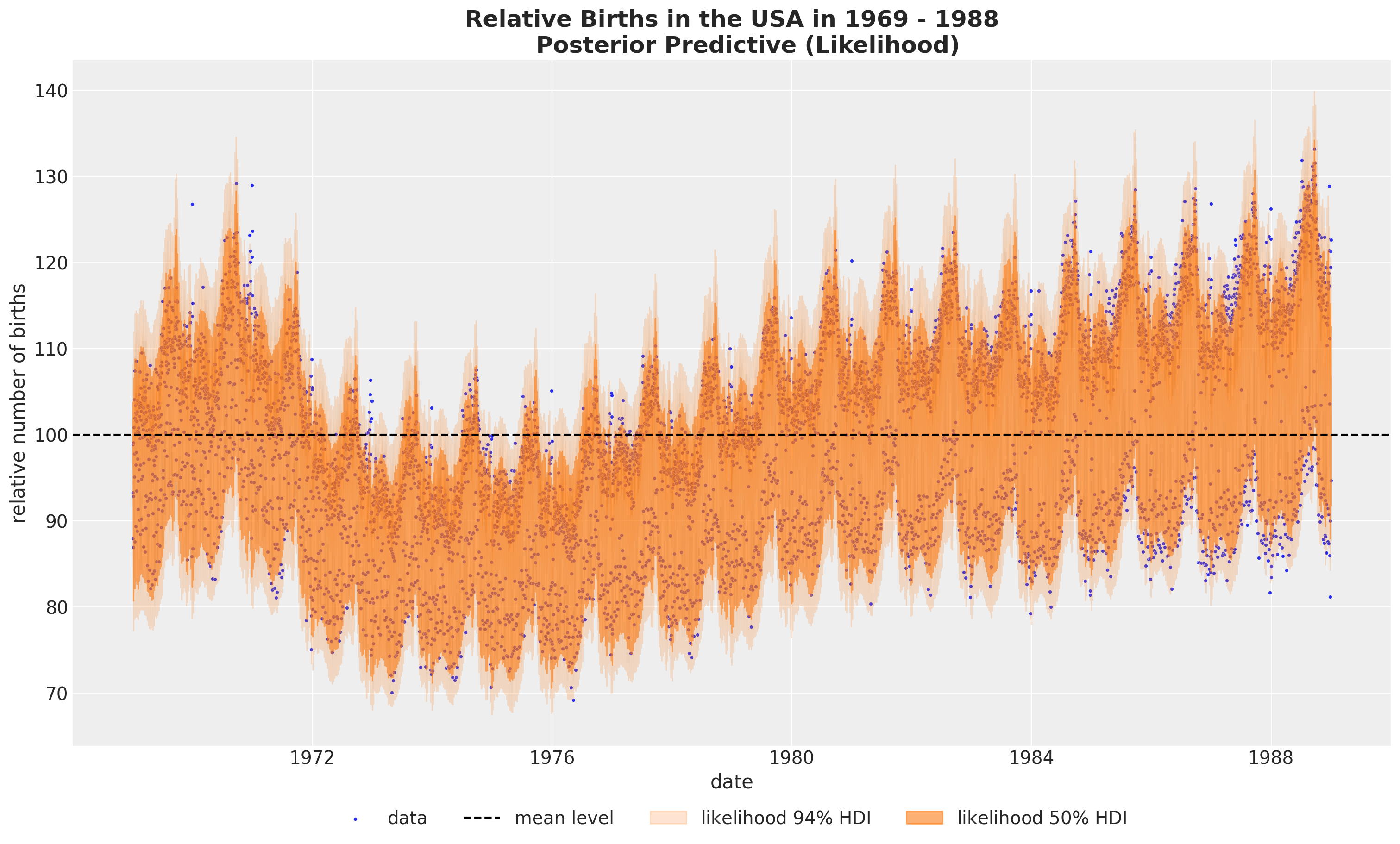
看起来我们正在捕捉全局变化。让我们查看后验分布图,以更好地理解模型。
fig, ax = plt.subplots()
az.plot_ppc(
    data=idata,
    num_pp_samples=1_000,
    observed_rug=True,
    random_seed=seed,
    ax=ax,
)
ax.set_title(label="Posterior Predictive", fontsize=18, fontweight="bold");
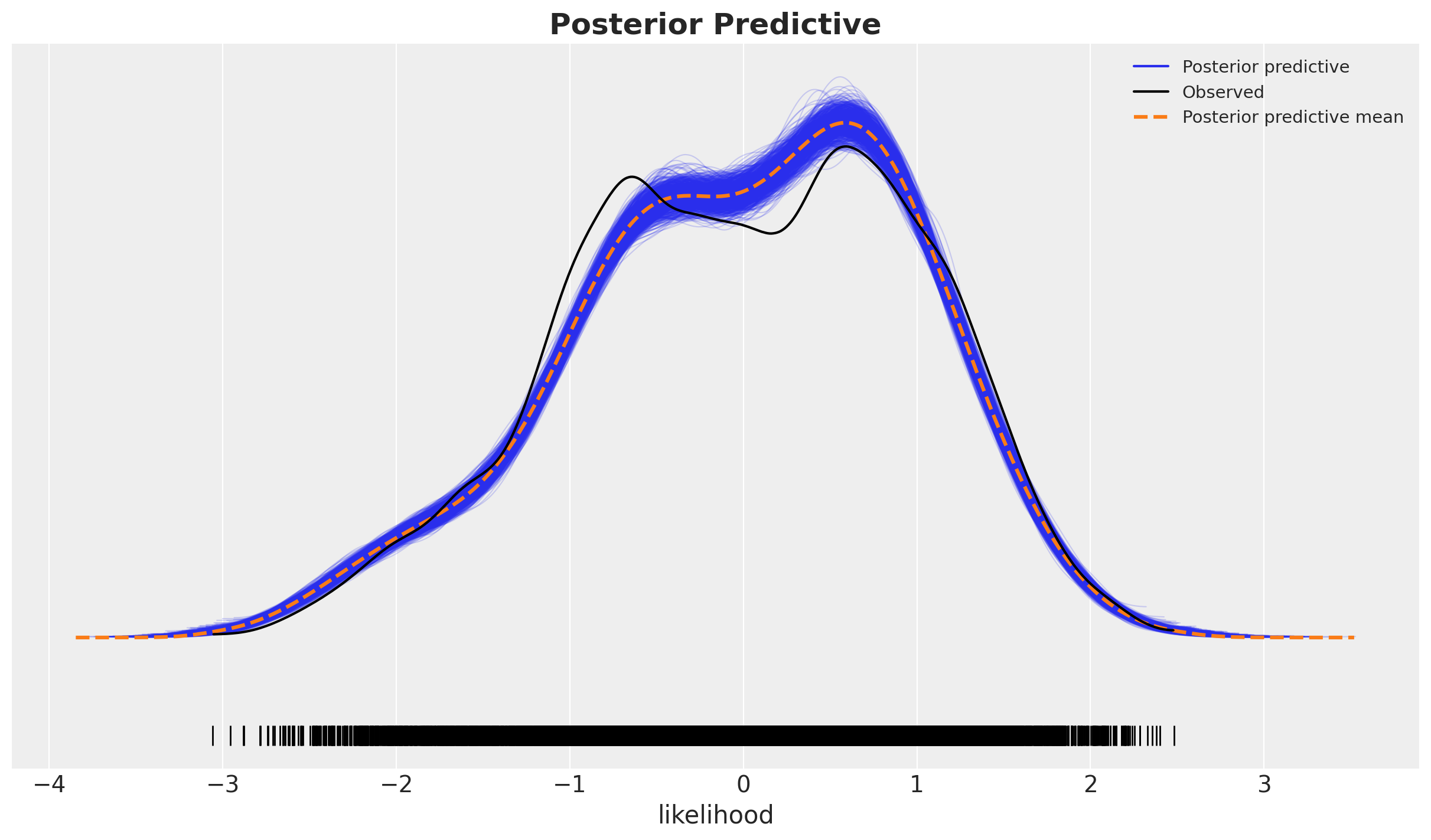
这看起来并不太好,因为在后验分布的主体部分,黑色线条和蓝色阴影之间存在相当大的差异,尾部看起来还不错。这表明我们可能遗漏了一些协变量。我们在后面的更复杂的模型中探讨了这一点。
为了更好地理解模型的拟合情况,我们需要查看各个组成部分。
模型组件#
接下来,我们可视化模型的每个主要组件。我们编写一个实用函数来完成此操作。
Show code cell source
def plot_component(
    component_name: str, color: str, component_label: str
) -> tuple[plt.Figure, plt.Axes]:
    fig, ax = plt.subplots(figsize=(15, 9))
    sns.scatterplot(
        data=data_df, x="date", y="births_relative100", c="C0", s=8, label="data", ax=ax
    )
    ax.axhline(100, color="black", linestyle="--", label="mean level")
    az.plot_hdi(
        x=date,
        y=pp_vars_original_scale[component_name],
        hdi_prob=0.94,
        color=color,
        fill_kwargs={"alpha": 0.2, "label": rf"{component_label} $94\%$ HDI"},
        smooth=False,
        ax=ax,
    )
    az.plot_hdi(
        x=date,
        y=pp_vars_original_scale[component_name],
        hdi_prob=0.5,
        color=color,
        fill_kwargs={"alpha": 0.6, "label": rf"{component_label} $50\%$ HDI"},
        smooth=False,
        ax=ax,
    )
    ax.legend(loc="upper center", bbox_to_anchor=(0.5, -0.07), ncol=4)
    ax.set(xlabel="date", ylabel="relative number of births")
    ax.set_title(
        label="""Relative Births in the USA in 1969-1988
        Posterior Predictive (Global Trend)""",
        fontsize=18,
        fontweight="bold",
    )
    return fig, ax
全球趋势#
fig, ax = plot_component(component_name="f_trend", color="C3", component_label="$f_{trend}$")
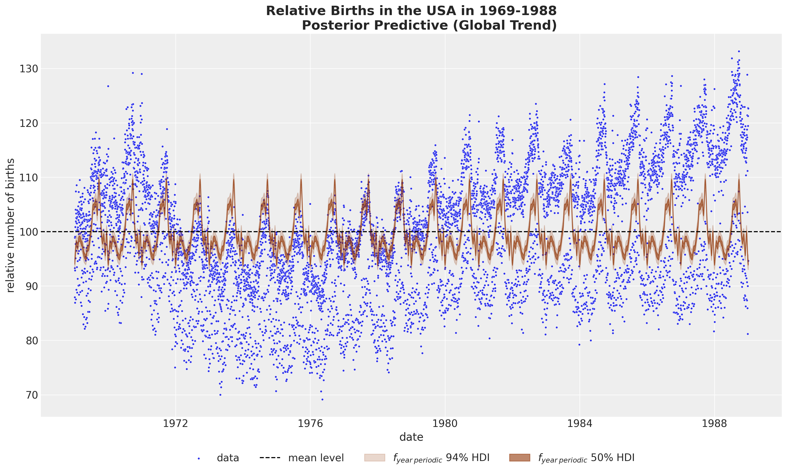
年度周期性#
fig, ax = plot_component(
    component_name="f_year_periodic",
    color="C4",
    component_label=r"$f_{year \: periodic}$",
)
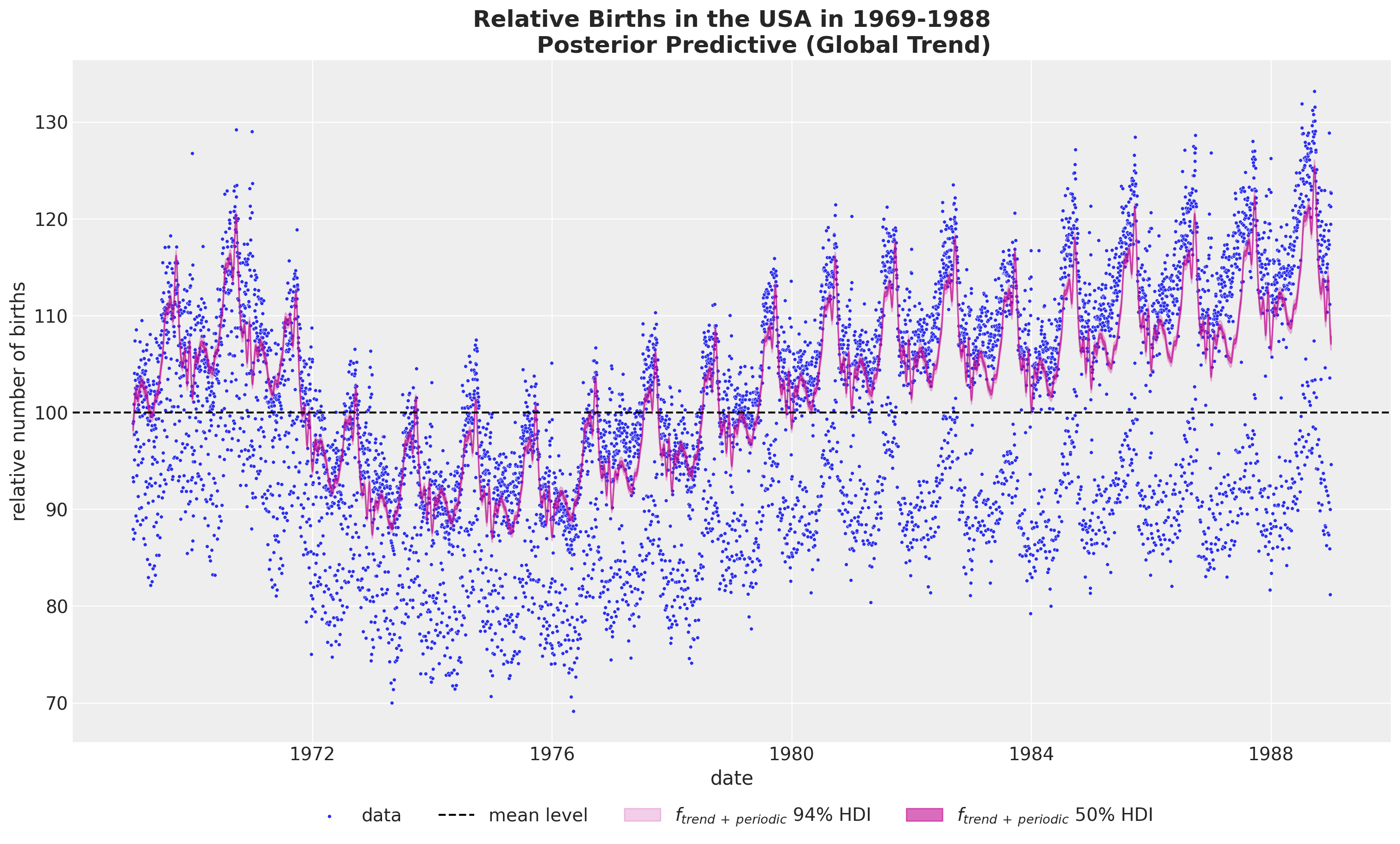
全球趋势加上年度周期性#
如果我们想要结合全球趋势和年度周期性,我们不能简单地在原始尺度上将这些成分相加,因为这样会将平均项加两次。相反,我们需要先对后验样本进行求和,然后再进行逆变换(这些操作不可交换!)。
pp_vars_original_scale["f_trend_periodic"] = apply_fn_along_dims(
    fn=births_relative100_pipeline.inverse_transform,
    a=idata["posterior"]["f_trend"] + idata["posterior"]["f_year_periodic"],
    dim="time",
)

fig, ax = plot_component(
    component_name="f_trend_periodic",
    color="C3",
    component_label=r"$f_{trend \: + \: periodic}$",
)
结论#
我们希望您能更好地理解HSGPs以及如何在实践中使用非常方便的PyMC的API来应用它们。能够将GPs战略性地融入到更大的模型中是非常棒的。虽然使用GPs是“可能”的,但HSGPs使这实际上成为可能。原因在于,每个GP组件的复杂性通过从\(\mathcal{O}(n^3)\)到\(\mathcal{O}(nm + m)\)的近似降低了,其中\(m\)是近似中使用的基函数的数量。这是一个巨大的加速!
HSGP 限制
请记住,HSGPs并不是万能的。
在实践中,这并不是一个很大的限制,因为大多数情况下我们处理的是平稳协方差和低输入维度。
在未来的笔记本中,我们将展示一个更完整的模型,以与Vehtari的结果进行比较。敬请期待!
致谢#
我想感谢Alex Andorra和Bill Engels在本笔记本编写过程中提供的宝贵反馈和建议。
参考资料#
安德鲁·格尔曼, 约翰·B·卡林, 哈尔·S·斯特恩, 大卫·B·邓森, 阿基·维塔里, 和唐纳德·B·鲁宾. 贝叶斯数据分析. 查普曼和霍尔/CRC, 2013.
Arno Solin 和 Simo Särkkä。基于希尔伯特空间方法的降秩高斯过程回归。统计与计算,30(2):419–446,2020。URL: https://doi.org/10.1007/s11222-019-09886-w,doi:10.1007/s11222-019-09886-w。
Aki Vehtari. 贝叶斯工作流程书籍 - 生日。2022年。URL: https://avehtari.github.io/casestudies/Birthdays/birthdays.html(访问于2022-03-07)。
加布里埃尔·里乌托-马约尔,保罗-克里斯蒂安·比尔克纳,迈克尔·R·安德森,阿尔诺·索林,和阿基·维塔里。实用希尔伯特空间近似贝叶斯高斯过程用于概率编程。统计与计算,33(1):17,2022。URL: https://doi.org/10.1007/s11222-022-10167-2,doi:10.1007/s11222-022-10167-2。
示例:用于高斯过程的希尔伯特空间逼近。URL: https://num.pyro.ai/en/stable/examples/hsgp.html.
Juan Orduz. 使用hsgp进行时间序列建模:婴儿出生示例。2024年。URL: https://juanitorduz.github.io/birthdays/(访问于2024-01-02)。
水印#
%load_ext watermark
%watermark -n -u -v -iv -w -p numpyro,pytensor
Last updated: Fri Mar 29 2024

Python implementation: CPython
Python version       : 3.11.7
IPython version      : 8.20.0

numpyro : 0.14.0
pytensor: 2.19.0

pandas    : 2.1.4
preliz    : 0.4.1
matplotlib: 3.8.2
pytensor  : 2.19.0
pymc      : 5.12.0
seaborn   : 0.13.2
numpy     : 1.26.3
xarray    : 2024.2.0
arviz     : 0.17.1

Watermark: 2.4.3