


样条曲线#
介绍#
通常,我们想要拟合的模型并不是在某些\(x\)和\(y\)之间的一条完美直线。 相反,模型的参数预计会随着\(x\)的变化而变化。 有多种方法可以处理这种情况,其中之一是拟合一个样条。 样条拟合实际上是多个单独曲线(分段多项式)的和,每个曲线拟合\(x\)的不同部分,并在它们的边界处连接在一起,这些边界通常称为节点。
样条曲线实际上是由多条单独的线段组成的,每条线段都拟合了\(x\)的不同部分,这些线段在其边界处连接在一起,通常称为节点。
下面是一个使用PyMC拟合样条的完整工作示例。数据和模型来自Statistical Rethinking 2e,作者是Richard McElreath [McElreath, 2018]。
有关这种非线性建模方法的更多信息,我建议从《Python中的贝叶斯建模与计算》第五章开始 [Martin 等,2021]。
from pathlib import Path

import arviz as az
import matplotlib.pyplot as plt
import numpy as np
import pandas as pd
import pymc as pm

from patsy import dmatrix
%matplotlib inline
%config InlineBackend.figure_format = "retina"

RANDOM_SEED = 8927
az.style.use("arviz-darkgrid")
樱花数据#
这个例子的数据是每年樱花树开花的天数(doy 代表“一年中的天数”)。
为了方便,缺少 doy 的年份被删除了(这在处理缺失数据时通常是一个不好的做法!)。
try:
    blossom_data = pd.read_csv(Path("..", "data", "cherry_blossoms.csv"), sep=";")
except FileNotFoundError:
    blossom_data = pd.read_csv(pm.get_data("cherry_blossoms.csv"), sep=";")


blossom_data.dropna().describe()
| year | doy | temp | temp_upper | temp_lower | |
|---|---|---|---|---|---|
| count | 787.000000 | 787.00000 | 787.000000 | 787.000000 | 787.000000 |
| mean | 1533.395172 | 104.92122 | 6.100356 | 6.937560 | 5.263545 |
| std | 291.122597 | 6.25773 | 0.683410 | 0.811986 | 0.762194 |
| min | 851.000000 | 86.00000 | 4.690000 | 5.450000 | 2.610000 |
| 25% | 1318.000000 | 101.00000 | 5.625000 | 6.380000 | 4.770000 |
| 50% | 1563.000000 | 105.00000 | 6.060000 | 6.800000 | 5.250000 |
| 75% | 1778.500000 | 109.00000 | 6.460000 | 7.375000 | 5.650000 |
| max | 1980.000000 | 124.00000 | 8.300000 | 12.100000 | 7.740000 |
blossom_data = blossom_data.dropna(subset=["doy"]).reset_index(drop=True)
blossom_data.head(n=10)
| year | doy | temp | temp_upper | temp_lower | |
|---|---|---|---|---|---|
| 0 | 812 | 92.0 | NaN | NaN | NaN |
| 1 | 815 | 105.0 | NaN | NaN | NaN |
| 2 | 831 | 96.0 | NaN | NaN | NaN |
| 3 | 851 | 108.0 | 7.38 | 12.10 | 2.66 |
| 4 | 853 | 104.0 | NaN | NaN | NaN |
| 5 | 864 | 100.0 | 6.42 | 8.69 | 4.14 |
| 6 | 866 | 106.0 | 6.44 | 8.11 | 4.77 |
| 7 | 869 | 95.0 | NaN | NaN | NaN |
| 8 | 889 | 104.0 | 6.83 | 8.48 | 5.19 |
| 9 | 891 | 109.0 | 6.98 | 8.96 | 5.00 |
在删除包含缺失数据的行后,有827年的数据记录了树木开花的天数。
blossom_data.shape
(827, 5)
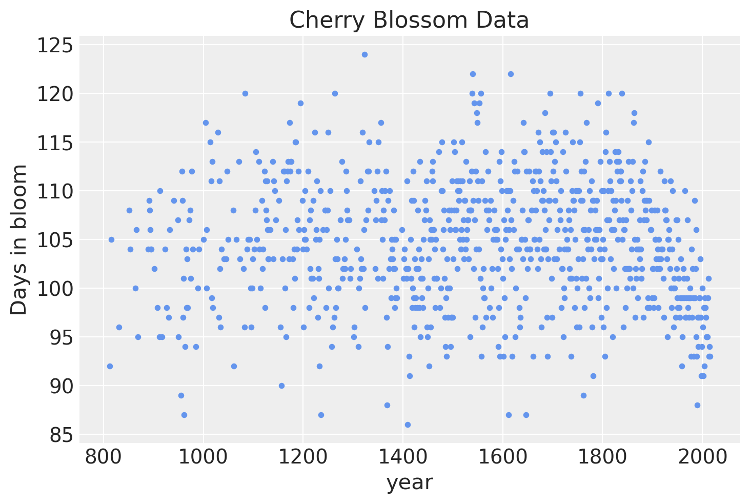
如果我们可视化数据,很明显存在大量的年度变化,但也有一些证据表明开花天数随时间存在非线性趋势。
blossom_data.plot.scatter(
    "year", "doy", color="cornflowerblue", s=10, title="Cherry Blossom Data", ylabel="Days in bloom"
);
模型#
我们将拟合以下模型。
\(D \sim \mathcal{N}(\mu, \sigma)\)
\(\quad \mu = a + Bw\)
\(\qquad a \sim \mathcal{N}(100, 10)\)
\(\qquad w \sim \mathcal{N}(0, 10)\)
\(\quad \sigma \sim \text{Exp}(1)\)
开花天数 \(D\) 将被建模为均值为 \(\mu\) 和标准差为 \(\sigma\) 的正态分布。反过来,均值将是一个由 y 截距 \(a\) 和由基 \(B\) 乘以模型参数 \(w\) 定义的样条组成的线性模型,每个基区域都有一个变量。两者都有相对较弱的正态先验。
准备样条#
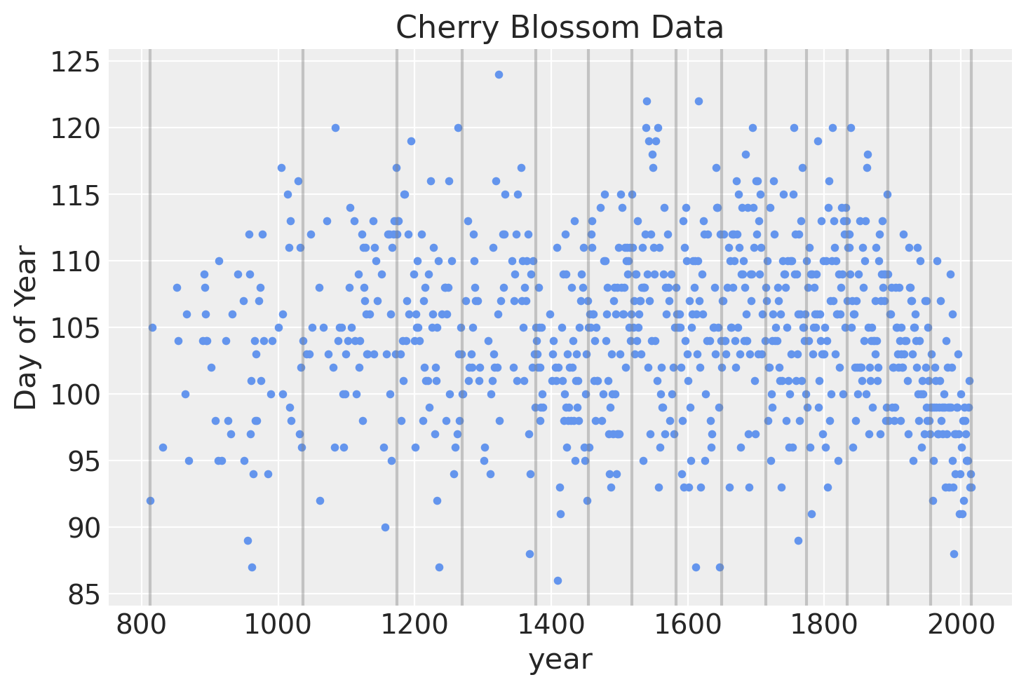
样条将具有15个节点,将年份划分为16个部分(包括覆盖数据前后年份的区域)。节点是样条的边界,名称源于在这些边界处将各个线段连接在一起以形成连续且平滑的曲线。节点将在年份上不均匀分布,使得每个区域具有相同比例的数据。
num_knots = 15
knot_list = np.quantile(blossom_data.year, np.linspace(0, 1, num_knots))
knot_list
array([ 812., 1036., 1174., 1269., 1377., 1454., 1518., 1583., 1650.,
       1714., 1774., 1833., 1893., 1956., 2015.])
下面是结点在数据上位置的图。
blossom_data.plot.scatter(
    "year", "doy", color="cornflowerblue", s=10, title="Cherry Blossom Data", ylabel="Day of Year"
)
for knot in knot_list:
    plt.gca().axvline(knot, color="grey", alpha=0.4);
我们可以使用 patsy 来创建矩阵 \(B\),它将作为回归的 b 样条基。
度数设置为 3 以创建三次 b 样条。
B = dmatrix(
    "bs(year, knots=knots, degree=3, include_intercept=True) - 1",
    {"year": blossom_data.year.values, "knots": knot_list[1:-1]},
)
B
Show code cell output
DesignMatrix with shape (827, 17)
  Columns:
    ['bs(year, knots=knots, degree=3, include_intercept=True)[0]',
     'bs(year, knots=knots, degree=3, include_intercept=True)[1]',
     'bs(year, knots=knots, degree=3, include_intercept=True)[2]',
     'bs(year, knots=knots, degree=3, include_intercept=True)[3]',
     'bs(year, knots=knots, degree=3, include_intercept=True)[4]',
     'bs(year, knots=knots, degree=3, include_intercept=True)[5]',
     'bs(year, knots=knots, degree=3, include_intercept=True)[6]',
     'bs(year, knots=knots, degree=3, include_intercept=True)[7]',
     'bs(year, knots=knots, degree=3, include_intercept=True)[8]',
     'bs(year, knots=knots, degree=3, include_intercept=True)[9]',
     'bs(year, knots=knots, degree=3, include_intercept=True)[10]',
     'bs(year, knots=knots, degree=3, include_intercept=True)[11]',
     'bs(year, knots=knots, degree=3, include_intercept=True)[12]',
     'bs(year, knots=knots, degree=3, include_intercept=True)[13]',
     'bs(year, knots=knots, degree=3, include_intercept=True)[14]',
     'bs(year, knots=knots, degree=3, include_intercept=True)[15]',
     'bs(year, knots=knots, degree=3, include_intercept=True)[16]']
  Terms:
    'bs(year, knots=knots, degree=3, include_intercept=True)' (columns 0:17)
  (to view full data, use np.asarray(this_obj))
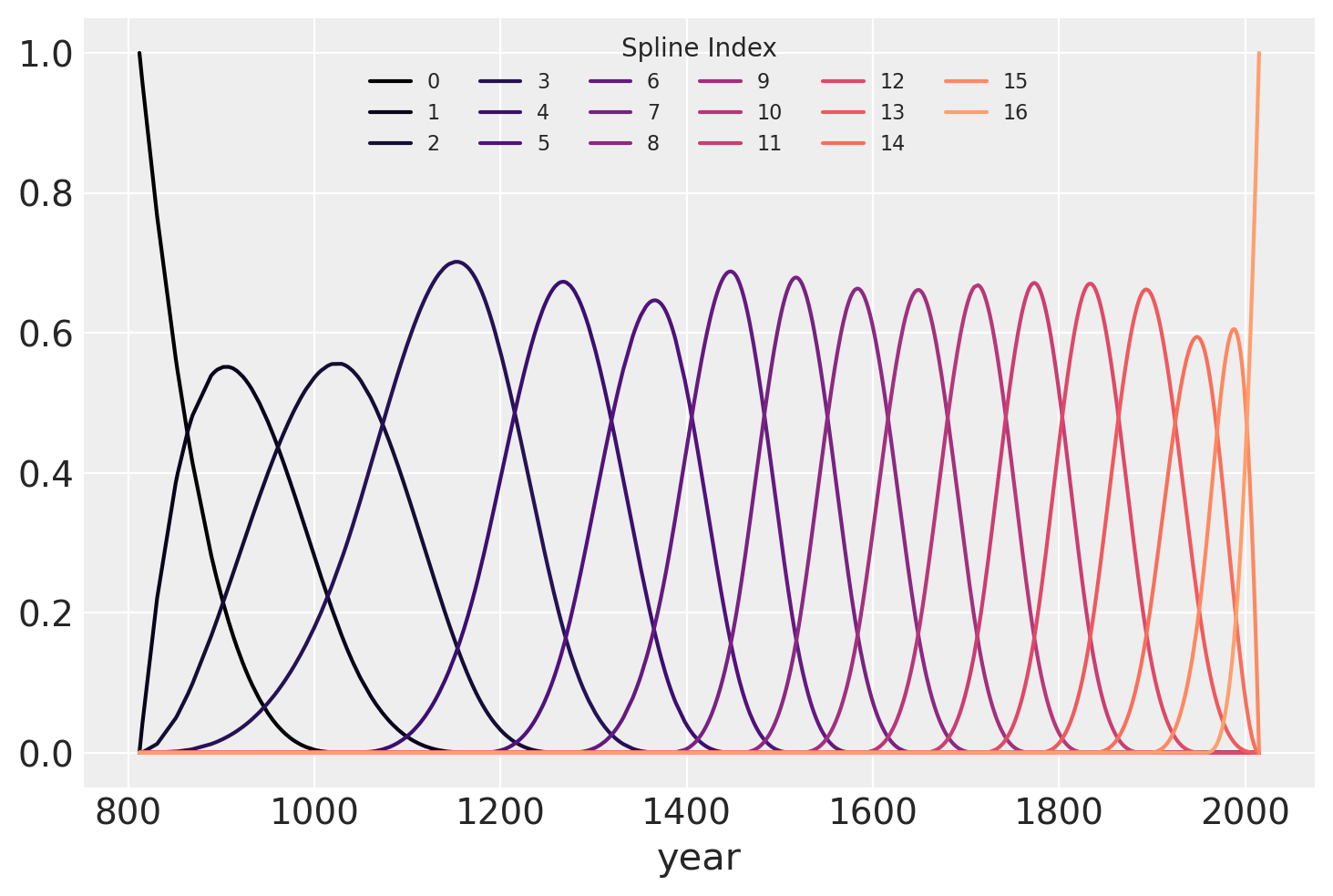
下面绘制了b样条基,显示了样条的每个部分的定义域。每条曲线的高度表示相应的模型协变量(每个样条区域一个)在该区域的模型推断中的影响程度。重叠区域代表节点,展示了从一个区域到下一个区域的平滑过渡是如何形成的。
spline_df = (
    pd.DataFrame(B)
    .assign(year=blossom_data.year.values)
    .melt("year", var_name="spline_i", value_name="value")
)

color = plt.cm.magma(np.linspace(0, 0.80, len(spline_df.spline_i.unique())))

fig = plt.figure()
for i, c in enumerate(color):
    subset = spline_df.query(f"spline_i == {i}")
    subset.plot("year", "value", c=c, ax=plt.gca(), label=i)
plt.legend(title="Spline Index", loc="upper center", fontsize=8, ncol=6);
拟合模型#
最后,可以使用 PyMC 构建模型。图形图显示了模型参数的组织结构(请注意,这需要安装 python-graphviz,我建议在 conda 虚拟环境中进行安装)。
COORDS = {"splines": np.arange(B.shape[1])}
with pm.Model(coords=COORDS) as spline_model:
    a = pm.Normal("a", 100, 5)
    w = pm.Normal("w", mu=0, sigma=3, size=B.shape[1], dims="splines")
    mu = pm.Deterministic("mu", a + pm.math.dot(np.asarray(B, order="F"), w.T))
    sigma = pm.Exponential("sigma", 1)
    D = pm.Normal("D", mu=mu, sigma=sigma, observed=blossom_data.doy, dims="obs")
pm.model_to_graphviz(spline_model)

with spline_model:
    idata = pm.sample_prior_predictive()
    idata.extend(pm.sample(draws=1000, tune=1000, random_seed=RANDOM_SEED, chains=4))
    pm.sample_posterior_predictive(idata, extend_inferencedata=True)
Auto-assigning NUTS sampler...
Initializing NUTS using jitter+adapt_diag...
Multiprocess sampling (4 chains in 4 jobs)
NUTS: [a, w, sigma]
Sampling 4 chains for 1_000 tune and 1_000 draw iterations (4_000 + 4_000 draws total) took 42 seconds.
分析#
现在我们可以分析从模型后验中抽取的结果。
参数估计#
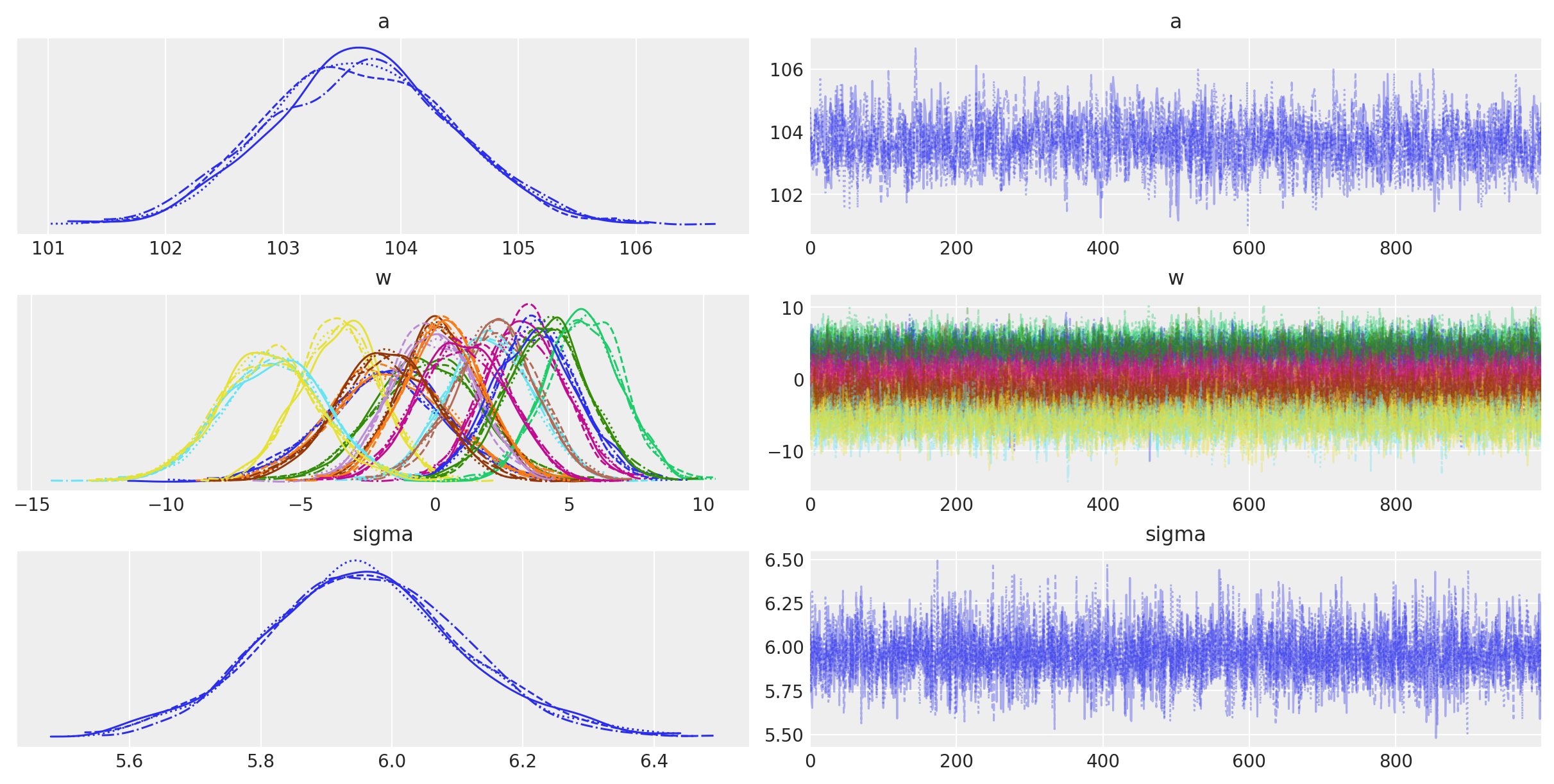
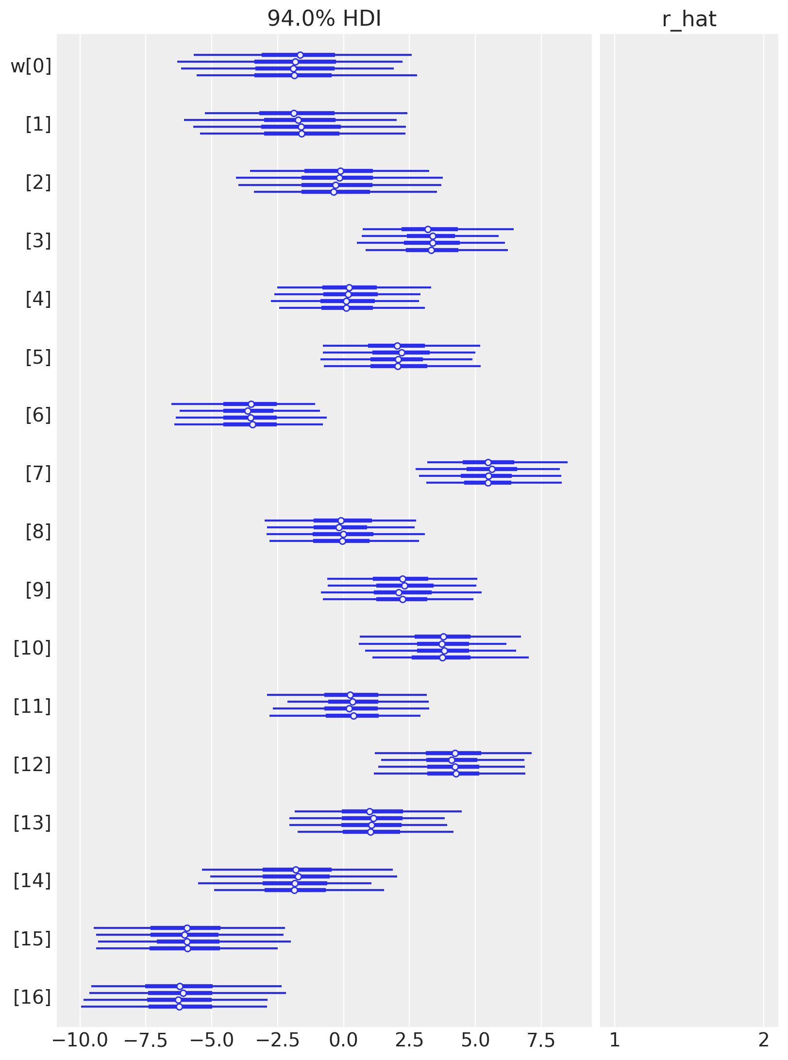
以下是一个表格,总结了模型参数的后验分布。 \(a\) 和 \(\sigma\) 的后验分布非常窄,而 \(w\) 的后验分布则较宽。 这可能是因为所有数据点都用于估计 \(a\) 和 \(\sigma\),而每个 \(w\) 值仅使用了一部分数据点。 (对这些参数进行层次建模,允许信息共享并增加样条的正则化,可能会很有趣。) 有效样本量和 \(\widehat{R}\) 值看起来都很好,表明模型已经收敛,并且很好地从后验分布中进行了采样。
az.summary(idata, var_names=["a", "w", "sigma"])
| mean | sd | hdi_3% | hdi_97% | mcse_mean | mcse_sd | ess_bulk | ess_tail | r_hat | |
|---|---|---|---|---|---|---|---|---|---|
| a | 103.655 | 0.773 | 102.178 | 105.033 | 0.018 | 0.013 | 1776.0 | 2343.0 | 1.0 |
| w[0] | -1.831 | 2.226 | -6.329 | 2.114 | 0.032 | 0.029 | 4970.0 | 3248.0 | 1.0 |
| w[1] | -1.670 | 2.131 | -5.707 | 2.235 | 0.036 | 0.029 | 3572.0 | 3260.0 | 1.0 |
| w[2] | -0.240 | 1.969 | -3.938 | 3.422 | 0.031 | 0.030 | 3970.0 | 3110.0 | 1.0 |
| w[3] | 3.331 | 1.477 | 0.725 | 6.269 | 0.030 | 0.021 | 2518.0 | 2967.0 | 1.0 |
| w[4] | 0.179 | 1.523 | -2.613 | 3.089 | 0.026 | 0.022 | 3357.0 | 3132.0 | 1.0 |
| w[5] | 2.087 | 1.590 | -0.783 | 5.122 | 0.028 | 0.020 | 3234.0 | 2885.0 | 1.0 |
| w[6] | -3.565 | 1.486 | -6.415 | -0.830 | 0.027 | 0.019 | 3056.0 | 2990.0 | 1.0 |
| w[7] | 5.514 | 1.441 | 2.920 | 8.277 | 0.026 | 0.018 | 3069.0 | 3006.0 | 1.0 |
| w[8] | -0.079 | 1.551 | -2.841 | 2.948 | 0.029 | 0.021 | 2905.0 | 3231.0 | 1.0 |
| w[9] | 2.222 | 1.560 | -0.840 | 5.002 | 0.027 | 0.019 | 3469.0 | 3096.0 | 1.0 |
| w[10] | 3.760 | 1.557 | 1.005 | 6.935 | 0.026 | 0.020 | 3481.0 | 2781.0 | 1.0 |
| w[11] | 0.309 | 1.546 | -2.512 | 3.250 | 0.029 | 0.024 | 2808.0 | 2825.0 | 1.0 |
| w[12] | 4.161 | 1.529 | 1.238 | 6.909 | 0.026 | 0.019 | 3383.0 | 3178.0 | 1.0 |
| w[13] | 1.069 | 1.640 | -2.001 | 4.084 | 0.030 | 0.022 | 2957.0 | 3066.0 | 1.0 |
| w[14] | -1.823 | 1.831 | -5.448 | 1.488 | 0.030 | 0.025 | 3770.0 | 2924.0 | 1.0 |
| w[15] | -5.984 | 1.916 | -9.308 | -2.129 | 0.034 | 0.024 | 3239.0 | 3005.0 | 1.0 |
| w[16] | -6.183 | 1.891 | -9.679 | -2.482 | 0.029 | 0.021 | 4211.0 | 2983.0 | 1.0 |
| sigma | 5.958 | 0.150 | 5.663 | 6.239 | 0.002 | 0.001 | 5461.0 | 2769.0 | 1.0 |
模型参数的轨迹图看起来很好(均匀且没有趋势的迹象),进一步表明链已经收敛并混合。
az.plot_trace(idata, var_names=["a", "w", "sigma"]);
az.plot_forest(idata, var_names=["w"], combined=False, r_hat=True);
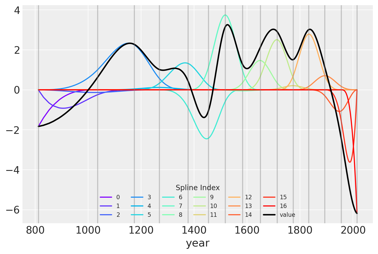
另一种展示拟合样条值的可视化方法是将其与基矩阵相乘后绘制。 节点边界再次以垂直线显示,但现在样条基与\(w\)的值相乘(以彩虹色曲线表示)。\(B\)和\(w\)的点积——线性模型中的实际计算——以黑色显示。
wp = idata.posterior["w"].mean(("chain", "draw")).values

spline_df = (
    pd.DataFrame(B * wp.T)
    .assign(year=blossom_data.year.values)
    .melt("year", var_name="spline_i", value_name="value")
)

spline_df_merged = (
    pd.DataFrame(np.dot(B, wp.T))
    .assign(year=blossom_data.year.values)
    .melt("year", var_name="spline_i", value_name="value")
)


color = plt.cm.rainbow(np.linspace(0, 1, len(spline_df.spline_i.unique())))
fig = plt.figure()
for i, c in enumerate(color):
    subset = spline_df.query(f"spline_i == {i}")
    subset.plot("year", "value", c=c, ax=plt.gca(), label=i)
spline_df_merged.plot("year", "value", c="black", lw=2, ax=plt.gca())
plt.legend(title="Spline Index", loc="lower center", fontsize=8, ncol=6)

for knot in knot_list:
    plt.gca().axvline(knot, color="grey", alpha=0.4);
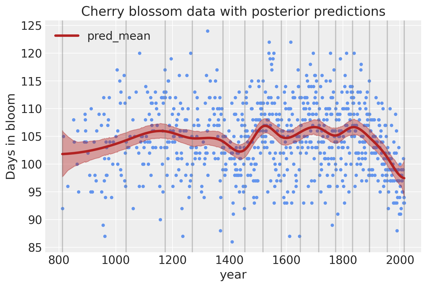
模型预测#
最后,我们可以使用后验预测检查来可视化模型的预测结果。
post_pred = az.summary(idata, var_names=["mu"]).reset_index(drop=True)
blossom_data_post = blossom_data.copy().reset_index(drop=True)
blossom_data_post["pred_mean"] = post_pred["mean"]
blossom_data_post["pred_hdi_lower"] = post_pred["hdi_3%"]
blossom_data_post["pred_hdi_upper"] = post_pred["hdi_97%"]
blossom_data.plot.scatter(
    "year",
    "doy",
    color="cornflowerblue",
    s=10,
    title="Cherry blossom data with posterior predictions",
    ylabel="Days in bloom",
)
for knot in knot_list:
    plt.gca().axvline(knot, color="grey", alpha=0.4)

blossom_data_post.plot("year", "pred_mean", ax=plt.gca(), lw=3, color="firebrick")
plt.fill_between(
    blossom_data_post.year,
    blossom_data_post.pred_hdi_lower,
    blossom_data_post.pred_hdi_upper,
    color="firebrick",
    alpha=0.4,
);
参考资料#
Osvaldo A Martin, Ravin Kumar, 和 Junpeng Lao. Python中的贝叶斯建模与计算. Chapman and Hall/CRC, 2021. doi:10.1201/9781003019169.
理查德·麦克埃尔雷思。统计重构:一个带有R和Stan示例的贝叶斯课程。查普曼和霍尔/CRC,2018年。
水印#
%load_ext watermark
%watermark -n -u -v -iv -w -p pytensor,xarray,patsy
Last updated: Sat Jul 23 2022

Python implementation: CPython
Python version       : 3.10.5
IPython version      : 8.4.0

pytensor: 2.7.5
xarray: 2022.3.0
patsy : 0.5.2

pymc      : 4.1.2
matplotlib: 3.5.2
numpy     : 1.23.0
arviz     : 0.12.1
pandas    : 1.4.3

Watermark: 2.3.1
许可证声明#
本示例库中的所有笔记本均在MIT许可证下提供,该许可证允许修改和重新分发,前提是保留版权和许可证声明。
引用 PyMC 示例#
要引用此笔记本,请使用Zenodo为pymc-examples仓库提供的DOI。
重要
许多笔记本是从其他来源改编的:博客、书籍……在这种情况下,您应该引用原始来源。
同时记得引用代码中使用的相关库。
这是一个BibTeX的引用模板:
@incollection{citekey,
  author    = "<notebook authors, see above>",
  title     = "<notebook title>",
  editor    = "PyMC Team",
  booktitle = "PyMC examples",
  doi       = "10.5281/zenodo.5654871"
}
渲染后可能看起来像: