


贝叶斯调节分析#
本笔记本涵盖了贝叶斯调节分析。当我们认为一个预测变量(调节变量)可能影响另一个预测变量与结果之间的线性关系时,这是合适的。这里我们看一个例子,研究训练小时数与肌肉质量之间的关系,其中年龄(调节变量)可能影响这种关系。
这并不是为了提供一个解决各种数据分析问题的万能方案,而是旨在作为一个教育性的阐述,展示调节分析的工作原理以及如何在PyMC中进行贝叶斯参数估计。
请注意,这有时会与中介分析混淆。当中介分析适用于我们相信预测变量对结果变量的影响(部分或全部)通过第三个中介变量进行中介时。读者可以参考Hayes [2017]的教科书,作为调节及相关模型的全面(尽管是频率主义的)指南,以及PyMC示例贝叶斯中介分析。
import arviz as az
import matplotlib.pyplot as plt
import numpy as np
import pandas as pd
import pymc as pm
import xarray as xr

from matplotlib.cm import ScalarMappable
from matplotlib.colors import Normalize
az.style.use("arviz-darkgrid")
%config InlineBackend.figure_format = 'retina'
首先在下面的(隐藏的)代码单元格中,我们定义了一些用于绘图的辅助函数,我们将在后面使用这些函数。
Show code cell source
def make_scalarMap(m):
    """Create a Matplotlib `ScalarMappable` so we can use a consistent colormap across both data points and posterior predictive lines. We can use `scalarMap.cmap` to use as a colormap, and `scalarMap.to_rgba(moderator_value)` to grab a colour for a given moderator value."""
    return ScalarMappable(norm=Normalize(vmin=np.min(m), vmax=np.max(m)), cmap="viridis")


def plot_data(x, moderator, y, ax=None):
    if ax is None:
        fig, ax = plt.subplots(1, 1)
    else:
        fig = plt.gcf()

    h = ax.scatter(x, y, c=moderator, cmap=scalarMap.cmap)
    ax.set(xlabel="x", ylabel="y")
    # colourbar for moderator
    cbar = fig.colorbar(h)
    cbar.ax.set_ylabel("moderator")
    return ax


def posterior_prediction_plot(result, x, moderator, m_quantiles, ax=None):
    """Plot posterior predicted `y`"""
    if ax is None:
        fig, ax = plt.subplots(1, 1)

    post = az.extract(result)
    xi = xr.DataArray(np.linspace(np.min(x), np.max(x), 20), dims=["x_plot"])
    m_levels = result.constant_data["m"].quantile(m_quantiles).rename({"quantile": "m_level"})

    for p, m in zip(m_quantiles, m_levels):
        y = post.β0 + post.β1 * xi + post.β2 * xi * m + post.β3 * m
        region = y.quantile([0.025, 0.5, 0.975], dim="sample")
        ax.fill_between(
            xi,
            region.sel(quantile=0.025),
            region.sel(quantile=0.975),
            alpha=0.2,
            color=scalarMap.to_rgba(m),
            edgecolor="w",
        )
        ax.plot(
            xi,
            region.sel(quantile=0.5),
            color=scalarMap.to_rgba(m),
            linewidth=2,
            label=f"{p*100}th percentile of moderator",
        )

    ax.legend(fontsize=9)
    ax.set(xlabel="x", ylabel="y")
    return ax


def plot_moderation_effect(result, m, m_quantiles, ax=None):
    """Spotlight graph"""

    if ax is None:
        fig, ax = plt.subplots(1, 1)

    post = az.extract(result)

    # calculate 95% CI region and median
    xi = xr.DataArray(np.linspace(np.min(m), np.max(m), 20), dims=["x_plot"])
    rate = post.β1 + post.β2 * xi
    region = rate.quantile([0.025, 0.5, 0.975], dim="sample")

    ax.fill_between(
        xi,
        region.sel(quantile=0.025),
        region.sel(quantile=0.975),
        alpha=0.2,
        color="k",
        edgecolor="w",
    )

    ax.plot(xi, region.sel(quantile=0.5), color="k", linewidth=2)

    # plot points at each percentile of m
    percentile_list = np.array(m_quantiles) * 100
    m_levels = np.percentile(m, percentile_list)
    for p, m in zip(percentile_list, m_levels):
        ax.plot(
            m,
            np.mean(post.β1) + np.mean(post.β2) * m,
            "o",
            c=scalarMap.to_rgba(m),
            markersize=10,
            label=f"{p}th percentile of moderator",
        )

    ax.legend(fontsize=9)

    ax.set(
        title="Spotlight graph",
        xlabel="$moderator$",
        ylabel=r"$\beta_1 + \beta_2 \cdot moderator$",
    )
训练对肌肉量的影响会随着年龄的增长而减少吗?#
我从一篇博客文章中获得了灵感 van den Berg [未注明日期] 该文章研究了年龄是否影响(调节)训练对肌肉百分比的效果。我们可能会推测,更多的训练会导致更高的肌肉质量,至少对年轻人来说是这样。但也有可能训练与肌肉质量之间的关系会随着年龄的变化而变化——也许训练在增加老年人的肌肉质量方面效果较差?
用于表示调节作用的示意图通常通过从调节变量指向预测变量与结果变量之间连线的箭头来表示。

使用一致的符号可能会有所帮助,因此我们将定义:
\(x\) 作为主要的预测变量。在这个例子中,它是训练。
\(y\) 作为结果变量。在这个例子中,它是肌肉百分比。
\(m\) 作为调节变量。在这个例子中,它是年龄。
调节模型#
虽然视觉示意图(上图)在你已经了解调节作用时,是理解复杂模型的一种有用简写方式,但你不能仅从图中推导出它。因此,让我们正式指定调节模型——它定义了一个结果变量 \(y\) 为:
其中 \(y\)、\(x\) 和 \(m\) 是您的观测数据,以下是模型参数:
\(\beta_0\) 是截距,它在解释这个模型时并不那么重要。
\(\beta_1\) 是 \(y\)(肌肉百分比)每单位 \(x\)(训练小时数)增加的速率。
\(\beta_2\) 是交互项 \(x \cdot m\) 的系数。
\(\beta_3\) 是 \(y\)(肌肉百分比)每单位 \(m\)(年龄)增加的速率。
\(\sigma\) 是观测噪声的标准差。
我们可以看到,均值 \(y\) 是两个预测变量 \(x\) 和 \(m\) 之间具有交互项的多元线性回归。
我们可以通过将其视为一个多元线性回归来理解这种情况的原因,其中\(x\)和\(m\)作为预测变量,但\(m\)的值影响\(x\)和\(y\)之间的关系。这是通过使\(x\)的回归系数成为\(m\)的函数来实现的:
如果我们将其定义为一个线性函数,\(f(m) = \beta_1 + \beta_2 \cdot m\),我们得到
我们可以稍后使用 \(f(m) = \beta_1 + \beta_2 \cdot m\) 来可视化调节效应。
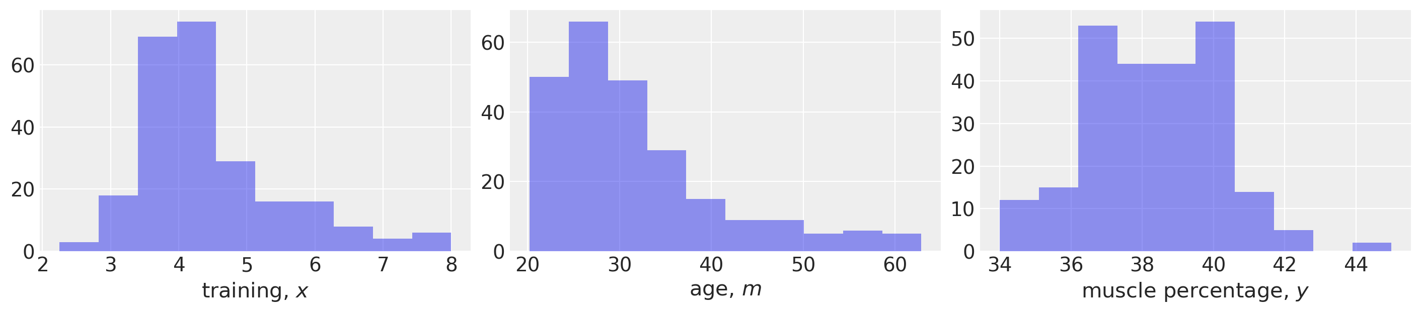
导入数据#
首先,我们将加载我们的示例数据并进行一些基本的数据可视化。该数据集取自van den Berg [未注明日期],但尚不清楚这是否对应于真实生活中的研究数据,还是模拟生成的。
def load_data():
    try:
        df = pd.read_csv("../data/muscle-percent-males-interaction.csv")
    except:
        df = pd.read_csv(pm.get_data("muscle-percent-males-interaction.csv"))

    x = df["thours"].values
    m = df["age"].values
    y = df["mperc"].values
    return (x, y, m)


x, y, m = load_data()

# Make a scalar color map for this dataset (Just for plotting, nothing to do with inference)
scalarMap = make_scalarMap(m)
fig, ax = plt.subplots(1, 3, figsize=(14, 3))

ax[0].hist(x, alpha=0.5)
ax[0].set(xlabel="training, $x$")

ax[1].hist(m, alpha=0.5)
ax[1].set(xlabel="age, $m$")

ax[2].hist(y, alpha=0.5)
ax[2].set(xlabel="muscle percentage, $y$");
定义 PyMC 模型并进行推理#
def model_factory(x, m, y):
    with pm.Model() as model:
        x = pm.ConstantData("x", x)
        m = pm.ConstantData("m", m)
        # priors
        β0 = pm.Normal("β0", mu=0, sigma=10)
        β1 = pm.Normal("β1", mu=0, sigma=10)
        β2 = pm.Normal("β2", mu=0, sigma=10)
        β3 = pm.Normal("β3", mu=0, sigma=10)
        σ = pm.HalfCauchy("σ", 1)
        # likelihood
        y = pm.Normal("y", mu=β0 + (β1 * x) + (β2 * x * m) + (β3 * m), sigma=σ, observed=y)

    return model
model = model_factory(x, m, y)
绘制模型图以确认其符合预期。
pm.model_to_graphviz(model)

with model:
    result = pm.sample(draws=1000, tune=1000, random_seed=42, nuts={"target_accept": 0.9})
Sampling 4 chains for 1_000 tune and 1_000 draw iterations (4_000 + 4_000 draws total) took 9 seconds.
可视化轨迹以检查收敛性。
az.plot_trace(result);
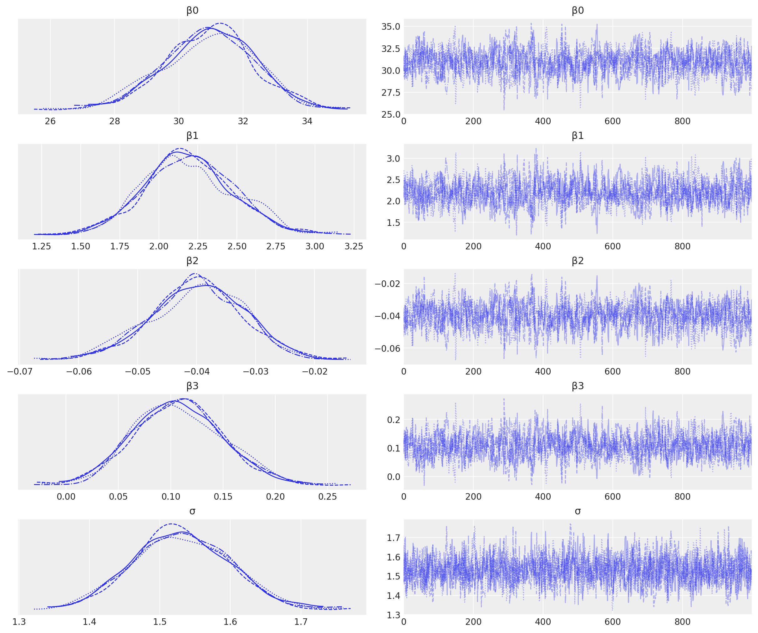
我们拥有良好的链混合,每个链的后验分布看起来非常相似,因此在这方面没有问题。
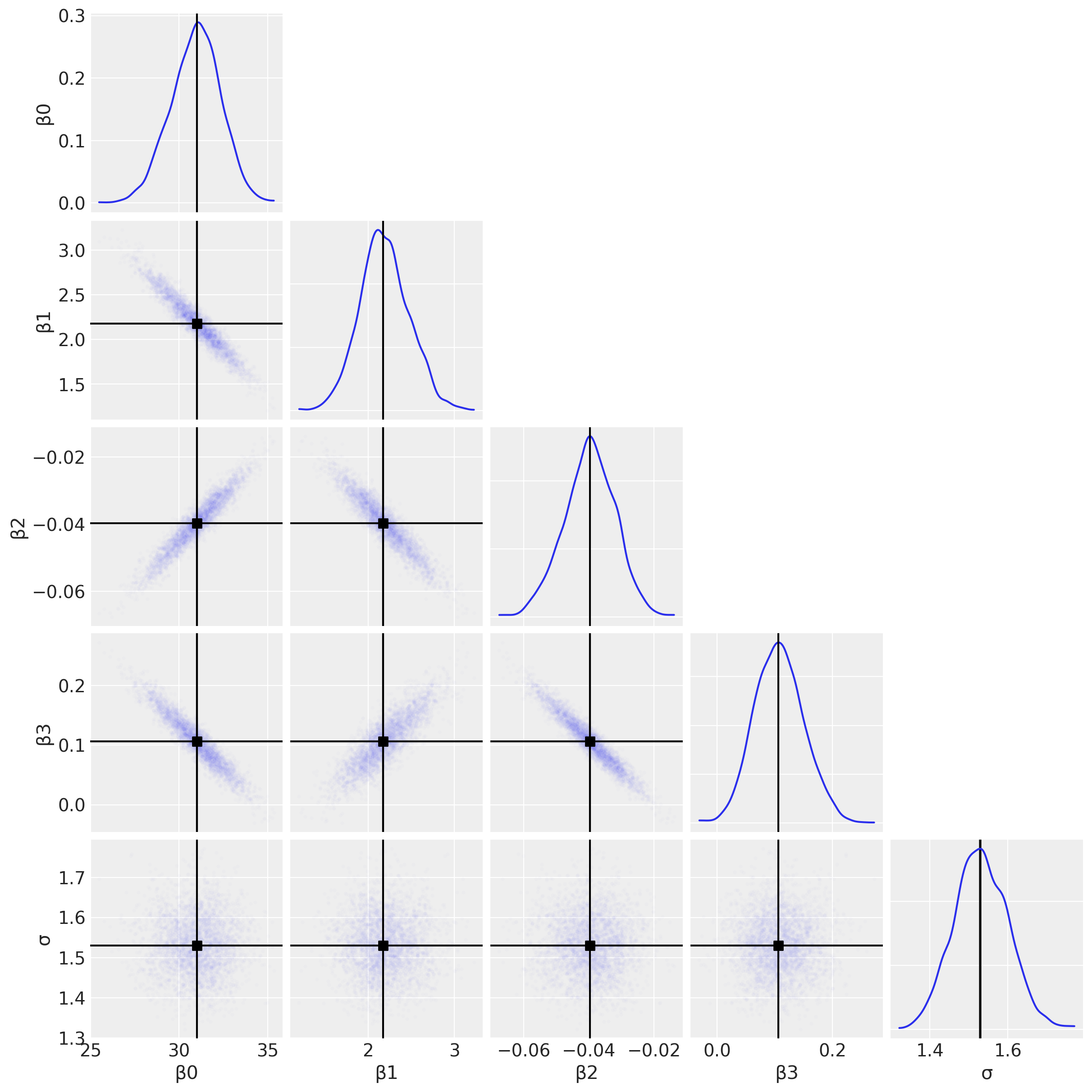
可视化重要参数#
首先,我们将使用配对图来查看联合后验分布。这可能有助于我们识别交互项的估计问题(参见下面关于多重共线性的讨论)。
az.plot_pair(
    result,
    marginals=True,
    point_estimate="median",
    figsize=(12, 12),
    scatter_kwargs={"alpha": 0.01},
);
为了完整性,我们可以绘制每个\(\beta\)参数的后验分布,并利用这些分布来得出研究结论。
az.plot_posterior(result, var_names=["β1", "β2", "β3"], figsize=(14, 4));
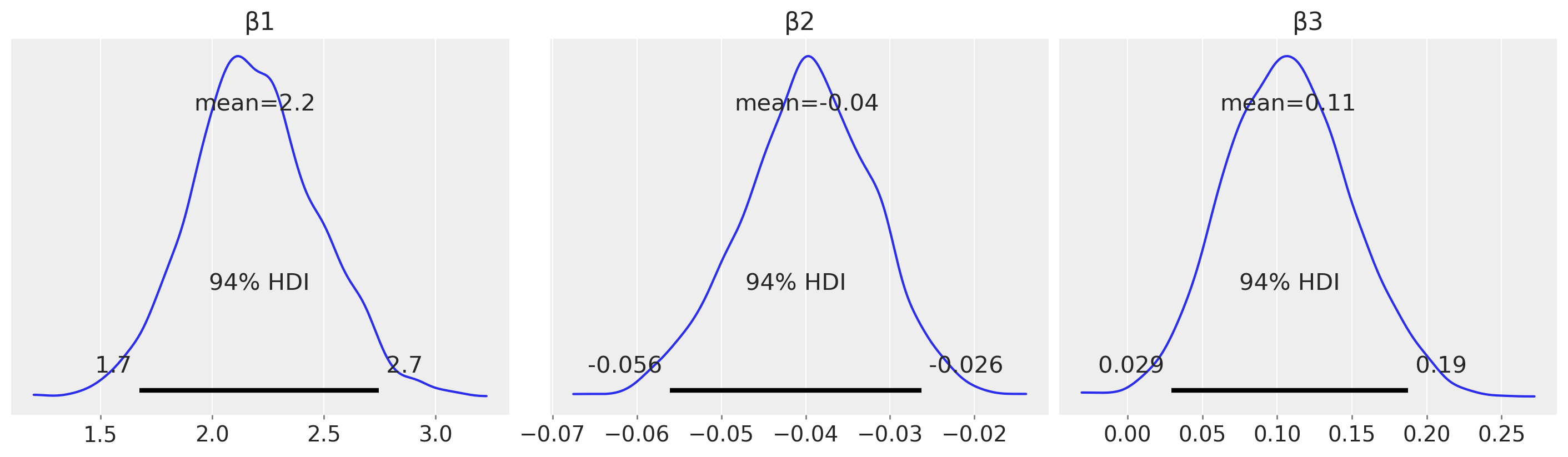
例如,从估计(与假设检验相对)的角度来看,我们可以查看\(\beta_2\)的后验分布,并声称存在可信的负向调节效应。
后验预测检查#
定义一组我们感兴趣的\(m\)的分位数以进行可视化。
m_quantiles = [0.025, 0.25, 0.5, 0.75, 0.975]
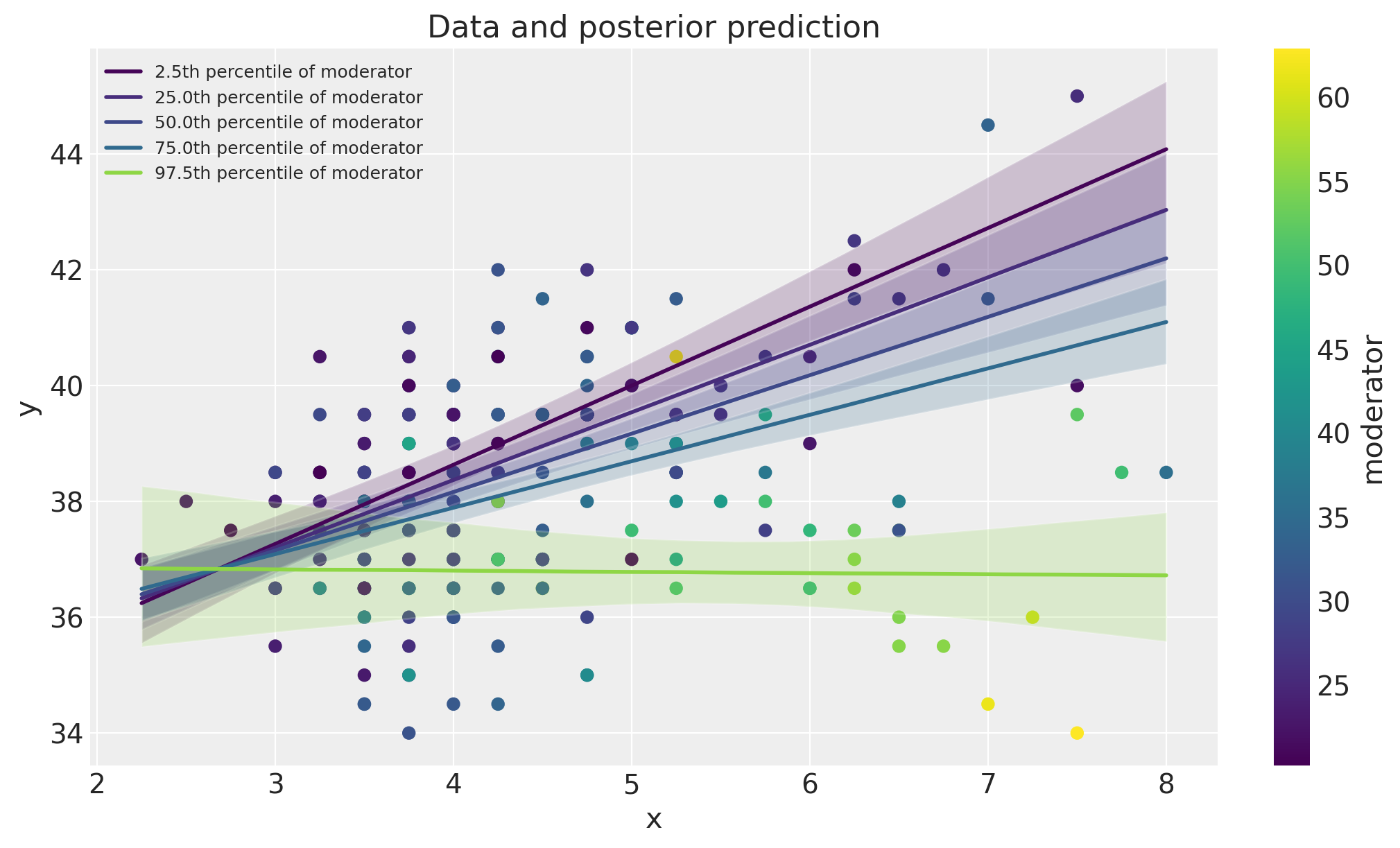
数据空间中的可视化#
在这里,我们将绘制数据以及模型后验预测检查。这是一种有用的可视化方法,用于比较模型预测与数据。
fig, ax = plt.subplots(figsize=(10, 6))
ax = plot_data(x, m, y, ax=ax)
posterior_prediction_plot(result, x, m, m_quantiles, ax=ax)
ax.set_title("Data and posterior prediction");
聚光灯图#
我们还可以通过绘制 \(\beta_1 + \beta_2 \cdot m\) 随 \(m\) 变化的关系图来可视化调节效应。这被称为聚光灯图,参见 Spiller 等人 [2013] 和 McClelland 等人 [2017]。
fig, ax = plt.subplots(1, 2, figsize=(10, 5))
plot_moderation_effect(result, m, m_quantiles, ax[0])
az.plot_posterior(result, var_names="β2", ax=ax[1]);
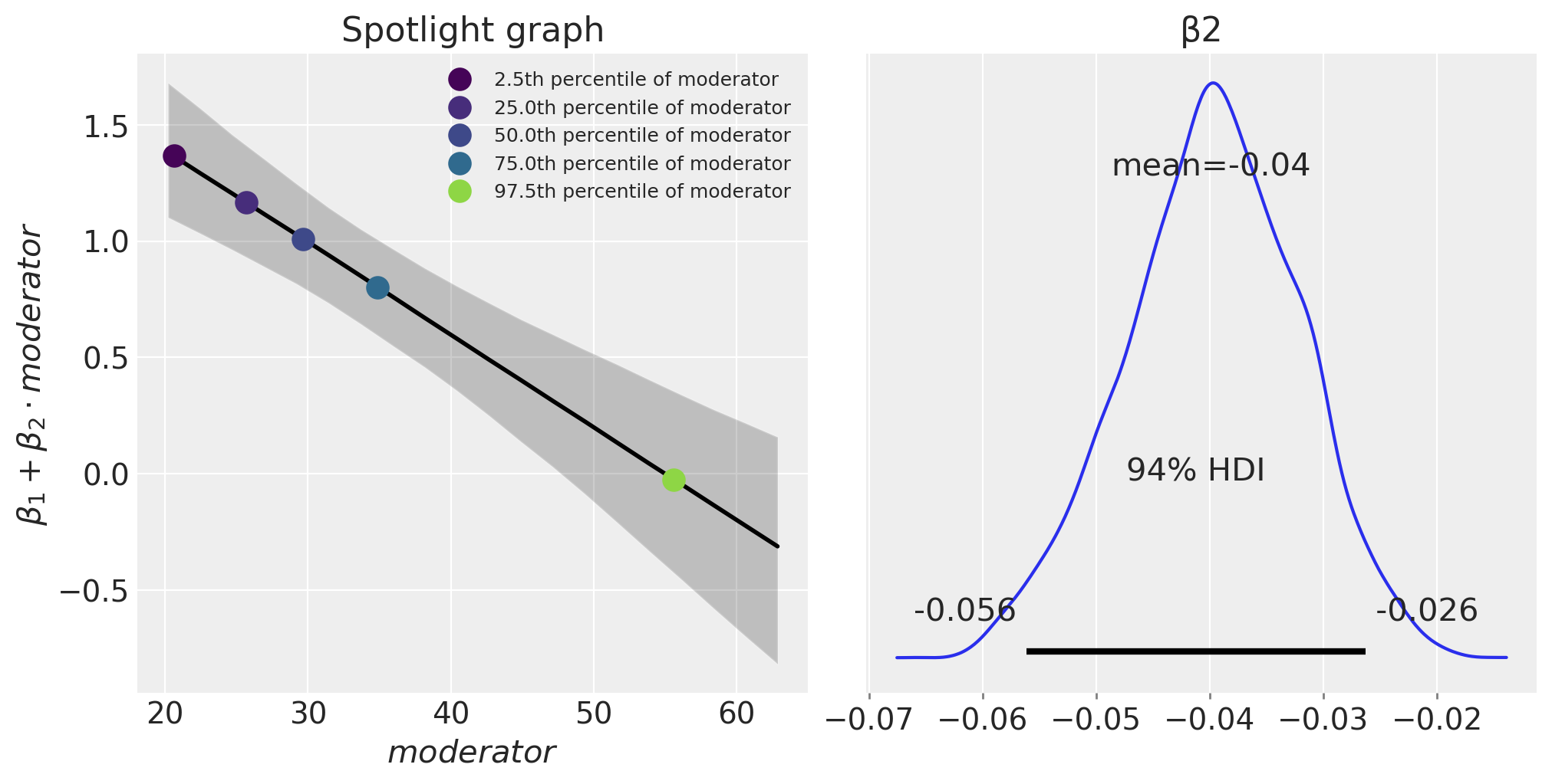
表达式 \(\beta_1 + \beta_2 \cdot \text{moderator}\) 定义了结果(肌肉百分比)每单位 \(x\)(每周训练小时数)的变化率。我们可以看到,随着年龄(调节变量)的增加,每周训练小时数对肌肉百分比的影响会减少。
进一步阅读#
关于“调节效应”的更多信息,或者McClelland et al. [2017]称之为聚光灯图的内容,可以在Bauer和Curran [2005]以及Spiller et al. [2013]中找到。尽管这些论文采用了频率主义(而非贝叶斯)的视角。
张和汪 [2017] 比较了在预测变量缺失的情况下,最大似然法和贝叶斯方法在调节分析中的应用。
多重共线性、数据中心化和带有交互项的线性模型也在许多著名的贝叶斯教科书中进行了讨论 [Kruschke, 2014, McElreath, 2018, Gelman 等, 2013, Gelman 等, 2020].
参考资料#
约翰·克鲁施克。贝叶斯数据分析:R、JAGS和Stan的教程。学术出版社,2014年。
理查德·麦克埃尔雷思。统计重构:一个带有R和Stan示例的贝叶斯课程。查普曼和霍尔/CRC,2018年。
R. G van den Berg. SPSS调节回归教程。网址: https://www.spss-tutorials.com/spss-regression-with-moderation-interaction-effect/ (访问于 2022-03-20)。
斯蒂芬·A·斯皮勒, 加文·J·菲茨西蒙斯, 约翰·G·林奇·Jr, 和加里·H·麦克莱兰. 聚光灯, 泛光灯, 和神奇数字零: 调节回归中的简单效应检验. 营销研究杂志, 50(2):277–288, 2013.
加里·H·麦克莱兰,朱莉·R·欧文,大卫·迪斯尼克,和利隆·西文。多重共线性在寻找调节变量时是一个红鲱鱼:解释调节多元回归模型的指南和对伊科博西乌、施耐德、波波维奇和巴卡米索斯(2016)的批评。行为研究方法,49(1):394–402, 2017。
Dawn Iacobucci、Matthew J Schneider、Deidre L Popovich 和 Georgios A Bakamitsos。均值中心化有助于缓解“微观”多重共线性,但无法缓解“宏观”多重共线性。行为研究方法,48(4):1308–1317,2016年。
Dawn Iacobucci, Matthew J Schneider, Deidre L Popovich, 和 Georgios A Bakamitsos. 均值中心化、多重共线性和多重回归中的调节变量:再议调和。行为研究方法,49(1):403–404, 2017.
丹尼尔·J·鲍尔和帕特里克·J·柯伦。在固定效应和多层次回归中探测交互作用:推断和图形技术。多变量行为研究,40(3):373–400, 2005。
钱张和汪丽娟。在预测变量中存在缺失数据的调节分析。《心理方法》,22(4):649, 2017.
安德鲁·格尔曼, 约翰·B·卡林, 哈尔·S·斯特恩, 大卫·B·邓森, 阿基·维塔里, 和唐纳德·B·鲁宾. 贝叶斯数据分析. 查普曼和霍尔/CRC, 2013.
安德鲁·格尔曼、詹妮弗·希尔和阿基·维塔里。《回归与其他故事》。剑桥大学出版社,2020年。
水印#
%load_ext watermark
%watermark -n -u -v -iv -w -p pytensor,aeppl,xarray
Last updated: Sun Feb 05 2023

Python implementation: CPython
Python version       : 3.10.9
IPython version      : 8.9.0

pytensor: 2.8.11
aeppl   : not installed
xarray  : 2023.1.0

pandas    : 1.5.3
arviz     : 0.14.0
xarray    : 2023.1.0
numpy     : 1.24.1
pymc      : 5.0.1
matplotlib: 3.6.3

Watermark: 2.3.1