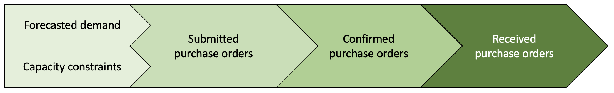
寻找供应链变化的根本原因#
在供应链中,库存中每种产品可供发货的单位数量对于更快满足客户需求至关重要。因此,零售商不断购买产品,以预测未来的客户需求。
假设每周零售商向供应商提交采购订单(POs),考虑到产品的未来需求和需要考虑的产能限制。供应商随后将确认他们是否能够履行零售商的部分或全部采购订单。一旦供应商确认并得到零售商的同意,产品就会被发送给零售商。然而,所有确认的采购订单可能不会一次性到达。
周环比变化#
对于这个案例研究,我们考虑了受供应链实际用例启发的合成数据。让我们特别看看两周的数据,w1 和 w2。
[1]:
import pandas as pd

data = pd.read_csv('supply_chain_week_over_week.csv')
[2]:
from IPython.display import HTML

data_week1 = data[data.week == 'w1']

HTML(data_week1.head().to_html(index=False)+'<br/>')
[2]:
| asin | 需求 | 约束 | 已提交 | 已确认 | 已接收 | 周 |
|---|---|---|---|---|---|---|
| C33384370E | 5.0 | 2.0 | 5.0 | 5.0 | 5.0 | w1 |
| F48C534AEF | 1.0 | 0.0 | 2.0 | 2.0 | 2.0 | w1 |
| 6DF2CA5FB8 | 4.0 | 2.0 | 2.0 | 2.0 | 2.0 | w1 |
| 1D1C2500DB | 2.0 | 1.0 | 2.0 | 2.0 | 2.0 | w1 |
| 0A83B415E2 | 0.0 | 1.0 | -0.0 | -0.0 | -0.0 | w1 |
[3]:
data_week2 = data[data.week=='w2']

HTML(data_week2.head().to_html(index=False)+'<br/>')
[3]:
| asin | 需求 | 约束 | 已提交 | 已确认 | 已接收 | 周 |
|---|---|---|---|---|---|---|
| C33384370E | 3.0 | 1.0 | 3.0 | 7.0 | 7.0 | w2 |
| F48C534AEF | 3.0 | 2.0 | 1.0 | 3.0 | 3.0 | w2 |
| 6DF2CA5FB8 | 5.0 | 1.0 | 6.0 | 12.0 | 12.0 | w2 |
| 1D1C2500DB | 3.0 | 3.0 | 0.0 | 1.0 | 1.0 | w2 |
| 0A83B415E2 | 3.0 | 1.0 | 2.0 | 5.0 | 5.0 | w2 |
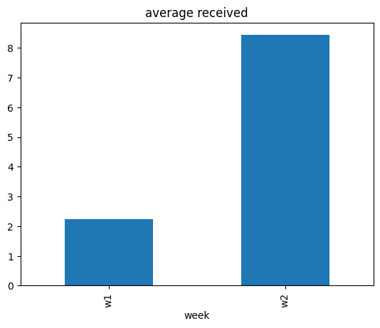
我们感兴趣的目标是这两周内接收到的平均值。
[4]:
data.groupby(['week']).mean(numeric_only=True)[['received']].plot(kind='bar', title='average received', legend=False);
[5]:
data_week2.received.mean() - data_week1.received.mean()
[5]:
6.197
received 数量的平均值从第 w1 周增加到第 w2 周。为什么?
为什么received数量的平均值每周都在变化?#
临时归因分析#
要回答这个问题,一个选择是查看其他变量每周的平均值,并看看是否存在任何关联。
[6]:
data.groupby(['week']).mean(numeric_only=True).plot(kind='bar', title='average', legend=True);

我们看到,除了constraint之外,其他变量的平均值也有所增加。虽然这表明某些事件可能改变了其他变量的平均值,从而可能改变了received的平均值,但这本身并不是一个令人满意的答案。在这里,人们也可以利用领域知识来声称需求平均值的变化可能是主要驱动因素,毕竟需求是一个关键变量。我们稍后会看到,这样的结论可能会忽略其他重要因素。为了得到一个更为系统的答案,我们转向基于因果关系的归因分析。
因果归因分析#
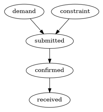
我们考虑基于图形因果模型的分布变化归因方法,该方法在Budhathoki等人,2021年中有所描述,并且在DoWhy中也有实现。简而言之,给定变量的潜在因果图,归因方法将目标变量的边际分布(或其摘要,如均值)的变化归因于因果图中上游变量的数据生成过程(也称为“因果机制”)的变化。变量的因果机制是给定其直接原因的变量的条件分布。我们也可以将因果机制视为系统中的一种算法(或计算程序),它将直接原因的值作为输入,并生成效果的值作为输出。要使用归因方法,我们首先需要变量的因果图,即需求、约束、提交、确认和接收。
图形因果模型#
我们使用领域知识构建因果图。根据引言中供应链的描述,假设以下因果图是合理的。
[7]:
import networkx as nx
import dowhy.gcm as gcm
from dowhy.utils import plot
gcm.util.general.set_random_seed(0)

causal_graph = nx.DiGraph([('demand', 'submitted'),
                           ('constraint', 'submitted'),
                           ('submitted', 'confirmed'),
                           ('confirmed', 'received')])
plot(causal_graph)
现在,我们可以设置因果模型:
[8]:
import matplotlib.pyplot as plt
import numpy as np

# disabling progress bar to not clutter the output here
gcm.config.disable_progress_bars()

# setting random seed for reproducibility
np.random.seed(10)

causal_model = gcm.StructuralCausalModel(causal_graph)

# Automatically assign appropriate causal models to each node in graph
auto_assignment_summary = gcm.auto.assign_causal_mechanisms(causal_model, data_week1)
在我们将这些变化归因于节点之前,让我们先看一下自动分配的结果:
[9]:
print(auto_assignment_summary)
When using this auto assignment function, the given data is used to automatically assign a causal mechanism to each node. Note that causal mechanisms can also be customized and assigned manually.
The following types of causal mechanisms are considered for the automatic selection:

If root node:
An empirical distribution, i.e., the distribution is represented by randomly sampling from the provided data. This provides a flexible and non-parametric way to model the marginal distribution and is valid for all types of data modalities.

If non-root node and the data is continuous:
Additive Noise Models (ANM) of the form X_i = f(PA_i) + N_i, where PA_i are the parents of X_i and the unobserved noise N_i is assumed to be independent of PA_i.To select the best model for f, different regression models are evaluated and the model with the smallest mean squared error is selected.Note that minimizing the mean squared error here is equivalent to selecting the best choice of an ANM.

If non-root node and the data is discrete:
Discrete Additive Noise Models have almost the same definition as non-discrete ANMs, but come with an additional constraint for f to only return discrete values.
Note that 'discrete' here refers to numerical values with an order. If the data is categorical, consider representing them as strings to ensure proper model selection.

If non-root node and the data is categorical:
A functional causal model based on a classifier, i.e., X_i = f(PA_i, N_i).
Here, N_i follows a uniform distribution on [0, 1] and is used to randomly sample a class (category) using the conditional probability distribution produced by a classification model.Here, different model classes are evaluated using the (negative) F1 score and the best performing model class is selected.

In total, 5 nodes were analyzed:

--- Node: demand
Node demand is a root node. Therefore, assigning 'Empirical Distribution' to the node representing the marginal distribution.

--- Node: constraint
Node constraint is a root node. Therefore, assigning 'Empirical Distribution' to the node representing the marginal distribution.

--- Node: submitted
Node submitted is a non-root node with discrete data. Assigning 'Discrete AdditiveNoiseModel using Pipeline' to the node.
This represents the discrete causal relationship as submitted := f(constraint,demand) + N.
For the model selection, the following models were evaluated on the mean squared error (MSE) metric:
Pipeline(steps=[('polynomialfeatures', PolynomialFeatures(include_bias=False)),
                ('linearregression', LinearRegression)]): 1.1828666304115492
LinearRegression: 1.202146528455657
HistGradientBoostingRegressor: 1.3214374799939141

--- Node: confirmed
Node confirmed is a non-root node with discrete data. Assigning 'Discrete AdditiveNoiseModel using LinearRegression' to the node.
This represents the discrete causal relationship as confirmed := f(submitted) + N.
For the model selection, the following models were evaluated on the mean squared error (MSE) metric:
LinearRegression: 0.10631247993087496
Pipeline(steps=[('polynomialfeatures', PolynomialFeatures(include_bias=False)),
                ('linearregression', LinearRegression)]): 0.10632506989501964
HistGradientBoostingRegressor: 0.22146133208979166

--- Node: received
Node received is a non-root node with discrete data. Assigning 'Discrete AdditiveNoiseModel using LinearRegression' to the node.
This represents the discrete causal relationship as received := f(confirmed) + N.
For the model selection, the following models were evaluated on the mean squared error (MSE) metric:
LinearRegression: 0.1785978818963511
Pipeline(steps=[('polynomialfeatures', PolynomialFeatures(include_bias=False)),
                ('linearregression', LinearRegression)]): 0.17920013806550833
HistGradientBoostingRegressor: 0.2892923434164462

===Note===
Note, based on the selected auto assignment quality, the set of evaluated models changes.
For more insights toward the quality of the fitted graphical causal model, consider using the evaluate_causal_model function after fitting the causal mechanisms.
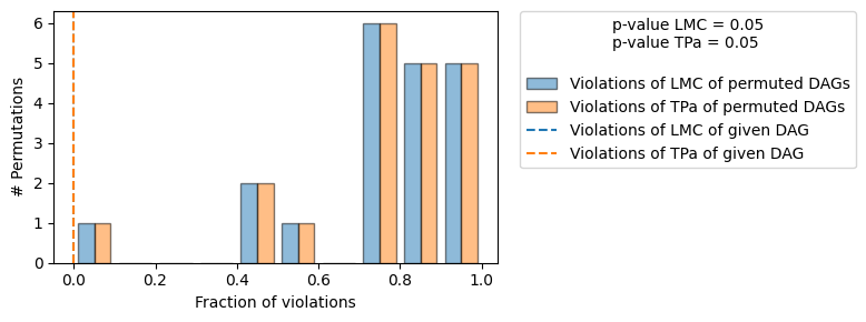
似乎大多数关系都可以通过线性模型很好地捕捉。让我们进一步评估假设的图结构。
[10]:
gcm.falsify.falsify_graph(causal_graph, data_week1, n_permutations=20, plot_histogram=True)
[10]:
+-------------------------------------------------------------------------------------------------------+
|                                         Falsification Summary                                         |
+-------------------------------------------------------------------------------------------------------+
| The given DAG is informative because 1 / 20 of the permutations lie in the Markov                     |
| equivalence class of the given DAG (p-value: 0.05).                                                   |
| The given DAG violates 0/7 LMCs and is better than 95.0% of the permuted DAGs (p-value: 0.05).        |
| Based on the provided significance level (0.05) and because the DAG is informative,                   |
| we do not reject the DAG.                                                                             |
+-------------------------------------------------------------------------------------------------------+
由于我们没有拒绝DAG,我们认为我们的因果图结构得到了确认。
归因变化#
我们现在可以归因于接收数量平均值的周环比变化:
[11]:
# call the API for attributing change in the average value of `received`
contributions = gcm.distribution_change(causal_model,
                                        data_week1,
                                        data_week2,
                                        'received',
                                        num_samples=2000,
                                        difference_estimation_func=lambda x1, x2 : np.mean(x2) - np.mean(x1))
[12]:
from dowhy.utils import bar_plot
bar_plot(contributions, ylabel='Contribution')
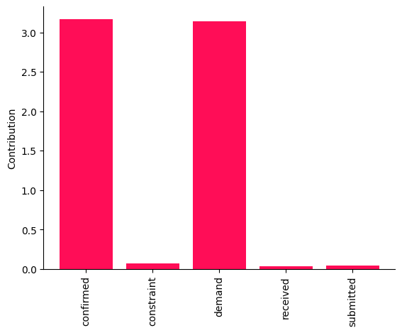
这些点估计表明,需求和确认的因果机制变化是两周之间接收平均值变化的主要驱动因素。然而,从这些点估计中得出结论是有风险的。因此,我们为每个归因计算了自举置信区间。
[13]:
median_contribs, uncertainty_contribs = gcm.confidence_intervals(
    gcm.bootstrap_sampling(gcm.distribution_change,
                           causal_model,
                           data_week1,
                           data_week2,
                           'received',
                           num_samples=2000,
                           difference_estimation_func=lambda x1, x2 : np.mean(x2) - np.mean(x1)),
    confidence_level=0.95,
    num_bootstrap_resamples=5,
    n_jobs=-1)
Evaluating set functions...: 100%|██████████| 32/32 [00:00<00:00, 227.82it/s]
Evaluating set functions...: 100%|██████████| 32/32 [00:00<00:00, 284.59it/s]
[14]:
bar_plot(median_contribs, ylabel='Contribution', uncertainties=uncertainty_contribs)
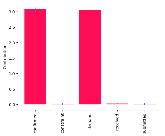
尽管需求和确认的贡献的\(95\%\)置信区间高于\(0\),但其他节点的置信区间接近\(0\)。总体而言,这些结果表明,需求和确认的因果机制的变化是观察到的接收数量周环比变化的驱动因素。在现实世界的系统中,因果机制可能会发生变化,例如在部署了具有不同算法的新子系统之后。事实上,这些结果与真实情况一致(见附录)。
附录:真实数据#
我们生成受亚马逊供应链实际用例启发的合成数据。为此,我们假设每个节点的底层数据生成过程为线性加性噪声模型(ANM)。也就是说,每个节点是其直接原因的线性函数加上一个加性的未观测噪声项。有关ANM的更多技术细节,感兴趣的读者可以参考《因果推断基础》的第7.1.2章。使用线性ANM,我们从每个变量的分布中生成数据(或抽取独立同分布样本)。我们主要使用Gamma分布作为噪声项,以模拟现实世界中的设置,其中变量的分布通常表现出重尾行为。在两周之间,我们仅通过将需求均值从\(2\)更改为\(4\),并将线性系数\(\alpha\)从\(1\)更改为\(2\),分别更改了需求和确认的数据生成过程(因果机制)。
[15]:
import pandas as pd
import secrets

ASINS = [secrets.token_hex(5).upper() for i in range(1000)]
import numpy as np
def buying_data(alpha, beta, demand_mean):
    constraint = np.random.gamma(1, scale=1, size=1000)
    demand = np.random.gamma(demand_mean, scale=1, size=1000)
    submitted = demand - constraint + np.random.gamma(1, scale=1, size=1000)
    confirmed = alpha * submitted + np.random.gamma(0.1, scale=1, size=1000)
    received = beta * confirmed + np.random.gamma(0.1, scale=1, size=1000)
    return pd.DataFrame(dict(asin=ASINS,
                              demand=np.round(demand),
                              constraint=np.round(constraint),
                              submitted = np.round(submitted),
                              confirmed = np.round(confirmed),
                              received = np.round(received)))


# we change the parameters alpha and demand_mean between weeks
data_week1 = buying_data(1, 1, demand_mean=2)
data_week1['week'] = 'w1'
data_week2 = buying_data(2, 1, demand_mean=4)
data_week2['week'] = 'w2'

data = pd.concat([data_week1, data_week2], ignore_index=True)
# write data to a csv file
# data.to_csv('supply_chain_week_over_week.csv', index=False)