销售增长和支出干预的因果归因#
场景#
假设我们有一个在线销售产品的广告商。为了促进销售,他们通过价格促销提供折扣,并通过展示广告和搜索结果页面中的赞助广告在线进行广告宣传。为了准备即将到来的业务审查,广告商比较了2024年和2023年的数据,并观察到销售和产品页面浏览量等关键绩效指标(KPI)的稳定增长。然而,分析团队想知道是什么因素推动了这种增长,是广告、价格促销,还是仅仅由于购物者趋势带来的有机增长?这个问题的答案对于理解过去的增长至关重要。此外,这个广告商希望获得可操作的建议用于业务规划,例如在投资回报较高的领域增加支出以进一步扩大收益。在以下场景中,我们将使用DoWhy进行双重分析:首先,正确地对KPI增长的驱动因素进行因果归因,以便分析团队以数据驱动的方式理解过去增长的动力。其次,我们基于因果影响估计进行干预,以推导出增量投资回报率(iROI),从而使广告商能够预测未来通过额外投资带来的KPI增长。这些因素和KPI包括:* dsp_spend:通过展示广告在需求方平台(DSP)上的广告支出 * sp_spend:在搜索结果页面上的广告支出,以提高产品排名以便于发现 * discount:通过降价提供的折扣 * special_shopping_event:一个二元变量,表示是否发生了由电子商务平台主办的购物活动,例如黑色星期五或网络星期一 * other_shopping_event:一个二元变量,表示电子商务平台之外的其他购物活动。它可能来自广告商本身,或其与其他平台的广告合作。* dpv:产品详情页面浏览量的数量 * sale:在重点电子商务平台上的每日收入
[1]:
import matplotlib.pyplot as plt
import networkx as nx
import numpy as np
import pandas as pd
from functools import partial
from dowhy import gcm
from dowhy.utils.plotting import plot

from scipy import stats
from statsmodels.stats.multitest import multipletests

gcm.util.general.set_random_seed(0)
%matplotlib inline
1. 探索数据#
首先,让我们加载代表2023年和2024年支出、折扣、销售和其他信息的数据。请注意,对于这个模拟数据,我们没有改变价格折扣在比较期间的分布,因此在后续的归因模型中不应该检测到这种情况。
[2]:
df = pd.read_csv('datasets/sales_attribution.csv', index_col=0)
df.head()
[2]:
| dsp_spend | sp_spend | dpv | discount | sale | activity_date | year | quarter | month | special_shopping_event | other_shopping_event | |
|---|---|---|---|---|---|---|---|---|---|---|---|
| 0 | 11864.799390 | 2609.702789 | 54954.823150 | 26167.824599 | 76740.886670 | 2023-01-01 | 2023 | 1 | 1 | 否 | 否 |
| 1 | 11084.057110 | 2568.540570 | 44907.063324 | 22340.009780 | 52480.718941 | 2023-01-02 | 2023 | 1 | 1 | 否 | 否 |
| 2 | 16680.850945 | 2847.576700 | 151643.912564 | 68301.747813 | 628062.966309 | 2023-01-03 | 2023 | 1 | 1 | 否 | 否 |
| 3 | 15473.576264 | 2788.515831 | 121173.343955 | 18906.050402 | 307547.583964 | 2023-01-04 | 2023 | 1 | 1 | 否 | 否 |
| 4 | 10308.414302 | 2523.591011 | 36234.267337 | 18198.689563 | 35602.101926 | 2023-01-05 | 2023 | 1 | 1 | 否 | 否 |
为了将感兴趣的因素因果归因于变化,我们首先需要定义比较的时间段。
[3]:
def generate_new_old_dataframes(df, new_year, new_quarters, new_months, old_year, old_quarters, old_months):
    # Filter new data based on year, quarters, and months
    new_conditions = (df['year'] == new_year) & (df['quarter'].isin(new_quarters)) & (df['month'].isin(new_months))
    df_new = df[new_conditions].copy()

    # Filter old data based on year, quarters, and months
    old_conditions = (df['year'] == old_year) & (df['quarter'].isin(old_quarters)) & (df['month'].isin(old_months))
    df_old = df[old_conditions].copy()

    return df_new, df_old

df_new, df_old = generate_new_old_dataframes(df, new_year=2024, new_quarters=[1,2], new_months=[1,2,3,4,5,6], old_year=2023, old_quarters=[1,2], old_months=[1,2,3,4,5,6])
然后我们定义累积分布函数来直观地观察两个时期之间指标的变化。让我们绘制它们:
[4]:
def plot_metric_distributions(df_new, df_old, metric_columns):
    for metric_column in metric_columns:
        fig, ax = plt.subplots()

        kde_new = stats.gaussian_kde(df_new[metric_column].dropna())
        kde_old = stats.gaussian_kde(df_old[metric_column].dropna())

        x_range = np.linspace(
            min(df_new[metric_column].min(), df_old[metric_column].min()),
            max(df_new[metric_column].max(), df_old[metric_column].max()),
            1000
        )
        ax.plot(x_range, kde_new(x_range), color='#FF6B6B', lw=2, label='After')
        ax.plot(x_range, kde_old(x_range), color='#4ECDC4', lw=2, label='Before')

        ax.fill_between(x_range, kde_new(x_range), alpha=0.3, color='#FF6B6B')
        ax.fill_between(x_range, kde_old(x_range), alpha=0.3, color='#4ECDC4')

        ax.set_xlabel(metric_column)
        ax.set_ylabel('Density')
        ax.set_title(f'Comparison of {metric_column} distribution')

        ax.spines['top'].set_visible(False)
        ax.spines['right'].set_visible(False)

        ax.grid(True, linestyle='--', alpha=0.7)
        ax.legend(fontsize=10)

        plt.tight_layout()
        plt.show()
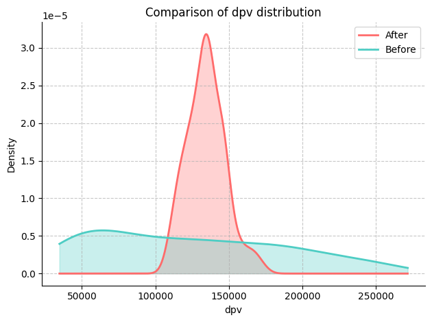
在这里,我们对‘dpv’和‘sale’变量感兴趣。
[5]:
# Define KPI
metric_columns = ['dpv', 'sale']
plot_metric_distributions(df_new, df_old, metric_columns)

我们可以通过比较KPI和潜在驱动因素的平均值、中位数和方差来进一步量化变化的幅度。
[6]:
def compare_metrics(df_new, df_old, metrics):
    comparison_data = []

    for metric in metrics:
        try:
            mean_old = df_old[metric].mean()
            median_old = df_old[metric].median()
            variance_old = df_old[metric].var()

            mean_new = df_new[metric].mean()
            median_new = df_new[metric].median()
            variance_new = df_new[metric].var()

            if mean_old == 0:
                print(f"Mean for {metric} in the old data is zero. Skipping mean change calculation.")
                mean_change = None
            else:
                mean_change = ((mean_new - mean_old) / mean_old) * 100

            if median_old == 0:
                print(f"Median for {metric} in the old data is zero. Skipping median change calculation.")
                median_change = None
            else:
                median_change = ((median_new - median_old) / median_old) * 100

            if variance_old == 0:
                print(f"Variance for {metric} in the old data is zero. Skipping variance change calculation.")
                variance_change = None
            else:
                variance_change = ((variance_new - variance_old) / variance_old) * 100

            comparison_data.append({
                'Metric': metric,
                'Δ mean': mean_change,
                'Δ median': median_change,
                'Δ variance': variance_change
            })
        except KeyError as e:
            print(f"Metric {metric} not found in one of the DataFrames: {e}")
            pass

    comparison_df = pd.DataFrame(comparison_data)
    return comparison_df
为了简化,下面我们假设关键绩效指标是收入(销售额)和产品浏览量(DPV),潜在的驱动因素包括需求方平台上的广告支出(dsp_spend)和搜索结果(sp_spend),以及价格促销(折扣)。
[7]:
comparison_df = compare_metrics(df_new, df_old, ['sale', 'dpv', 'dsp_spend',  'sp_spend', 'discount'])
print(comparison_df)
      Metric     Δ mean   Δ median  Δ variance
0       sale  11.274001  84.089817  -95.972002
1        dpv   8.843596  12.453083  -95.913214
2  dsp_spend   6.387894   3.718354  -66.203836
3   sp_spend  10.335289  10.013358  312.605493
4   discount  -1.837933  32.438169  -99.570962
2. 绘制因果图#
2.1. 设置基本因果图#
在第一步中,我们利用我们的领域知识,即所有的广告投资和购物事件都可能是产品页面浏览和销售的潜在原因,但反之则不然。此外,无论是否有广告投资,详情页面的浏览也可能导致销售。
[8]:
edges = []
for col in df.columns:
    if 'spend' in col:
        edges.append((col, 'dpv'))
        edges.append((col, 'sale'))
edges.append(('special_shopping_event', 'dpv'))
edges.append(('other_shopping_event', 'dpv'))
edges.append(('special_shopping_event', 'sale'))
edges.append(('other_shopping_event', 'sale'))
edges.append(('discount', 'sale'))
edges.append(('dpv', 'sale'))

causal_graph = nx.DiGraph(edges)
[9]:
plot(causal_graph)
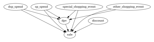
这些边不太可能都是显著的。让我们在下一步中修剪一些潜在的原因。这是为了获得更精细的因果图,即更接近真相。
2.2. 修剪节点和边#
一种修剪不显著因果关系的方法是通过统计依赖性测试进行因果最小性测试。因果最小性测试排除了节点\(Y\)的任何父子边(\(X\to Y\)),如果\(Y\)在给定\(Y\)的其他父节点的情况下与\(X\)条件独立。如果是这种情况,节点\(X\)在\(Y\)的其他父节点之上不提供额外的信息。用通俗的语言来说,某些广告在存在其他广告的情况下可能不提供增量信息。因此,我们可以移除那些\(X \to Y\)的边。请注意,该测试已针对多重假设测试进行了调整,以保证一致的错误发现率。
[10]:
def test_causal_minimality(graph, target, data, method='kernel', significance_level=0.10, fdr_control_method='fdr_bh'):
    p_vals = []
    all_parents = list(graph.predecessors(target))
    for node in all_parents:
        tmp_conditioning_set = list(all_parents)
        tmp_conditioning_set.remove(node)
        p_vals.append(gcm.independence_test(data[target].to_numpy(), data[node].to_numpy(), data[tmp_conditioning_set].to_numpy(), method=method))

    if fdr_control_method is not None:
        p_vals = multipletests(p_vals, significance_level, method=fdr_control_method)[1]

    nodes_above_threshold = []
    nodes_below_threshold = []
    for i, node in enumerate(all_parents):
        if p_vals[i] < significance_level:
            nodes_above_threshold.append(node)
        else:
            nodes_below_threshold.append(node)

    print("Significant connection:", [(n, target) for n in sorted(nodes_above_threshold)])
    print("Insignificant connection:", [(n, target) for n in sorted(nodes_below_threshold)])

    return sorted(nodes_below_threshold)
然后我们移除不重要的边及其相关节点,得到一个精炼的因果图。
[11]:
for insignificant_parent in test_causal_minimality(causal_graph, 'sale', df):
    causal_graph.remove_edge(insignificant_parent, 'sale')

for insignificant_parent in test_causal_minimality(causal_graph, 'dpv', df):
    causal_graph.remove_edge(insignificant_parent, 'dpv')

cols_to_remove=[]
cols_to_remove.extend([node for node in causal_graph.nodes if causal_graph.in_degree(node) + causal_graph.out_degree(node) == 0])
Significant connection: [('discount', 'sale'), ('dpv', 'sale'), ('dsp_spend', 'sale'), ('sp_spend', 'sale'), ('special_shopping_event', 'sale')]
Insignificant connection: [('other_shopping_event', 'sale')]
Significant connection: [('dsp_spend', 'dpv'), ('sp_spend', 'dpv')]
Insignificant connection: [('other_shopping_event', 'dpv'), ('special_shopping_event', 'dpv')]
[12]:
causal_graph.remove_nodes_from(set(cols_to_remove))
plot(causal_graph)
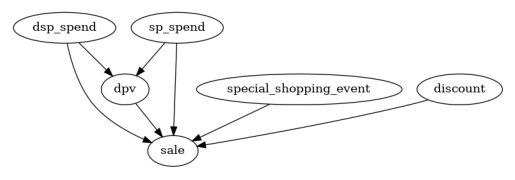
有趣的是,'other_shopping_event'变量对'dpv'或'sale'没有显著影响。
3. 拟合因果图#
接下来,我们需要为每个节点分配功能因果模型(FCMs),这些模型描述了从x到y的数据生成过程,并包含一个误差项。自动分配方法会比较每个节点的不同预测模型,并选择误差最小的模型。quality参数控制测试的模型类型集合,其中BETTER表示一些最常见的回归和分类模型,例如树、支持向量回归等。你也可以使用GOOD来拟合较少的模型以加快速度,或者使用BEST,这需要较高的计算资源(并且需要安装AutoGluon)。分配模型后,我们可以将它们拟合到数据中:
[13]:
causal_model = gcm.StructuralCausalModel(causal_graph)
[14]:
print(gcm.auto.assign_causal_mechanisms(causal_model, df, quality=gcm.auto.AssignmentQuality.BETTER))
When using this auto assignment function, the given data is used to automatically assign a causal mechanism to each node. Note that causal mechanisms can also be customized and assigned manually.
The following types of causal mechanisms are considered for the automatic selection:

If root node:
An empirical distribution, i.e., the distribution is represented by randomly sampling from the provided data. This provides a flexible and non-parametric way to model the marginal distribution and is valid for all types of data modalities.

If non-root node and the data is continuous:
Additive Noise Models (ANM) of the form X_i = f(PA_i) + N_i, where PA_i are the parents of X_i and the unobserved noise N_i is assumed to be independent of PA_i.To select the best model for f, different regression models are evaluated and the model with the smallest mean squared error is selected.Note that minimizing the mean squared error here is equivalent to selecting the best choice of an ANM.

If non-root node and the data is discrete:
Discrete Additive Noise Models have almost the same definition as non-discrete ANMs, but come with an additional constraint for f to only return discrete values.
Note that 'discrete' here refers to numerical values with an order. If the data is categorical, consider representing them as strings to ensure proper model selection.

If non-root node and the data is categorical:
A functional causal model based on a classifier, i.e., X_i = f(PA_i, N_i).
Here, N_i follows a uniform distribution on [0, 1] and is used to randomly sample a class (category) using the conditional probability distribution produced by a classification model.Here, different model classes are evaluated using the (negative) F1 score and the best performing model class is selected.

In total, 6 nodes were analyzed:

--- Node: dsp_spend
Node dsp_spend is a root node. Therefore, assigning 'Empirical Distribution' to the node representing the marginal distribution.

--- Node: sp_spend
Node sp_spend is a root node. Therefore, assigning 'Empirical Distribution' to the node representing the marginal distribution.

--- Node: special_shopping_event
Node special_shopping_event is a root node. Therefore, assigning 'Empirical Distribution' to the node representing the marginal distribution.

--- Node: discount
Node discount is a root node. Therefore, assigning 'Empirical Distribution' to the node representing the marginal distribution.

--- Node: dpv
Node dpv is a non-root node with continuous data. Assigning 'AdditiveNoiseModel using ExtraTreesRegressor' to the node.
This represents the causal relationship as dpv := f(dsp_spend,sp_spend) + N.
For the model selection, the following models were evaluated on the mean squared error (MSE) metric:
ExtraTreesRegressor: 166470642.14064425
RandomForestRegressor: 202413093.75654438
HistGradientBoostingRegressor: 210199781.95027882
AdaBoostRegressor: 277405500.13712883
KNeighborsRegressor: 367859348.3758382
Pipeline(steps=[('polynomialfeatures', PolynomialFeatures(include_bias=False)),
                ('linearregression', LinearRegression)]): 428084148.87153566
LinearRegression: 548678262.1828389
RidgeCV: 548678284.3329667
LassoCV(max_iter=10000): 557118490.7847294
SVR: 2900199761.6189833

--- Node: sale
Node sale is a non-root node with continuous data. Assigning 'AdditiveNoiseModel using ExtraTreesRegressor' to the node.
This represents the causal relationship as sale := f(discount,dpv,dsp_spend,sp_spend,special_shopping_event) + N.
For the model selection, the following models were evaluated on the mean squared error (MSE) metric:
ExtraTreesRegressor: 2332009300.2678514
RandomForestRegressor: 5154831913.930094
AdaBoostRegressor: 7802031657.73537
LinearRegression: 20252807738.720932
RidgeCV: 20398999697.143623
KNeighborsRegressor: 25224016431.708626
HistGradientBoostingRegressor: 29079555677.630787
LassoCV(max_iter=10000): 32196615412.165276
SVR: 134229564521.51865

===Note===
Note, based on the selected auto assignment quality, the set of evaluated models changes.
For more insights toward the quality of the fitted graphical causal model, consider using the evaluate_causal_model function after fitting the causal mechanisms.
[15]:
gcm.fit(causal_model, df)
Fitting causal mechanism of node discount: 100%|██████████| 6/6 [00:00<00:00, 28.75it/s]
4. 识别KPI变化的因果驱动因素#
为了回答过去增长驱动因素的问题,我们通过比较2023年和2024年的数据来测试是否有任何潜在驱动因素导致KPI变化。下面我们量化了对KPI均值变化的贡献,但同样可以估计对中位数或方差等的贡献。
[16]:
def calculate_difference_estimation(causal_model, df_old, df_new, target_column, difference_estimation_func, num_samples=2000, confidence_level=0.90, num_bootstrap_resamples=4):

    difference_contribs, uncertainty_contribs = gcm.confidence_intervals(
        lambda : gcm.distribution_change(causal_model,
                                          df_old,
                                          df_new,
                                          target_column,
                                          num_samples=num_samples,
                                          difference_estimation_func=difference_estimation_func,
                                          shapley_config=gcm.shapley.ShapleyConfig(approximation_method=gcm.shapley.ShapleyApproximationMethods.PERMUTATION, num_permutations=50)),
        confidence_level=confidence_level,
        num_bootstrap_resamples=num_bootstrap_resamples
    )

    return difference_contribs, uncertainty_contribs

median_diff_contribs, median_diff_uncertainty = calculate_difference_estimation(causal_model, df_old, df_new, 'sale', lambda x1, x2: np.mean(x2) - np.mean(x1))
Evaluating set functions...: 100%|██████████| 61/61 [00:01<00:00, 32.41it/s]
Evaluating set functions...: 100%|██████████| 61/61 [00:03<00:00, 17.95it/s]
Evaluating set functions...: 100%|██████████| 62/62 [00:01<00:00, 34.44it/s]
Evaluating set functions...: 100%|██████████| 62/62 [00:01<00:00, 34.86it/s]
Estimating bootstrap interval...: 100%|██████████| 4/4 [00:13<00:00,  3.46s/it]
然后我们以可视化的方式绘制驾驶员对KPI变化的贡献,接着以表格形式展示。
[17]:
gcm.util.bar_plot(median_diff_contribs, median_diff_uncertainty, 'Contribution', figure_size=(10,5))
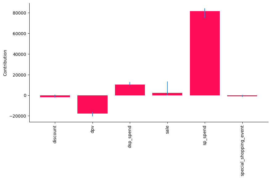
在这里,我们看到‘sp_spend’对‘sale’平均值的变化贡献最大,而‘discount’和‘special_shopping_event’几乎没有贡献。这与数据生成的方式一致。
查看表格概览以基于置信区间寻找显著性:
[18]:
def show_tabular(median_contribs, uncertainty_contribs):
    rows = []
    for node, median_contrib in median_contribs.items():
        rows.append(dict(node=node, median=median_contrib, lb=uncertainty_contribs[node][0], ub=uncertainty_contribs[node][1]))
    df = pd.DataFrame(rows).set_index('node')
    df.rename(columns=dict(median='median', lb='lb', ub='ub'), inplace=True)
    return df

# show_tabular(median_contribs, uncertainty_contribs)
result_df = pd.DataFrame(show_tabular(median_diff_contribs, median_diff_uncertainty))
result_df
[18]:
| 中位数 | 下限 | 上限 | |
|---|---|---|---|
| 节点 | |||
| 折扣 | -1810.011296 | -2351.954517 | 424.608728 |
| dpv | -17865.805004 | -20495.635150 | -16255.578160 |
| dsp_spend | 10219.005392 | 9890.028357 | 12702.789510 |
| 销售 | 2230.337416 | 14.939261 | 13218.827985 |
| sp_spend | 81392.392557 | 75001.284410 | 84178.124307 |
| special_shopping_event | -1019.724448 | -1713.046781 | 70.768253 |
接下来,我们移除所有置信区间中包含0或为负的变量,即那些没有明显显著正向贡献的变量:
[19]:
def filter_significant_rows(result_df, direction, ub_col, lb_col):

    if direction == 'positive':
        significant_rows = result_df[(result_df[ub_col] > 0) & (result_df[lb_col] > 0)]
    elif direction == 'negative':
        significant_rows = result_df[(result_df[ub_col] < 0) & (result_df[lb_col] < 0)]
    else:
        raise ValueError("Invalid direction. Choose 'positive' or 'negative'.")

    return significant_rows
[20]:
positive_significant_rows = filter_significant_rows(result_df, 'positive', 'ub', 'lb')
positive_significant_rows
[20]:
| 中位数 | 下限 | 上限 | |
|---|---|---|---|
| 节点 | |||
| dsp_spend | 10219.005392 | 9890.028357 | 12702.789510 |
| 销售 | 2230.337416 | 14.939261 | 13218.827985 |
| sp_spend | 81392.392557 | 75001.284410 | 84178.124307 |
这告诉我们,‘dsp_spend’ 和 ‘sp_spend’ 对‘sale’的变化有显著的正面贡献。
5. 最优干预#
上面的第4部分帮助我们理解过去增长的驱动因素。现在,展望业务规划,我们进行干预以了解对KPI的增量贡献。直观地说,应该加倍投入那些带来更高回报的支出类型。在这里,我们明确排除了‘sale’、‘dpv’和‘special_shopping_event’作为可能的干预目标。
[21]:
def intervention_influence(causal_model, target, step_size=1, non_interveneable_nodes=None, confidence_level=0.95, prints=False, threshold_insignificant=0.0001):
    progress_bar_was_on = gcm.config.show_progress_bars

    if progress_bar_was_on:
        gcm.config.disable_progress_bars()

    causal_effects = {}
    causal_effects_confidence_interval = {}
    capped_effects = []

    if non_interveneable_nodes is None:
        non_interveneable_nodes = []

    for node in causal_model.graph.nodes:
        if node in non_interveneable_nodes:
            continue

        # Define interventions
        def intervention(x):
            return x + step_size

        def non_intervention(x):
            return x

        interventions_alternative = {node: intervention}
        interventions_reference = {node: non_intervention}

        effect = gcm.confidence_intervals(
            partial(gcm.average_causal_effect,
                    causal_model=causal_model,
                    target_node=target,
                    interventions_alternative=interventions_alternative,
                    interventions_reference=interventions_reference,
                    num_samples_to_draw=10000),
            n_jobs=-1,
            num_bootstrap_resamples=40,
            confidence_level=confidence_level)

        causal_effects[node] = effect[0][0]
        causal_effects_confidence_interval[node] = effect[1].squeeze()

        # Apply non-negativity constraint - Here, spend cannot be negative. However, small negative values can happen in the analysis due to misspecifications.
        if  node.endswith('_spend') and causal_effects[node] < 0:
            causal_effects[node] = 0
            causal_effects_confidence_interval[node] = [np.nan, np.nan]

    if progress_bar_was_on:
        gcm.config.enable_progress_bars()

    print(causal_effects)
    if prints:
        for node in sorted(causal_effects, key=causal_effects.get, reverse=True):
            if abs(causal_effects[node]) < threshold_insignificant:
                print(f"{'Increasing' if step_size > 0 else 'Decreasing'} {node} by {step_size} has no significant effect on {target}.")
            else:
                print(f"{'Increasing' if step_size > 0 else 'Decreasing'} {node} by {step_size} {'increases' if causal_effects[node] > 0 else 'decreases'} {target} "
                        f"by around {causal_effects[node]} with a confidence interval ({confidence_level * 100}%) of {causal_effects_confidence_interval[node]}.")

    all_variables = list(causal_effects.keys())
    all_causal_effects = [causal_effects[key] for key in all_variables]
    all_lower_bounds = [causal_effects_confidence_interval[key][0] for key in all_variables]
    all_upper_bounds = [causal_effects_confidence_interval[key][1] for key in all_variables]
    result_df = pd.DataFrame({'Variable': all_variables,
                              'Causal Effect': all_causal_effects,
                              'Lower CI': all_lower_bounds,
                              'Upper CI': all_upper_bounds},
                             index = all_variables)

    return result_df
[22]:
interv_result = intervention_influence(causal_model=causal_model, target='sale', non_interveneable_nodes=['dpv', 'sale', 'special_shopping_event'], prints=True)
interv_result
{'dsp_spend': 17.24967418278742, 'sp_spend': 251.46429418905464, 'discount': -0.3838008170953823}
Increasing sp_spend by 1 increases sale by around 251.46429418905464 with a confidence interval (95.0%) of [189.23222528 297.30733219].
Increasing dsp_spend by 1 increases sale by around 17.24967418278742 with a confidence interval (95.0%) of [ 2.88751799 40.04585586].
Increasing discount by 1 decreases sale by around -0.3838008170953823 with a confidence interval (95.0%) of [-1.04614227  1.0169307 ].
[22]:
| 变量 | 因果效应 | 置信区间下限 | 置信区间上限 | |
|---|---|---|---|---|
| dsp_spend | dsp_spend | 17.249674 | 2.887518 | 40.045856 |
| sp_spend | sp_spend | 251.464294 | 189.232225 | 297.307332 |
| 折扣 | 折扣 | -0.383801 | -1.046142 | 1.016931 |
我们同样筛选出具有显著正面影响的干预措施,即具有统计显著正面回报的支出。解释是,对于每种广告类型每花费一美元,我们会获得X的回报,X在“因果效应”列中表示。
[23]:
filter_significant_rows(interv_result, 'positive', 'Upper CI', 'Lower CI')
[23]:
| 变量 | 因果效应 | 置信区间下限 | 置信区间上限 | |
|---|---|---|---|---|
| dsp_spend | dsp_spend | 17.249674 | 2.887518 | 40.045856 |
| sp_spend | sp_spend | 251.464294 | 189.232225 | 297.307332 |
这告诉我们,在‘sp_spend’和‘dsp_spend’上加倍投入有明显的益处。需要注意的是,由于模型设定错误,这里的定量数字可能不准确,但它们仍然提供了一些有用的见解。
摘要#
这位广告主来到我们这里,想要了解过去增长背后的驱动因素。我们从领域知识绘制的因果图开始,对图进行了优化,去除了不必要的节点和边。然后,我们在第4节中拟合了一个因果归因模型,以测试哪些类型的投资变化导致了KPI的增长。我们发现,与2023年相比,2024年dsp_spend和sp_spend的增加都对KPI的增长有贡献。这一结论帮助分析团队理解了过去销售增长的根本原因。展望未来的预算规划,我们进行了干预,以了解增量投资回报率(iROI),并确定那些支出类型远高于1美元以加倍投入。