mars.dataframe.DataFrame.plot.bar#
- DataFrame.plot.bar(*args, **kwargs)#
垂直条形图。
条形图是一种用矩形条表示分类数据的图表,条的长度与所代表的值成比例。条形图显示离散类别之间的比较。图表的一个轴显示被比较的特定类别,另一个轴表示测量值。
- Parameters
x (标签 或 位置, 可选) – 允许将一列与另一列绘图。如果未指定,则使用DataFrame的索引。
y (标签 或 位置, 可选) – 允许绘制一列与另一列的关系。如果未指定,使用所有数值列。
color (str, array-like, 或 dict, 可选) –
每个DataFrame列的颜色。可能的值有:
- 一个由名称、RGB或RGBA代码表示的单一颜色字符串,
例如‘red’或者‘#a98d19’。
- 一个颜色字符串的序列,通过名称、RGB或RGBA
代码表示,将递归用于每一列。例如 [‘green’,’yellow’] 每一列的条形将交替填充绿色或黄色。如果仅有一列要绘制,则仅使用颜色列表中的第一个颜色。
- 形式为 {column namecolor} 的字典,使得每一列将被
相应着色。例如,如果你的列名为 a 和 b,则传递 {‘a’: ‘green’, ‘b’: ‘red’} 将使列 a 的条形为绿色,列 b 的条形为红色。
在版本 1.1.0 中新增。
**kwargs – 额外的关键字参数在
DataFrame.plot()中有所记录。
- Returns
An ndarray is returned with one
matplotlib.axes.Axesper column whensubplots=True.DataFrame.plot.barh : Horizontal bar plot. DataFrame.plot : Make plots of a DataFrame. matplotlib.pyplot.bar : Make a bar plot with matplotlib.
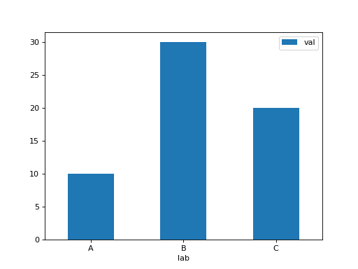
Basic plot.
(Source code, png, hires.png, pdf)
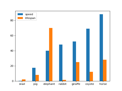
Plot a whole dataframe to a bar plot. Each column is assigned a distinct color, and each row is nested in a group along the horizontal axis.
(Source code, png, hires.png, pdf)
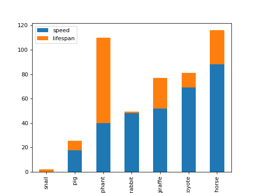
Plot stacked bar charts for the DataFrame
(Source code, png, hires.png, pdf)
Instead of nesting, the figure can be split by column with
subplots=True. In this case, anumpy.ndarrayofmatplotlib.axes.Axesare returned.(Source code, png, hires.png, pdf)

If you don’t like the default colours, you can specify how you’d like each column to be colored.
(Source code, png, hires.png, pdf)

Plot a single column.
(Source code, png, hires.png, pdf)

Plot only selected categories for the DataFrame.
(Source code, png, hires.png, pdf)

- Return type
matplotlib.axes.Axes 或它们的 np.ndarray